Spectrum
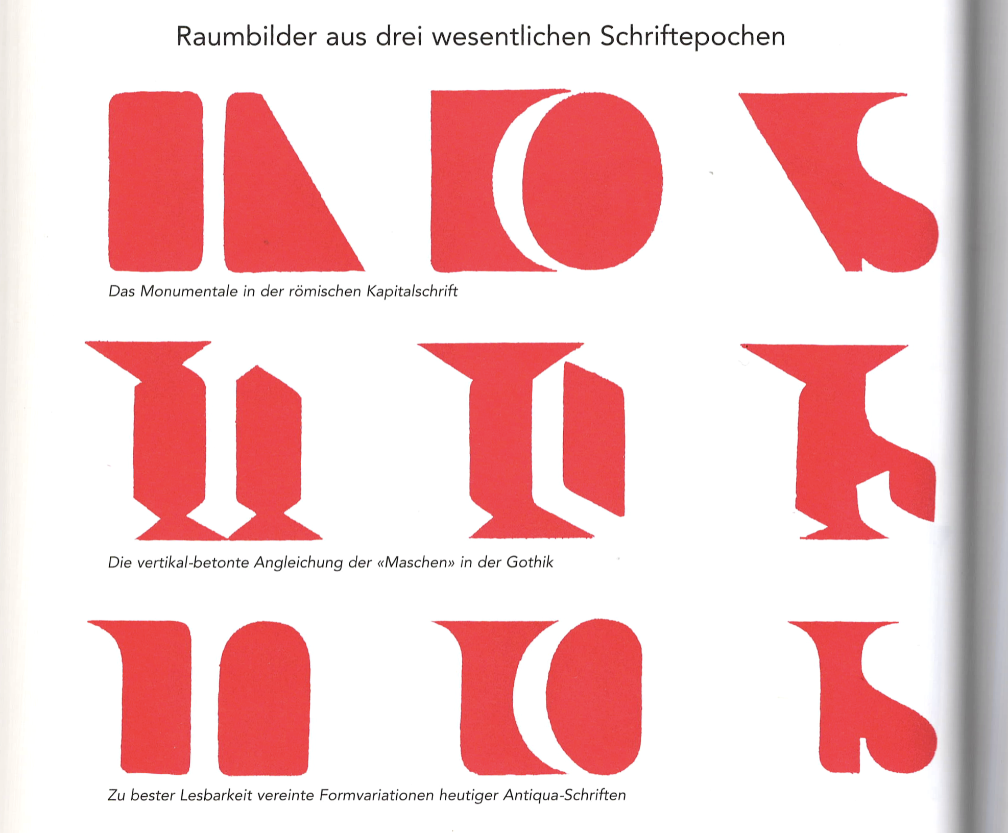
This morning we heard about geometry, mathematics and calculation. Geometry is fascinating because you can build entire worlds with geometry. Not only as in Minecraft, but actual entire systems – writing systems, graphic systems – and you can generate and sustain them based on geometry.
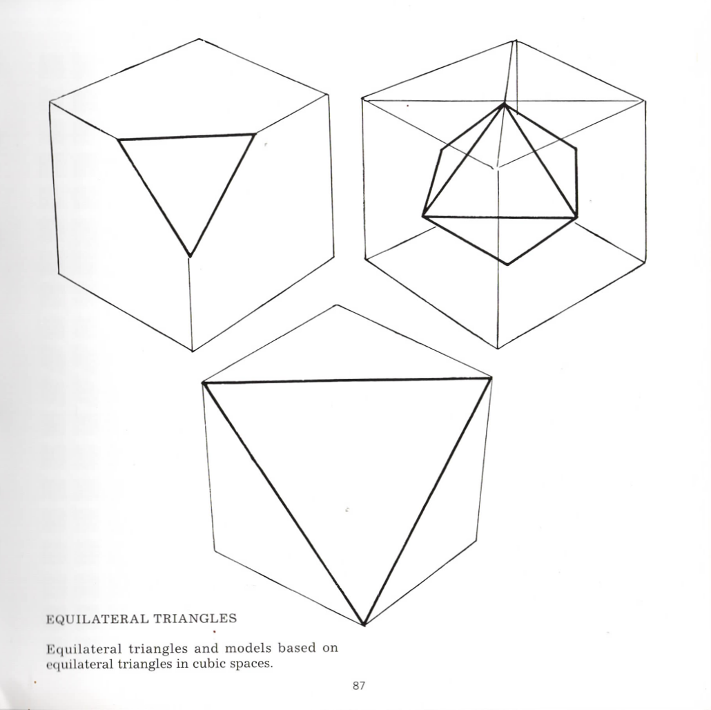
What I really like is when geometry is counterintuitive, when you can draw triangles using squares or circles, or you use squares to draw circles or rework your triangle in a Shuriken style – I think it’s a triangle of constant width kind of structure – and use them to draw squares.1 I’ve been using Bézier curves to draw type for almost twenty years and the more familiar I become with them, the more something bothers me about them. Even though vector drawing is itself a wonder of geometry, it seems to be a missed opportunity of using unexplored conventions of geometry, because what I also like about geometry is how it can explain the world visually.
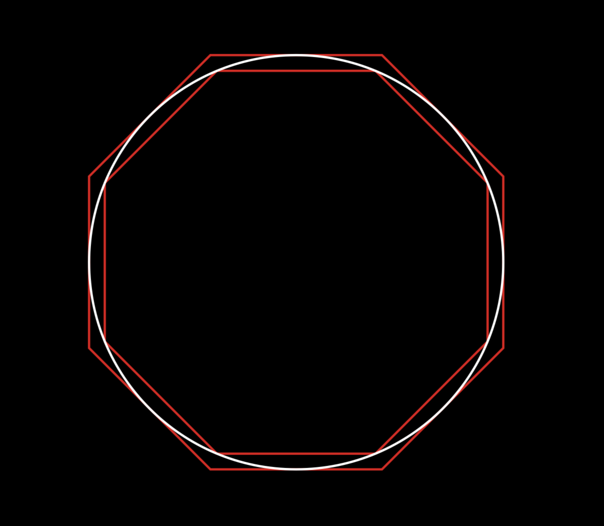
I’ll tell you a little story: when I was a teenager, around thirteen years old, I had a class on applied mathematics and our teacher gave us a geometry exercise. He was basically reenacting a process imagined by Archimedes some 2,200 years ago which is called the method of exhaustion, which aims to calculate the surface of a circle. When you don’t know π, basically you inscribe and circumscribe it within two polygons, such as squares, and the surface of the circle is in between two other surfaces. It’s an approximation, and the more complex polygons you use, the more accurate your results are. Doing this in our class, a question came up about our pencil drawings: Should we take the thickness of the line into consideration? Picture the middle schoolers scratching their heads.
The teacher then changed the drawing method, to stop using lines and instead to draw with plain colour. I think his point was to show that in geometry a line is an abstraction to represent the limit within two things. What I took from this is, a drawing is not reality, it’s a visual representation of reality. I learned about this not through Magritte, or an art history lesson, but in maths class.
So basically from three elements – inside, border and outside – we defined two. I had completely forgotten about this until I started to study type design, where I noticed that some typefaces were designed in a line process, whereas others were following principles like those explained by my maths teacher.
The best results are often those which mix these two principles, something that became even clearer when I started collecting pictures of letterforms in public space, where a simple mistake, a glitch in the normal behaviour of letters, instantly made them more attractive. An example of missing counterforms… they may be missing voluntarily. Or you don’t notice at first that there is no counterspace for the E and it’s actually okay in terms of readability. Beautiful visual games can come from playing with forms and counterforms, and sometimes just a pinhole in a wooden sign is enough to make the counterform.
Stonecarvers know this of course. It’s part of their work as practitioners of an art form which consists of ’removing matter’ to create shapes. It’s the same in sculpture or in engraving. And of course it’s also how type designers operated for about five centuries.2 When you cut shapes, it makes sense to think in terms of counters and then draw accordingly.
But what about contemporary type design? Thinking with surfaces is not a necessity today. It’s an option amongst many others. So at the start of this project, I first wanted to know what has been written about this topic within the field of type design. What’s very common in all of the texts I found is how the authors always state the importance of mastering the space between the letters, but then they leave it up to you to find out how.
Aldo Novarese wrote that when designing letters it’s necessary to keep in mind the importance of optical factors in order to create harmony.3 In more recent texts, Sofie Beier brings up the subject in her book about type design, where she mentions exceptions to the rule and how spacing is not a priority.4
The last example is Rudolf von Larisch in 1926. Larisch is very lyrical about the notion of surface forms and counterforms, but here again he asks us to achieve ‘mastery over the ornamental distribution of letter masses.’5 Larisch unfortunately gave us only one or two examples, without any form of explanation. Beginners have to find out by themselves. So, given that certain type designers are known for their personal inclination for counterforms, I wanted to look at their approach.
The first example that comes to mind is Dwiggins6 and his M formula, which could be used by a sculptor to contrast crude counters with softer outer forms to enhance the legibility of text forms, particularly at small sizes. Apart from this idea, Dwiggins, as far as I know, never said more on the subject, but he did influence others such as Cyrus Highsmith.7 In a 2018 interview Highsmith said that ‘The non calligraphic approach of Dwiggins interested me a lot. Until then, all the information I was able to gather about drawing letters was from a calligraphic point of view. It was all about stroke order and from left to right. My brain doesn’t work in a linear way.’ Neither does mine. In the same text, Highsmith writes that this approach might be rooted in a childhood moment. Apparently he wanted to draw trees, and his mother, who was an artist, advised him to not draw the branches of the tree, but the spaces between the branches. That’s what he did and continued. I think that’s how this beautiful drawing came to life. ‘It is not the trees themselves that make a wood, but the shape and disposition of the remaining light, of the sky that descends between the trees.’ 8
Apart from sculpture and engraving, there is another art form that deals mainly with space, which is architecture. It’s no surprise that architectural examples appear repeatedly in the numerous publications of Adrian Frutiger, who was comparing calligraphic styles to building principles of the same period.9
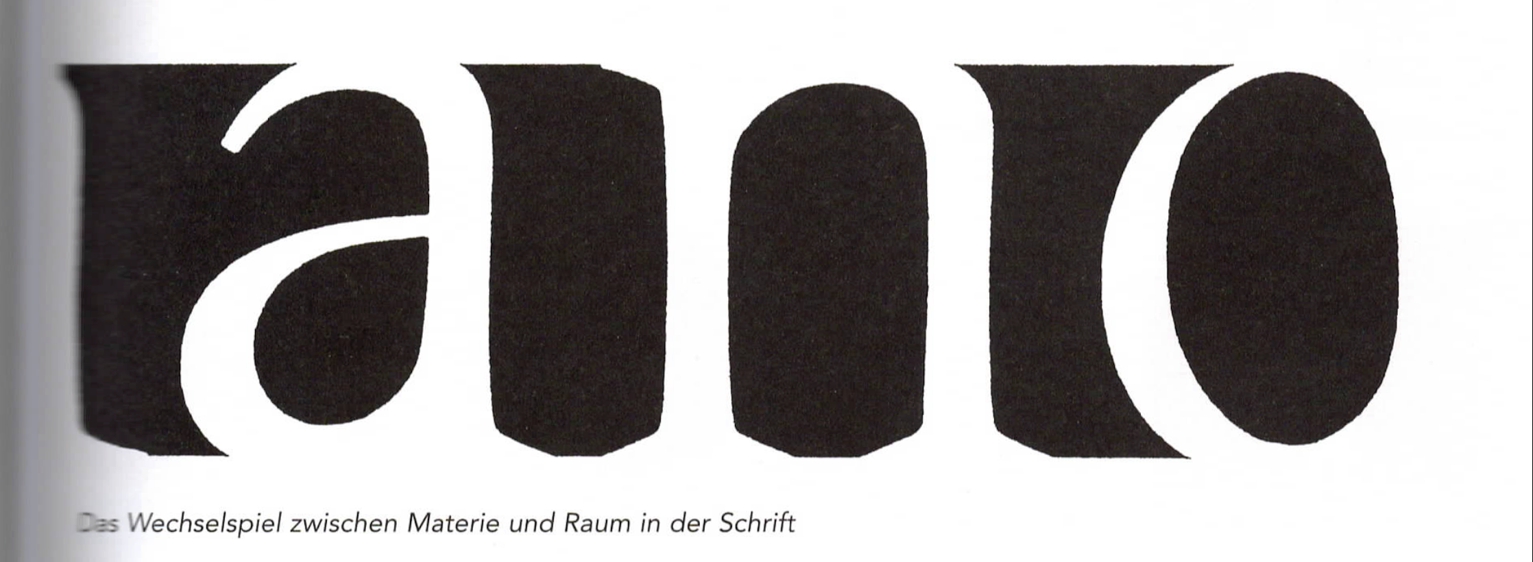
Among those who have published texts about type design practice, Frutiger is the one who most regularly refers to surfaces. As you can see here, he described a ‘Wechselspiel’10 between ‘Raum’ and ‘Materie’, so this is probably a question of mindset. Maybe some designers cultivated it, some not.
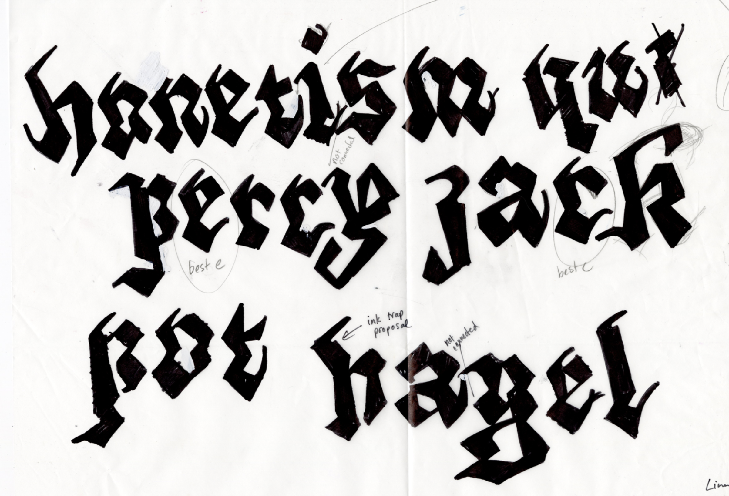
If you look at these two Gs, they are very similar, but I’m sure that one has been drawn with a pen and the other with a chisel. The one on the right is a bit less frequent, maybe, because it comes from a mindset that does not come naturally. When you learn to write as a child, you write with a pencil, you make lines, you don’t learn to draw a letter. Whereas as a non-trained adult you want to draw counters, stencil forms for instance. I really love the one on the right, with its counterforms in the O, R and D.

At this stage of the project, two points appeared to be essential: the first one is that working with surfaces involves necessarily drawing words, not letters. If you decompose the shape and take into account the space between the letters, you cannot work with each of them in isolation. You have to build from words, even fake words. The second important point, and I remember discussing this with Alice Savoie quite frequently, is that in all our processes, there was always the question of, ‘Oh, I found this new way, but how to make it into a method that could be used for several fonts?’ It’s not about lettering. It’s not about making one single piece. But we wish to draw, to create a system.
That’s our thing as type designers, to build systems and to have something that could be used for several systems.
With these two ideas in mind, I started sketching, trying to find principles in the decomposition of shapes, forms and counterforms.
It was a long, slightly boring process. The difficulty I encountered was the level of precision. For instance, here, the space between D and H, can be the same as between O and H. This is the case for some typefaces, for example Futura, and yet not for most serif typefaces. But I said, okay, this is not yet the time for the subtleties.
So let’s look for some more brutal stuff. Warming up with a simple alphabet, every letter is made of one large square with small circles of different sizes and positioned to create the counters. It was fun to do, quite basic and extremely systematic. It’s a total system, and extremely rigid too, but not really usable. And we won’t even speak about legibility.
The next step was to look into more classical shapes made with pure geometry, with traditional capitals, trying to work with as few elements as possible. I allowed myself to work with verticals, horizontal circles and thirty degree obliques. This was still in the realm of rather traditional type, but allowed some dead ends to appear. For instance, it was impossible to make a letter S with that principle. Capitals G and Q are also a bit more complicated than the rest. They have a line element in them, which is visible also here. So G and Q are slightly ’off’. On the whole, the font is slightly off, but some letters more than others.
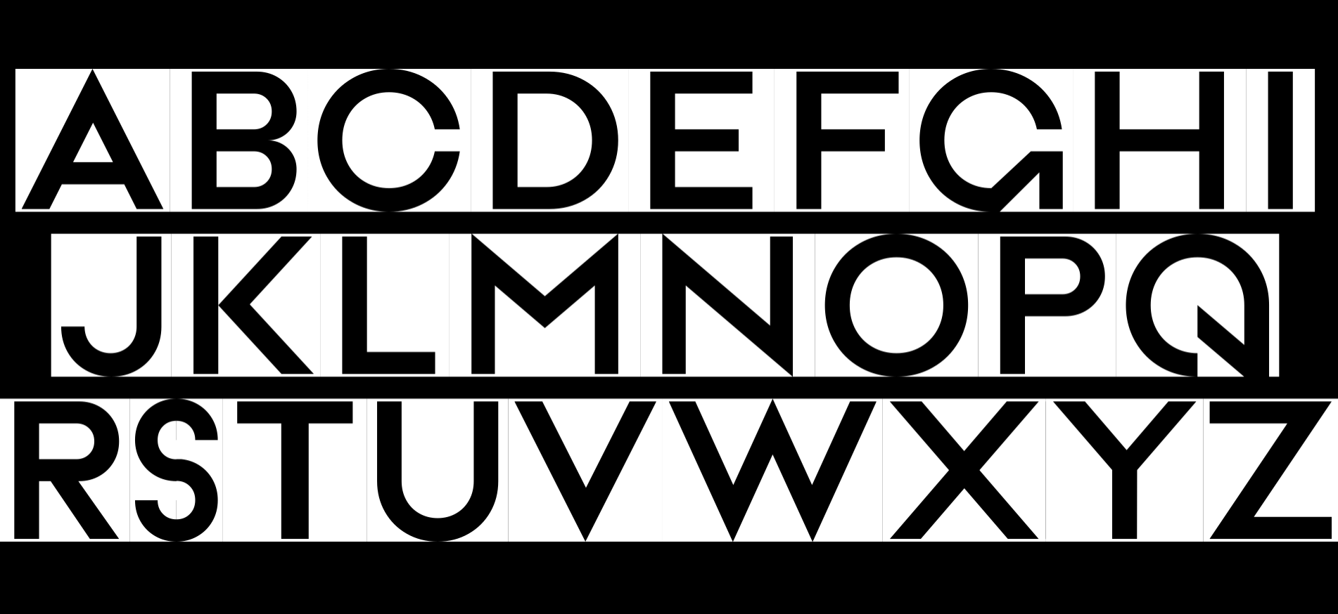
It’s not very satisfying. Yet, those exact exercises were worth doing in order to understand the logic of counterforms. The challenge then is to design a system that is flexible enough to allow creativity, but rigid enough to allow proper production. And here, spoiler alert, Bézier wins – as stated already twice this morning – whenever it’s about producing typefaces in an efficient and quick manner. What I experimented with is not at all as efficient as Bézier, but that is not the point.
As I was developing this, one of the Master Type Design students who is present today, Nell May, was coincidentally working on a similar project, albeit from a different starting point but with common goals and mostly similar issues.
One issue was that if you work with counterforms, you have to constantly switch between black and white and you need to train your eyes to do this. It’s a bit like learning a new writing system. We also noticed that it’s important to have only masses and no lines at all. As soon as the shapes go thin and long enough to look like a line, it takes over and the ‘autofocus’ is broken. This is very difficult to read as letterforms, and I think the same problem comes up in this sketch for Adrian Frutiger’s Element Grotesk in 1953.11
So Nell focused on uppercase and how slab serifs could play with a combination of letters. There are very few components and many optical corrections here and there, a lot of case-by-case considerations. And for this surface method it’s an issue that, to properly produce forms, you need to make a lot of tiny changes everywhere.
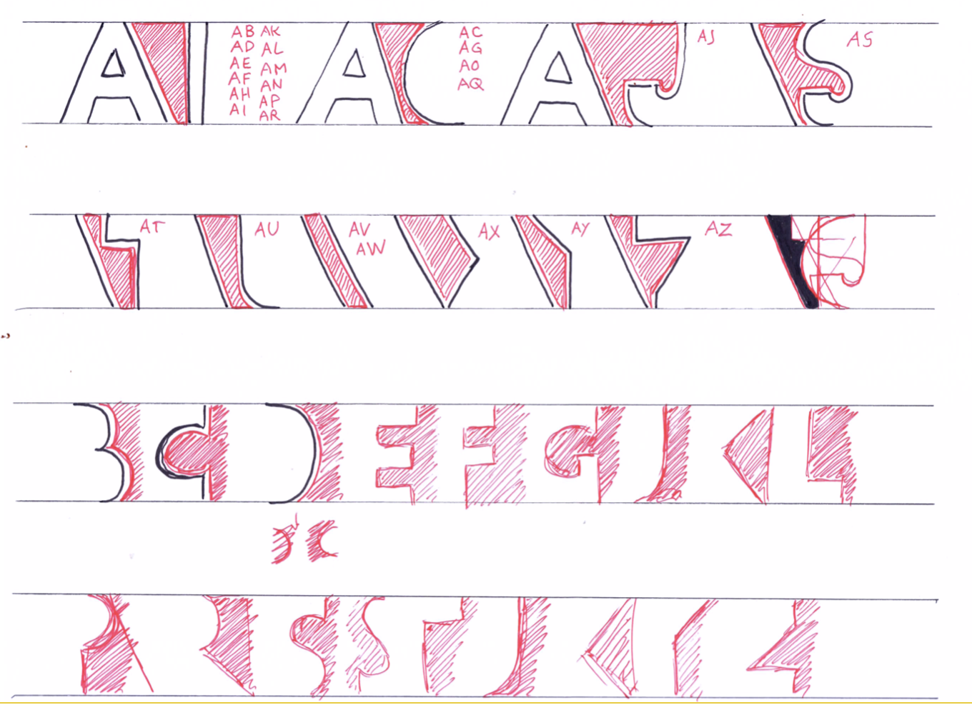
And why? Because when combined, twenty-six uppercase letters generate 676 pairs. That’s a lot of work. With sans-serif, the counter between A and B is the same as between A and D, E, F, H, etc. So you can reduce the total to a still quite large number of 322. And then most of the letters have inner counters as well as external ones, some of which I call for lack of a better word ’semi-counters’. When the counterform is not clearly an isolated element, it connects with the other negative shapes. There are also letters with no counters, uppercase I and T and lowercase l, and specific cases such as q, f, i and j, uppercase Q and lowercase f.
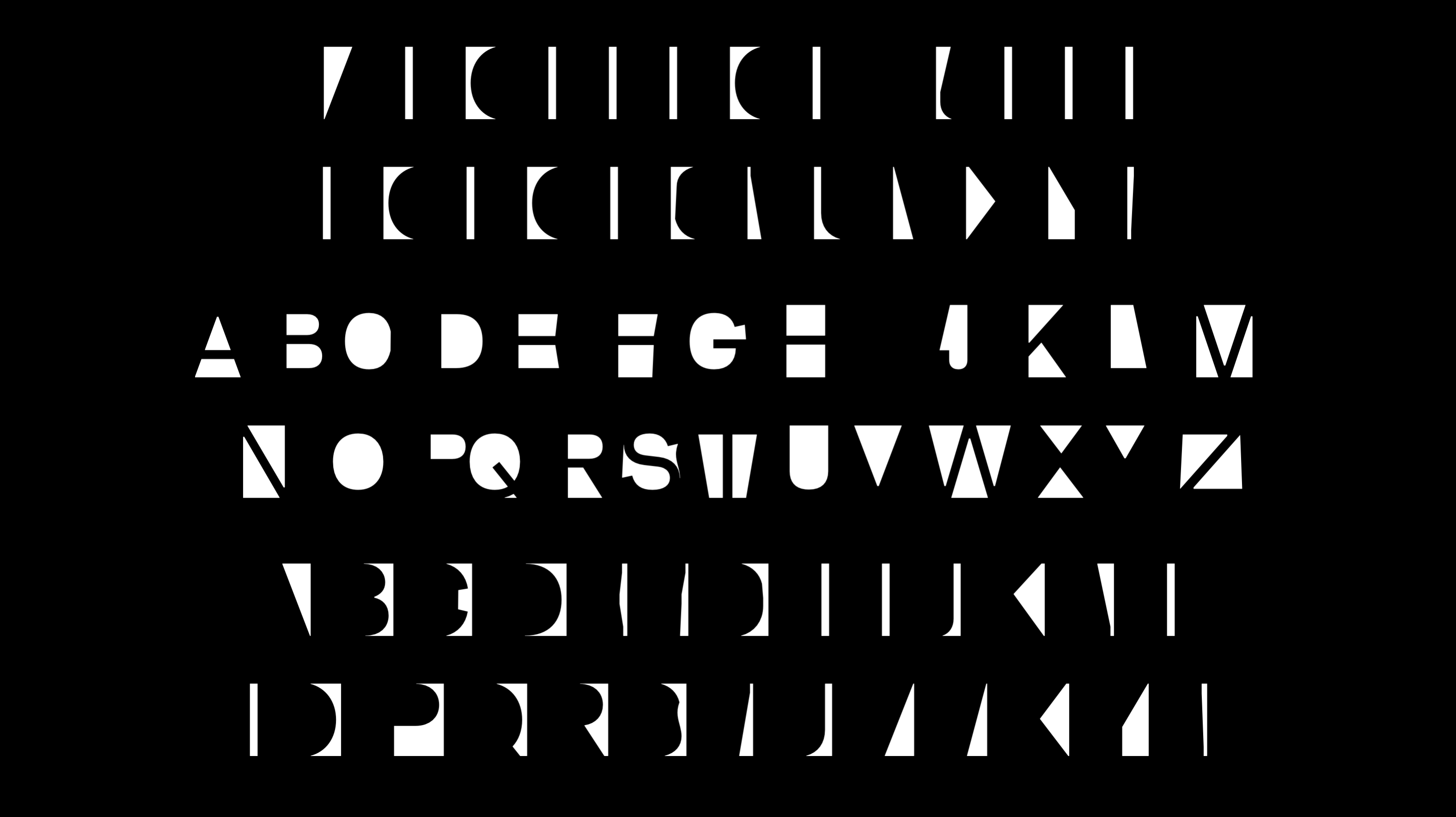
So basically these are my building blocks. The first series corresponds to the space ‘before’ the letters, the second to ‘inside’ the letters, and the third ‘after’ the letters. They’re not easy to differentiate. If you had to draw them like this, it would be very difficult, but with a bit of contextual ligature and openType code, you can type things with them. And now it’s possible to play with it. I just played with basic typographic features, like increasing the spacing, reducing the spacing, deformation of the width, and the legibility holds surprisingly well even when condensing the spacing, slanting, or a combination of different effects.
If you only want a serif font, you apply a rounded effect and you have kind of a serif. I did this from an existing simple sans-serif font.
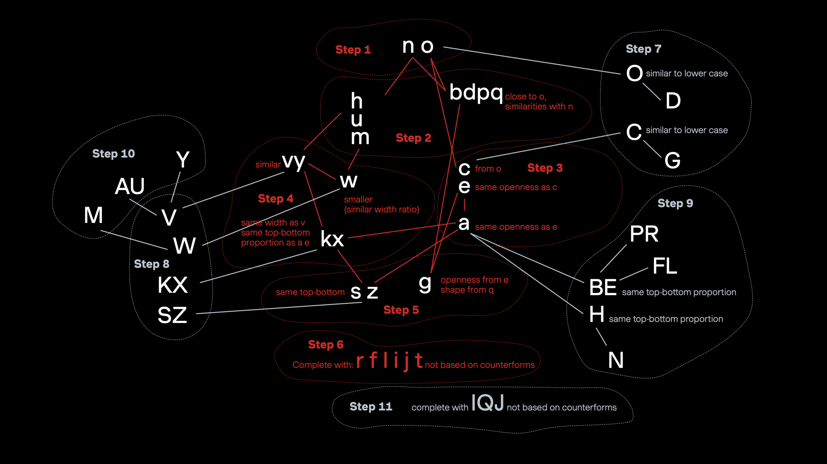
So the next point was: Where to begin if one wants to draw from scratch with this system? So I did – on a much lower level than Florence – some statistics. I looked at the frequency of lowercase letter pairs, comparing English, Italian, French, German and Latin using online statistics tools. As with the capitals, the number of options can be reduced by creating shape groups. The behaviour of a lowercase n and m is similar. So I was navigating between complexity and simplification, and it ended up with something like this:
The most frequent space is the space you have between a lowercase o and lowercase n, and then between two ns, etc.
I was looking for a logical process, which gave me this messy thing, though still understandable. At first, one draws the core of the alphabet n and o, and shapes derive from them. Then steps two and three, the development of complexity; adding obliques in step four; more complex shapes in step five. And now we have enough material to work on capitals in the same order, which are steps seven to ten. And finally some letters, step six for lowercase and eleven for uppercase have difficulty fitting into the counterform principles, so they arrive last. Which means there is a kind of a system, but you may have been troubled by the lack of vocabulary: counters, negative space…
This was addressed by Cyrus Highsmith in his 2023 talk at the ATypI conference. There aren’t precise words to describe different counterforms. Most authors touching on that concept did not go far enough in their texts to create new words. Punchcutters seem to rely more on the gesture and the verbs and actions to speak about them.12 What matters for them is the movement that you make, not the final shape.
So I tried to be creative with the words. This is the first poetic attempt to create a little glossary using terms from geography, as if letters were lands and counters were different bodies of water. Quite silly, not very practical, but it’s about space, because space is at the core of geography, type design and architecture.
At this point I was lucky enough in my reading to find this quote: ‘Space is substance.’ Cézanne painted and modelled space. Giacometti sculpted by taking the fat of space away. Mallarmé conceived poems with absences as well as words. Ralph Richardson asserts that acting lays in pauses. Isaac Stern described music as ‘that little bit between each note – silence, which gives the form’.
In Japanese there is a word, ‘Ma’ for this interval, which gives shape to the whole. In the West, we have neither words nor terms for this.13 That was what I was looking for! So written with this Kanji 間. But you know, the Japanese writing system is highly contextual.14 This Kanji can have multiple readings depending on the context. ‘Ai’, ‘Awai’, ‘Hisoka’, ‘Ni’, ‘Koro’, etc. It appears as a component in very basic words, such as 時間 (Jikan), which is ‘time’ and 空間 (Kūkan), which is ‘space’, and some readings are borrowed from Chinese, while others are purely Japanese. The reading of ‘Ma’ is purely Japanese.
Basically ‘Ma’ is what you can see in most of this painting, the emptiness between two things or two people, which is not separating them but is part of their identities. In this philosophy, things are not dissociable from their surroundings. ‘Ma’ is the space holding as much importance as the rest of an artwork, an emptiness full of possibilities, like a promise yet to be fulfilled.15 In less poetic terms, the word ‘Ma’ defines the distance between two opponents, but also the time it involves hitting each other. It’s the vital zone around each fighter. ‘Ma’ creates an adequate space between two things. That’s what I want to draw actually. And there is another word, another reading of that character, which is ‘Awai‘, which is that moment in the early morning when it’s not night, not day yet. In French it’s called ‘Entre chien et loup’.16 Maybe this is peculiar to Japanese art and architecture17 or to East Asian societies18 : The idea of fighting balance, that there is no dualism, that silence is equally important as sentences.19 I wish this could be applied to type design because as with other things in life, type design is not binary.
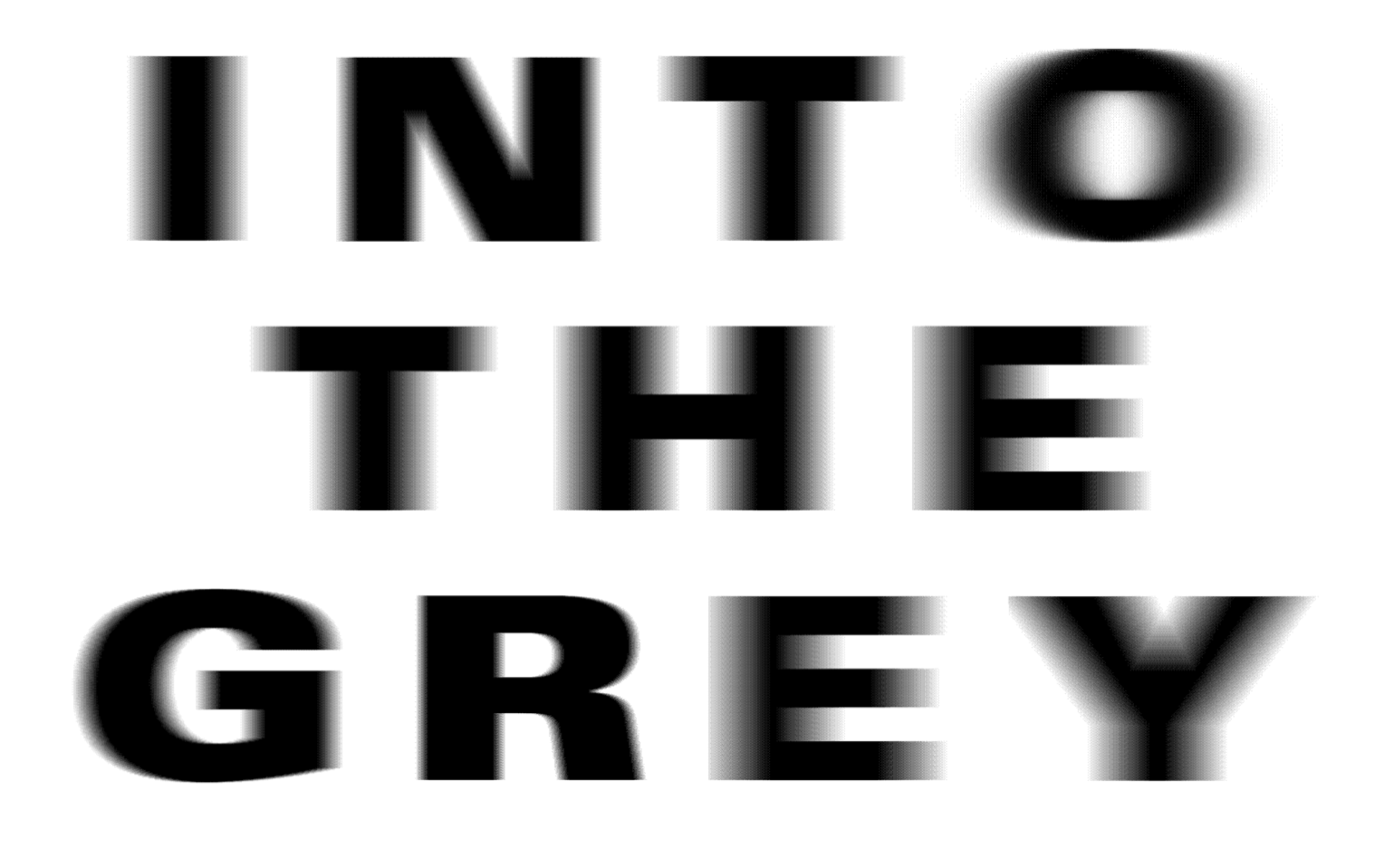
I started questioning why we always draw in pure black and white and nothing in between? It’s been a recipe for type since Gutenberg, more or less for practical and technical reasons, because printing in colour was time consuming and expensive. We’ve been accustomed to reading black letters on white paper for centuries. It was not the case before the introduction of movable type, neither is it with contemporary screens. Yet. If you draw with Bézier, you have to decide if it’s either black or white. There is no grey. If you want grey, you must use rasterising, for instance, as here, or use colour fonts. But then the type designer imposes the choice of colour on the user, which is not a good solution.
And if you look at lead type, even if typefaces are conceived in black and white, they never were. You have ink squashes. On screen, you have grey pixels.
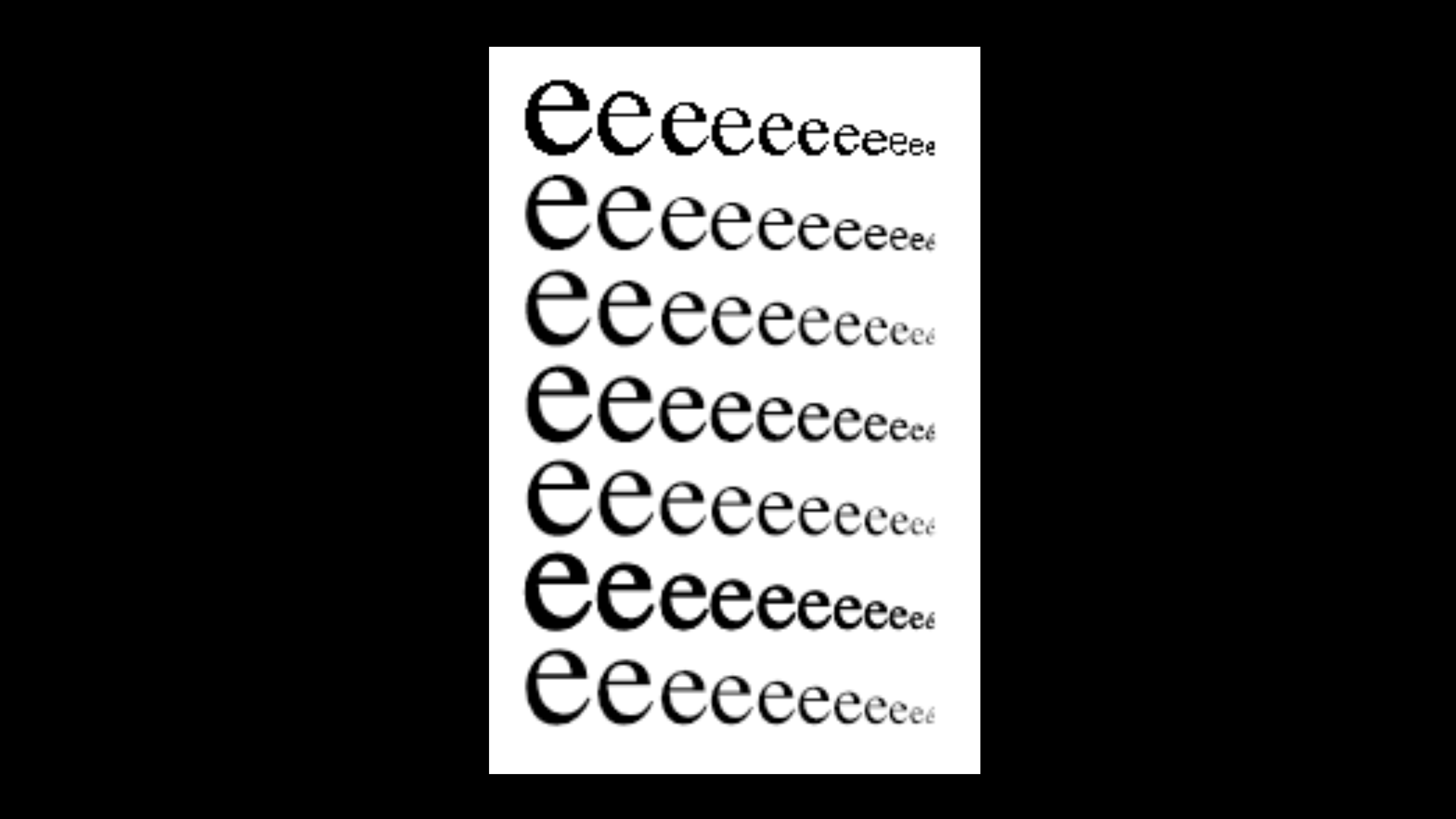
Here you see different versions of anti-aliasing in Photoshop – sharp, crisp, strong, smooth light, and LCD. And of course, you’re looking at this on a projector. It’s different and doesn’t look exactly the same on this giant screen as on my laptop, or on your smartphone. The pixel density depends on the monitor. Even if many type designers, some secretly, some not at all, dream of having total control on the display of their work, they don’t. Macs and PCs differ in how they interpret text and images. Type designers are not almighty. We never have been, and hopefully we never will be.
We have to find tricks… which reminded me of one of the themes in Fred Smeijers‘ famous book Counterpunch.20 There is a gap between the ambition of a rational mind and the reality of the mistakes that might happen when you cut by hand. So to avoid this, there is an efficient way to achieve a suitable solution. This solution is a kind of ‘vibration’ that many today find pleasant and agreeable to read, but that generations of type designers have tried to overcome since the late eighteenth century. Now that we have high definition screens, there seems to be some kind of craving for a human touch in type design. Over the past year, this notion appeared more and more in the motivation letters of the applicants to the Master Type Design. And it appeared frequently in their theses too.21 We have to resist polishing the contours, as Kai said earlier, which is a temptation with type design software.
In his thesis, Mac Wang interviewed the Chinese designer, Ying Yonghui who stated that ‘I prefer to go straight in with digitising the characters and adjust them later. As a result, many of the inconsistencies and quirks from the woodblock prints are preserved, and I very much enjoy this process. This no-component approach helped me internalise the spirit of the design and stay flexible. It may sound weird, but it allows me to design more freely.’22
He also says, that ‘I’m a digital woodblock cutter, as a joke, but this is how I see my work. I try to produce digital typefaces in the manner of a craftsman.’23
So what I take from this is the idea of ‘no components’. Type design software using Bézier pushes us to make components, to use anchors. It’s convenient, practical, quick. It speeds up the process, increases the productivity in a time of fierce, capitalist competition. If you avoid components, you have to work more. I wonder if this new craft approach is a reaction to automation, a way of adding value to the font. Or if this approach assumes the high-tech aspect of type design as a given and no longer valuable, as if it’s too easy to create fonts.24
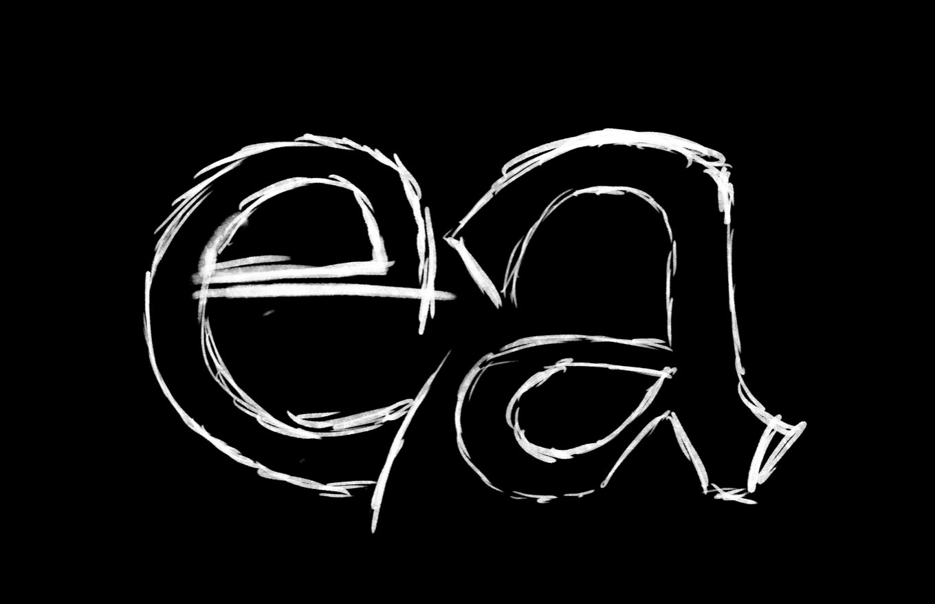
Most people prefer to spend time away from their screens and draw by hand. Bézier curves are unbeatable for their precision, but what if precision is no longer an important value? Are our tools too precise? The Scribbler tool designed by Kai is an attempt to lose precision in drawing, to sketch more freely. I tried using blurry tools. It’s fairly easy with an iPad to play with density in order to draw in a total blur.
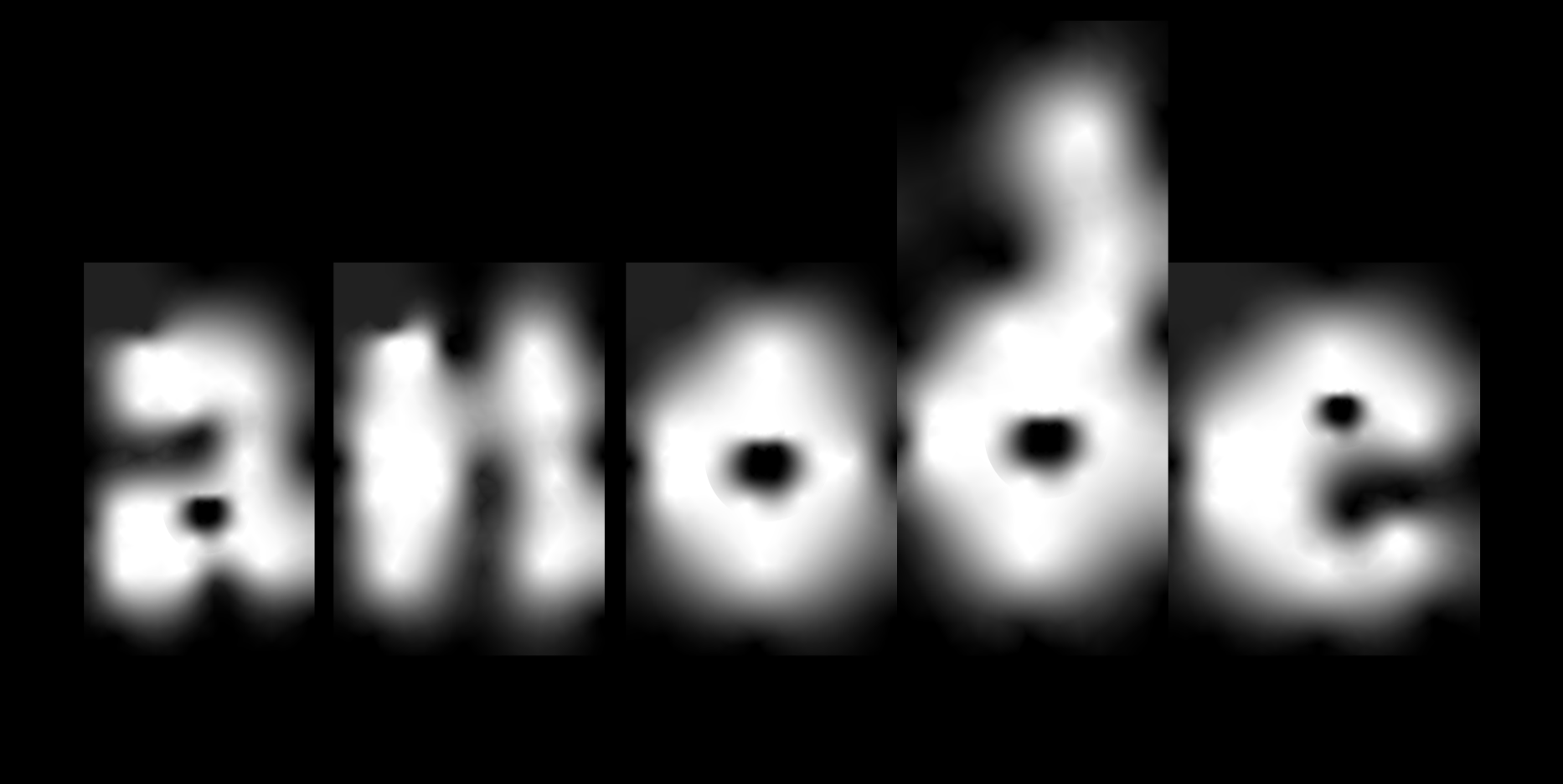
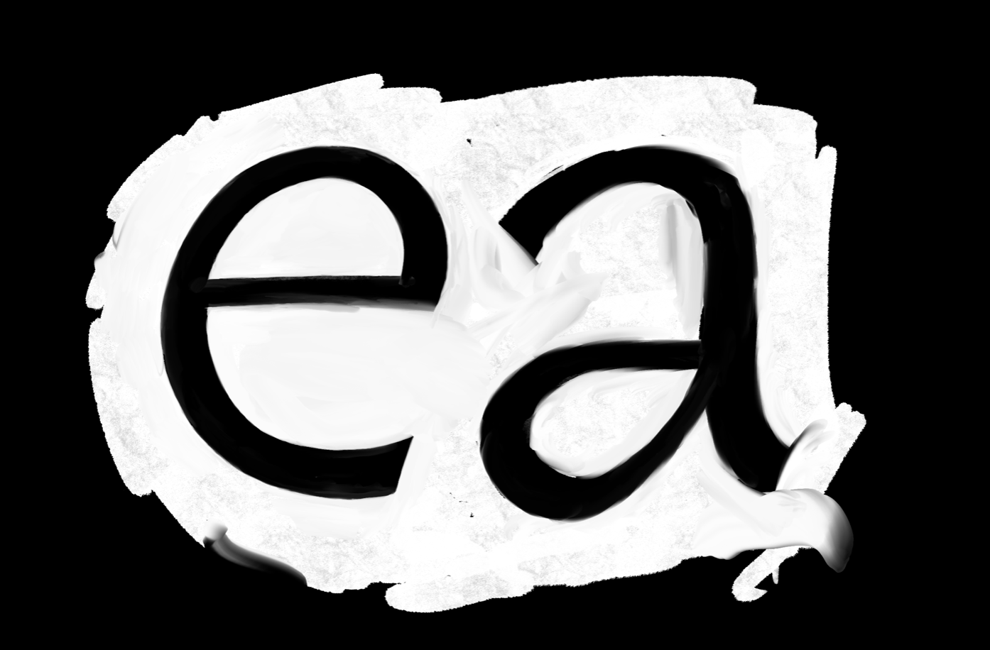
I also tried Adobe Illustrator and some options that they offer let you generate ghosts of letter forms. You still have to draw a vector box, but within the box you can play with the masses of black and white that interact with each other.
As you can see, this method is highly imprecise and every change tends to affect the whole design. These calculations also use a substantially larger amount of computer energy. It’s extremely slow to produce in this way, so these are not exactly eco-fonts and, anyway, they belong more to the realm of lettering than type design.

Illustrator, after all, is a software that has been designed to make vectors, and vectors are by definition not blurry. I also added these attempts here, because Illustrator allows you to draw with a shade. It’s not very practical, but what is interesting is that it forces you to draw the counterforms and the form at the same time by, for instance, changing colour, and this gave me an idea: What about using lines to draw counterforms?
It resulted in three typefaces. For the first I took a slightly diagonal bar and two parentheses. So this is an o. When you put two of those next to each other, you don’t need any extra space. From that, the game is to find shapes that can connect well, whatever the neighbouring letter is. And it involves quite a bit of kerning – yet everybody loves doing kerning. It becomes more readable when you get accustomed to it. Still, I find this horribly complicated to read. I then added just a bit of weight and some weird shapes. The result – I may have seen this too often already – but I find it quite legible.
For the second attempt I looked back in history. Gutenberg made the first movable type with blackletter, so I guess that they were quite suitable for a block principle with boxy shapes. So I repeated the same principle using blackletter. Adding a little spur on the left proved helpful in combining some letter pairs. And at at the end, it works relatively well. I then extended the set a bit with some capitals, while accents are not designed with the same principle. I don’t think it affects the legibility. The solution I use is quite common too, for instance, Diana Ovezea’s Granblue typeface uses the same idea. The accents are not included within the ‘box’.
Finally, a third attempt resulted in this font, which I’m continuing to develop. These are my favourite letters. You recognise them as uppercase G and then lowercase a, e, ø for our Danish friends and s. These I like because they break more with the traditional construction of letters. Again, I find this legible – but I understand if you disagree.
With this small family of three fonts, a specific byproduct of surface methods can be seen: the ‘Bouba-Kiki’ effect. It is worth mentioning, I think, because although I didn’t include it at the beginning of the research project, I can not un-see it now.
The Bouba-Kiki effect was coined by the Georgian psychologist Dimitri Uznadza back in 1924, and several other scientists have since worked with it.25 In the first study, they showed a picture like this one to people from different regions of the world, speaking different languages, and asked them: One of these shapes is called Bouba, the other Kiki – which one is which? It turns out that attributing soft, organic roundness to Bouba, and sharp, spiky forms to Kiki is extremely common throughout the world and relates to a kind of universal linguistic feature.

Some fonts can be very Bouba-esque or very Kiki-esque. If we consider it as a spectrum, my own experiments in drawing with the surface method end up on extreme ends. For instance, with this, an attempt using slight curves ends in Kiki. Noticing this, I started to look at letter drawings and designers from different sources, placing them on the Bouba-Kiki spectrum, and this is when I invited French designer, Malou Verlomme for a workshop at ECAL. It was not an innocent invitation, as I remember a 2017 talk during which Malou showed a process of layering two drawings in order to create the shapes, but not the spacing. He basically did this: one layer, two layer, then together. For the workshop, students used linoleum, potato printing, black paper and scissors, or sheets of transparent papers to cut the font. No lines were involved, only surfaces, and the results were eventually laser cut into greyboard. And again, you can see a strong Bouba-Kiki effect, across the whole spectrum.
It seems to be intrinsically part of drawing with surfaces. Adrian Frutiger acknowledged it in his Frutiger Stones font – maybe one of his least usable fonts. And you also find the Bouba-Kiki thing in Cyrus Highsmith’s work.
Looking back at another workshop around the same topic with Franziska Weitgruber, this was the case too. Some projects are Bouba, others are Kiki. Some started Bouba and ended up super Kiki. And I think that’s one of the limits of this method. But being aware of this spectrum allows me to avoid drawing too much Bouba or too much Kiki in my own practice, when rough sketching, in the slow process of reworking, and even when cleaning up the layers.
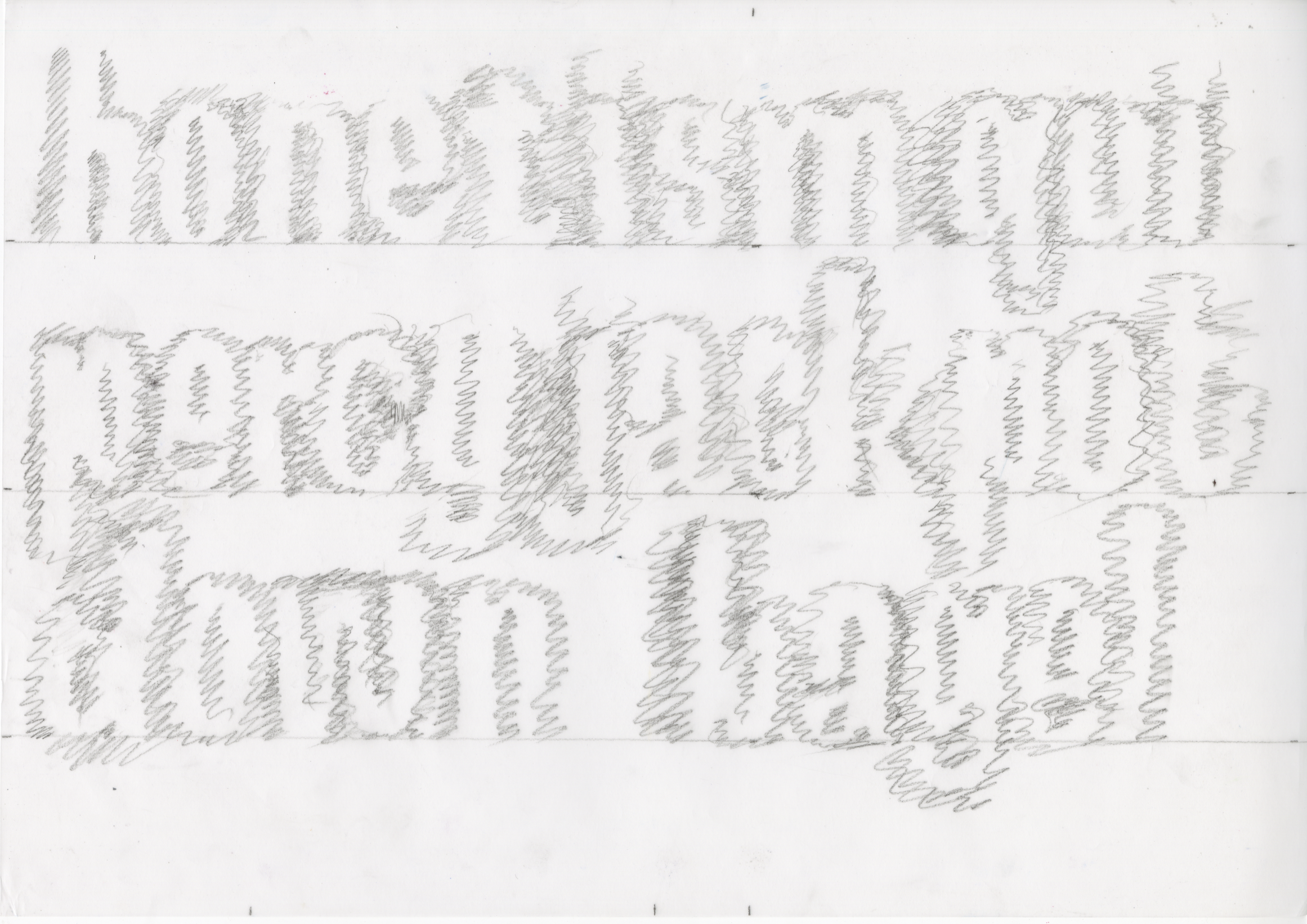
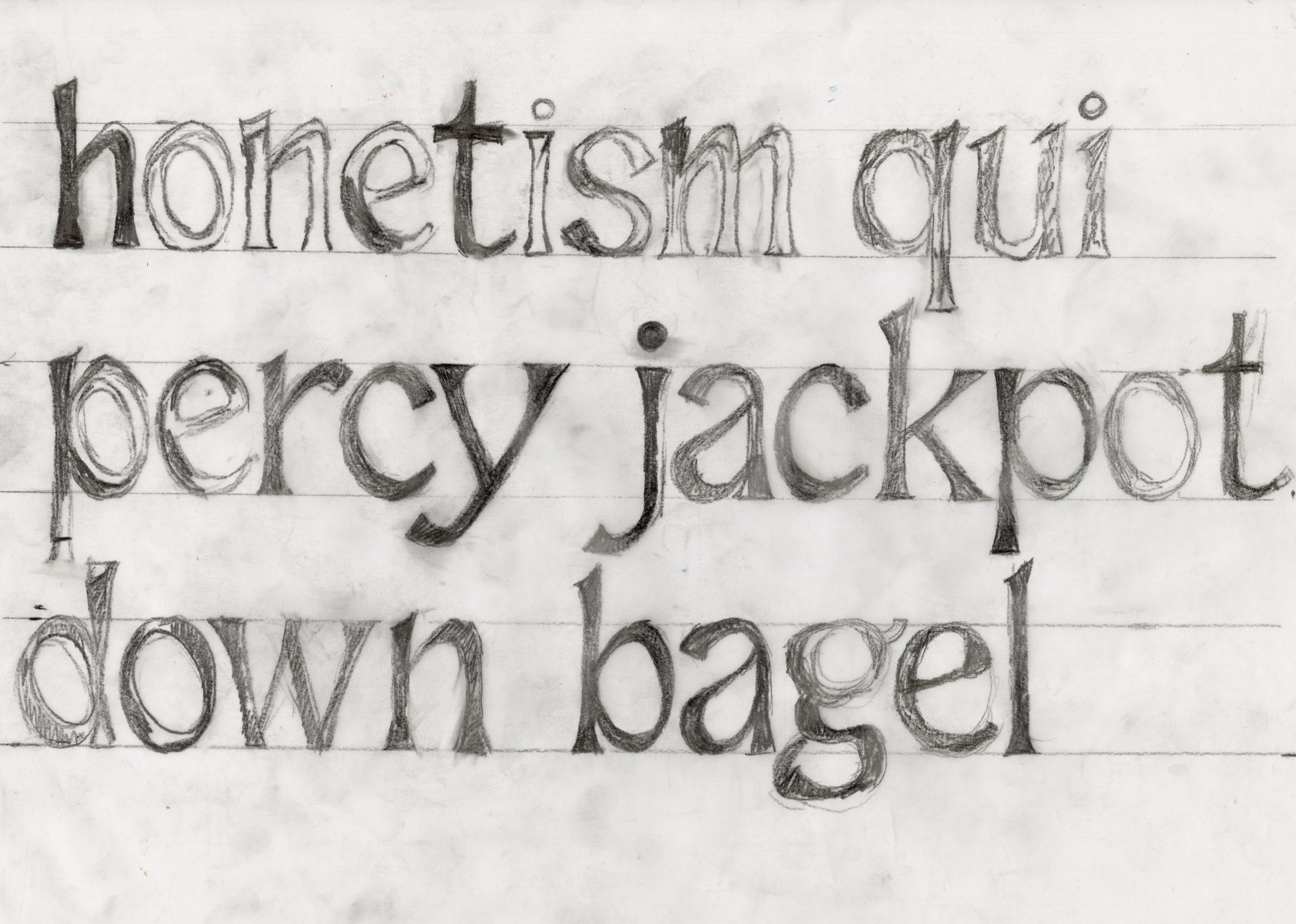
Back to the main story. I mapped the pros and cons of the surface method. It’s good for sketching, good for spacing, but not good for finalising and detail work. The last part of this talk is dedicated to the question of pedagogy and type design. You remember this chart? With the help of ChatGPT I tried to find words that could include the counterforms following that process. I had to do a few attempts in ChatGPT before arriving at something meaningful. The idea then was that students would work on several parts of the alphabet simultaneously. They were asked to work precisely and slowly and refine the whole alphabet, while not falling into the rabbit hole of drawing one single letter for a full day. They had to consider the whole constantly, working on both form and counterform at the same time.
It became the brief that I gave to our first year students for my first semester class and it included an element of collaboration, with classmates working in pairs. In each case, one student was asked to draw the counterform of the alphabet, and the other the form, as a starting point for the first drawing. Each of them received two random words, one a more objective, typographic feature, the other more subjective. The project is ongoing, but we can already see some interesting elements.
Sometimes the pairs communicated fluidly and were quick to agree on something. The feedback principle helped with validating and implementing new ideas. You can see that the work evolves with each step, a real dialogue between two people to make decisions. Other times, no clear path was taken and a lot of variation happened before settling down. Sometimes, resistance happened on both sides, with seemingly major changes, undoing the other student’s work. Nevertheless, with an agreement on the general concept, the evolution from one stage to the next was productive. Some projects slowly turned Kiki with each step. Others are fully Kiki from the beginning, or totally Bouba, or both Kiki and Bouba at the same time.
This class was also an occasion for me to test my hypothesis. As you know, I’ve been drawing type for decades. I have habits, routines and experience. In the class, my question was, will my assumptions be proven with younger, less experienced, people, with more flexibility in the handling of a new process?
One assumption was that the work on spacing would be easier and more natural with this process. It turned out it wasn’t. The spacing is not necessarily better than if you do it letter by letter. In many exchanges, the spacing varied a lot with each stage. Even if a properly harmonious spacing doesn’t happen straight away, I think this method discreetly sets a mood and awareness about spaces that will make the spacing process more efficient when digitising.
The second hypothesis was that a certain harmony would come from working on the whole alphabet. This proved true: even if the sample text did not contain the whole set, or only lowercase, there is no letter that looks out of place or seems to belong to another font. The downside of this is that any missing letters in a set are extra-complicated to add afterwards.
To conclude, I would say that the surface happened to be a good teaching tool. I hope it can be useful for designers with a specific mindset, though it does not beat Bézier for efficient productivity or precision – but then perhaps what we should question is the emphasis we place on productivity and precision.
The surface method is not enough to make digital fonts as we understand them. Maybe that was my mistake at the start. With this axis of research, I originally wanted to design a method that would provide all the answers, but it simply can’t. Probably no method can, otherwise it becomes rigid and dogmatic. On the other hand, it has helped me to gain a holistic view on a design approach that can lead to excellent work such as this:
This was done with the surface mindset. This letter may not be readable by itself, but the ‘Ma’ principle tells us that context is everything.
For instance, playing with alternates, the Viscera font can provide striking legibility with great formal freedom. These letterforms have no calligraphic skeleton. They are purely made of forms and counterforms. As in my maths class in middle school, we’re not seeing three elements, but two.
Designing type means finding a balance between black and white, finding the ‘Ma’. But from that same source, quoting the Japanese philosopher Nishida Kitarō, ‘when looking for “Ma”, which is the space, you might encounter the second “Ma”, a demon, and never find the third “Ma”, which is truth’. To find it, you need intuition.
And the philosopher describes intuition as follows:
‘At that precise moment, the object and the subject disappear one into the other, and there is then only a single universe and a single landscape, where neither submits to the other. Intellectual intuition may appear to some as merely a subjective act, but it is actually a state that transcends the duality of subject and object […]. An artistic inspiration is an example of reaching this state of ultimate unity.’26
This final quote is for me a good definition of an excellent typeface.
- 1 Bruno Munari, Square Circle Triangle, Princeton Architectural Press, New York, 2015. (Il Cerchio, 1964. Il Quadrato, 1960. Il Triangolo, 1976.).
- 2 James Clough, Chiara Scattolin, Alfabeti di legno: Luigi Melchiori e la storia dei caratteri di legno in Italia, Tipoteca Italiana, Cornuda, 2014.
- 3 Aldo Novarese, Il segno alfabetico, Progresso Grafico, Torino, 1971, p. 11. ‘È necessario quindi, nel disegnare caratteri, tenere presente questo importante fattore ottico, al fine di creare un’armonia nel chiaro-scuro di ogni lettera.’
- 4 Sofie Beier, Type Tricks: Your Personal Guide to Type Design, BIS Publishers, Amsterdam, 2017.
- 5 Rudolf von Larisch, Unterricht in ornamentaler Schrift, Aus der Österreich, Staatsdruckerei, Wien, 1926.
- 6 Bruce Kennett, W. A. Dwiggins: A Life in Design, Letterform Archive, San Francisco, 2017.
- 7 Cyrus Highsmith, ‘Space and Rhythm, interview with Jan Middendorp’, in: Products of a Thinking Hand, Royal Academy of Art, Gerrit Noordzij prize, The Hague, 2018, p. 14. See also: Cyrus Highsmith, Inside Paragraphs. Typographic Fundamentals, Font Bureau, 2012.
- 8 J A Baker, The Peregrine, Collins, London, 1967. Quoted in Casper Henderson: A Book of Noises, University of Chicago Press, Chicago, 2023.
- 9 Adrian Frutiger, Buch der Schriften: Anleitung für Schriftenentwerfer, Marix Verlag, Wiesbaden, 2005.
- 10 Ibid. A word that my German-speaking colleagues thought sounded slightly odd. Maybe Frutiger, after years spent in France, translated the French ‘jeux de miroirs’ in his native tongue?
- 11 Heidrun Osterer, Philipp Stamm (eds.), Adrian Frutiger – Caractères. L’Œuvre complète, Birkhäuser, Basel/Boston/Berlin, 2009, p. 46.
- 12 Nelly Gable and Annie Bocel, Dessins de geste. Gravure & poinçon typographique, Éditions des Cendres, 2018.
- 13 Alan Fletcher, The Art of Looking Sideways, Phaidon, London, 2001, p. 370.
- 14 Augustin Berque, ‘Étendre Ma et Aida à la logique et aux sciences dures? Vers un paradigme de la raison sensible’, in: Sakae Murakami-Giroux, Masakatsu Fujita, and Virgine Fermaud (eds.), Ma et Aida. Des possibilités de la pensée et de la culture japonaise, Éditions Philippe Picquier, Paris, 2016, p. 9–53.
- 15 Ibid.
- 16 ‘Between dog and wolf’, i.e. between dusk and dawn.
- 17 Jun’ichirō Tanizaki, In Praise of Shadows, English translation, Leete’s Island Books, 1977, (first published 1933).
- 18 Richard Nisbett, The Geography of Thought: How Asians and Westerners Think Differently… and Why?, Free Press, New York, 2003.
- 19 Murakami-Giroux et al., op. cit., p. 55–78.
- 20 Fred Smeijers, Counterpunch: Making Type in the Sixteenth Century, Designing Typefaces Now, Hyphen Press, London, 1996.
- 21 MATD theses: Alina Andone, The Aura of Type Design, 2021; Niklas Herrmann, Between Emotions and Imperfections: On Human Values in Type Design, 2023; Simon Memel, The Influence of Hand-Lettering Practices on Contemporary Type Design, 2024; Mac Wang, Craft is Dead, Long Live Craft, 2024; Rebekka Hausmann, Searching for the Tipping Point, 2025.
- 22 Interview with 應永會 / Ying Yonghui, in: Mac Wang, Craft is Dead, Long Live Craft, MA Thesis, ECAL MATD, Lausanne, 2024 (unpublished).
- 23 Ibid.
- 24 Pierre Bourdieu, La Distinction, Critique sociale du jugement, Les Éditions de Minuit, Paris 1979.
- 25 Dimitri Uznadze, ‘Ein experimenteller Beitrag zum Problem der psychologischen Grundlagen der Namengebung’ (‘An experimental contribution to the problem of the psychological foundations of naming’), in: Psychologische Forschung, Vol. 5.1–2, 1924, pp. 24–43.
- 26 ‘L’objet et le sujet à ce moment précis disparaissent l’un et l’autre, et il n’y a plus alors qu’un seul univers et un seul paysage, là où aucun des deux ne se soumet à l’autre. L’intuition intellectuelle peut paraître à certains comme un acte seulement subjectif, mais elle est en réalité un état qui transcende la dualité du sujet et de l’objet (…). Une inspiration artistique est un exemple de l’atteinte de cet état d’unicité ultime.’ Nishida Kitaro, Essai sur le Bien, Osiris, Paris, 1997, p. 48. Original text available here. Quoted by Augustin Berque, ‘Étendre Ma et Aida à la logique et aux sciences dures? Vers un paradigme de la raison sensible’ in Murakami-Giroux et al., op. cit., pp. 9–53.