The path of least efficiency
Good morning and thank you for the introduction.
We have a problem in the type design industry, I think, a problem of craft. And that is that we’re all using the same tools to do our work, by and large. We have gone through some iterations of this. In the beginning, we had pixel typefaces – of course that was before Susan Kare’s work for the Macintosh, and it actually didn’t look like pixel typefaces at all.
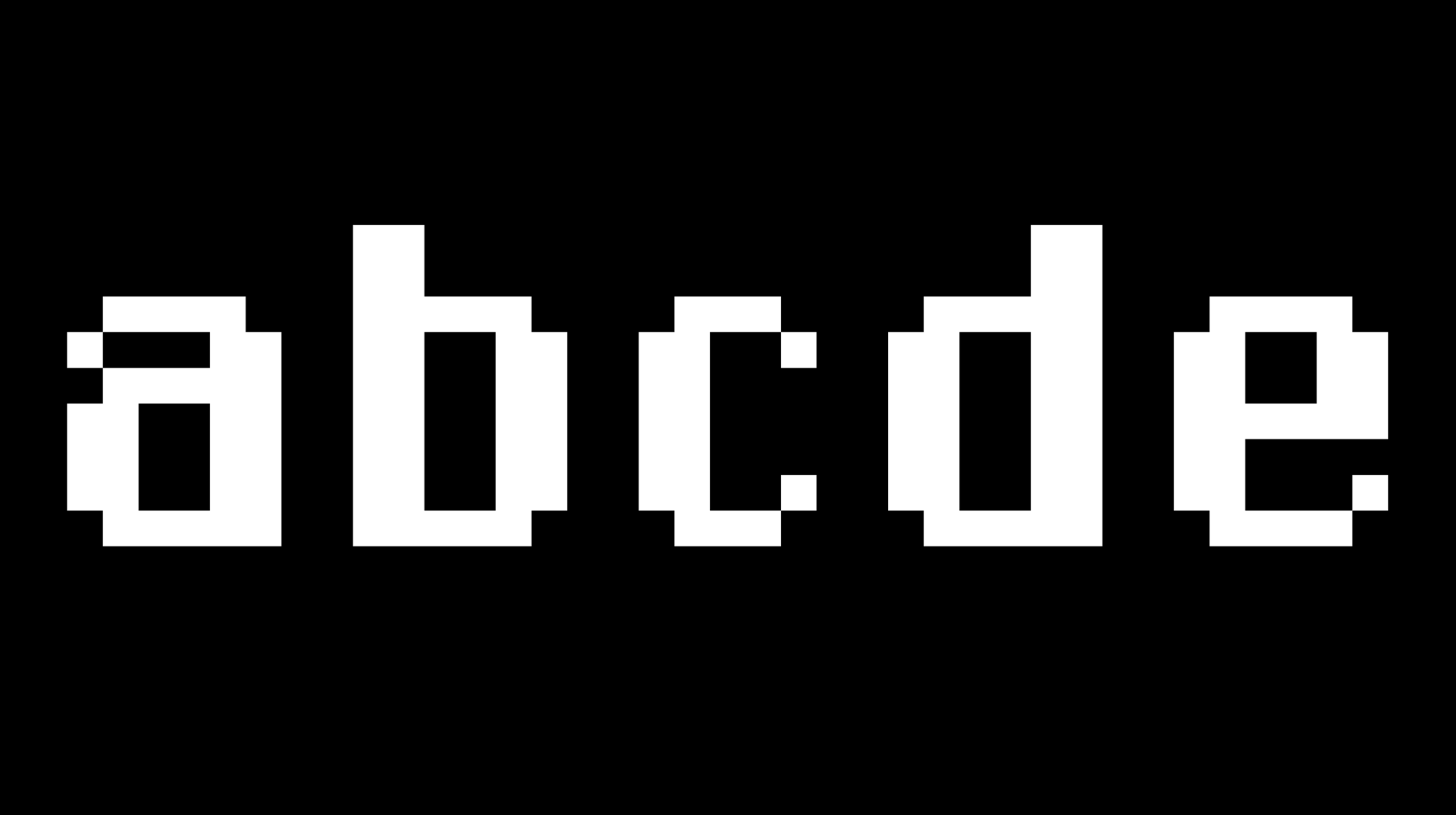
The first digital typeface was a pixel typeface, Digi Grotesk by Rudolf Hell. It was stored in pixels for the first computerised photocomposition machine. So instead of storing the typeface on a little piece of film, this was the first to be digitally stored. It tried not to look like a pixel typeface, because this new technology was really just thought to reach the quality of what had come before. But you can see the stair treads there in the headline version of the font which only much later would become a stylistic expression or a sign of ‘technical restriction’.
Here’s an issue of what Hell had published as an internal newsletter titled Technology for All of Us, where, among others, we can see Gerard Unger’s Demos typeface. Unger, after a first presentation when he had come to Kiel with classically drawn typefaces, confessed to having to change his approach to type design for Hell, and he said in a later interview that there is no question of 0.1 millimetre when you have to take away some of those squares.1 And Zapf, who used the black grid and whiteout to make his Marconi and Edisons typeface that he developed for Hell, also meant that this is not joyful for a type designer to work on.
It’s nice to see that in this Hell newsletter they show a DigiSet, a digital photocomposition machine, together with a developer output device with a galley of text being spit out of it, ready for paste-up. And at the bottom of the article, a totally not-at-all staged photograph of somebody doing manual corrections to a DigiSet font on paper with the pixels.
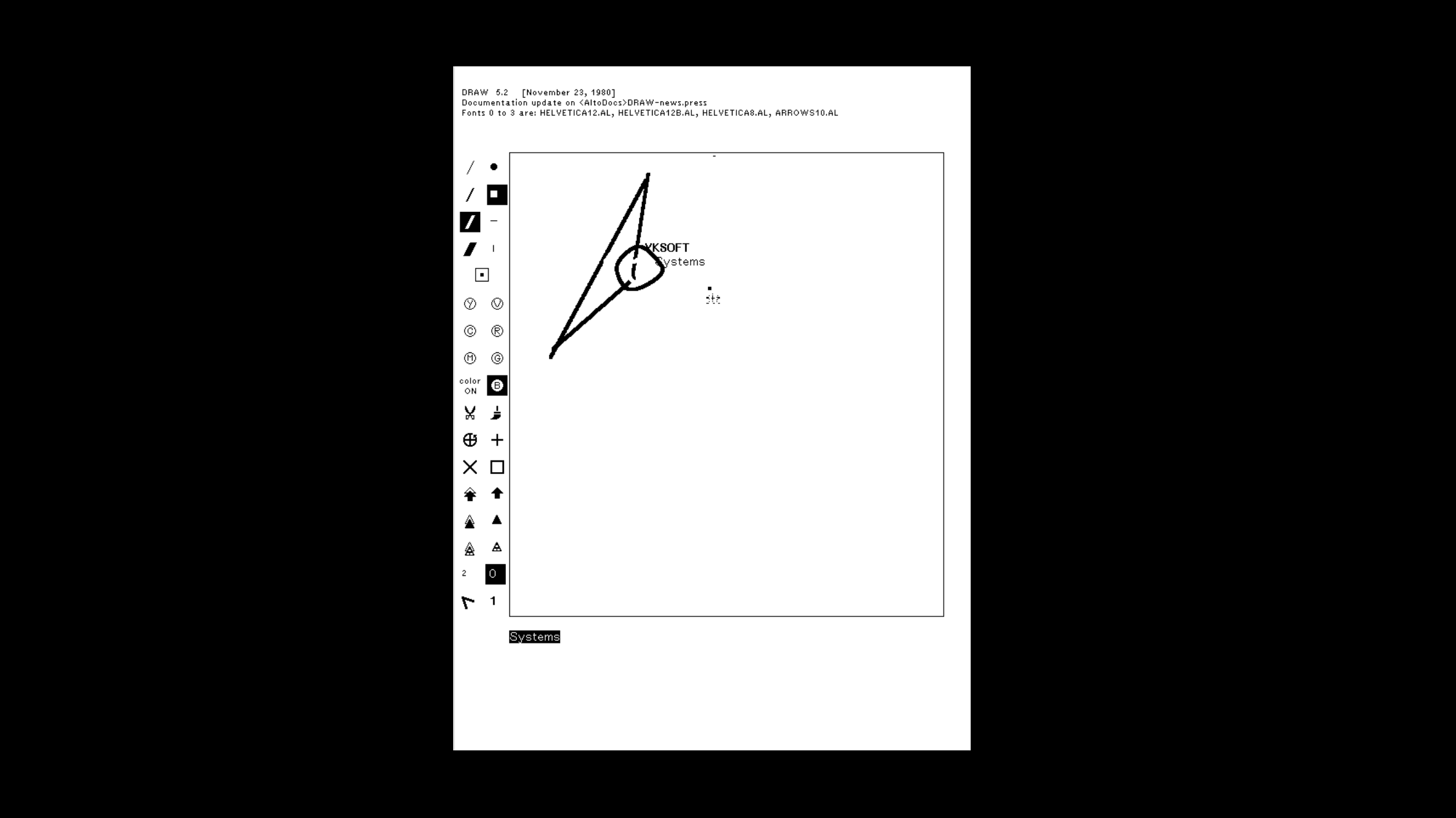
A little while later we get to vector drawing and at first this happened at Xerox PARC with the Alto computer system. At Xerox PARC there was a software called Fred, for drawing and pre-press, where the typeface creation digitisation stack was part of a larger concept. It was a kind of forerunner of desktop publishing, in that it managed a graphic layout and it was possible to use a page description language, way before Photoshop, to send documents to a networked laser printer. This was completely unheard of at the time. Here is a screenshot from Draw, and it’s not a Bézier drawing, but I feel like we’re getting there.
Many of these things I know about thanks to Ferdinand Ulrich, who was kind enough to let me read his PhD thesis about the early days of digital type design. If you’re interested, he gave me a few answers in an interview which you can read on our project website.
MetaFont has been mentioned before, an academic project started by Donald Knuth in the late 1970s. A project, let’s say, which is not originally outline based. It’s a programmatic, parametric description of letter shapes that was part of TeX, a larger project also by Knuth, both born out of a dissatisfaction with the quality of typography that he could ask for when printing his academic papers. I’m showing this together with MetaType1 by a team called JNS (Bogusław Jackowski, Janusz Marian Nowacki and Piotr Strzelczyk). I want to highlight a particular problem, one that I also encountered in this research and which Florence mentioned just before during questions: ‘In the end, it’s always Bézier.’ Wherever we start from, what it ends with is Bézier-based contour drawing and interpolation – that seems to be the narrow definition of what a typeface is for us these days, what we draw and what we think of contours, and that it has to fit inside an OTF or a TTF font. This is so ingrained that, even within our framework of going ‘Beyond Bezier’, we are going to frequently revisit Bézier curves and contours.
Personally, I feel very comfortable with this particular way of drawing and I think most of us are. So the problem is that although you can draw anything with a Bézier curve, as Matthew Carter demonstrates in this TED talk, I think it’s very clear that like any tool, Bézier favours a certain way of drawing. It makes certain things easy: ‘All straight lines are dead straight and the curves have that kind of mathematical smoothness that the Bézier formula imposes’… and it makes certain other things very difficult: ‘None of the straight lines are actually straight and the curves are kind of subtle. It has that spark of life from the human hand that the machine or the program can never capture.’2
It’s interesting to explore and amplify what a tool wants you to draw. Recent type design history is littered with examples of typefaces that were drawn in what we could call a ‘digital way’. What then started as a reaction to technical restrictions quickly became an exploration of some sort of native or inherent formal quality and is now a fairly popular style of drawing, perhaps because we feel this approaches, as we have always called it in the studio, ‘true to the material’, or ‘Materialtreue’ in German, but it’s definitely a temptation to draw like this, because corners and straight lines and fewer vector points are much easier to manipulate than tiny curves, subtle curves, more vector points. I think it’s a reasonable argument that in part we are drawing these kinds of typefaces because it’s easier to draw them like this with our Bézier drawing tools. So for me the Beyond Bézier project was like a way to increase friction in the drawing process and to see how I might draw things differently using different tools. This is all important as a prelude and we’ll get back to it in the end.
My actual task in this project was to research notions of the stroke, which, given I studied on the Type & Media Master Program in The Hague, makes complete sense. At this point, let’s say, a loose definition, a quick disambiguation, is in order: a stroke has a thickness and a direction, and possibly it has contrast, whereas a contour has no thickness and just describes the left and right edge of a stroke. So it’s a delimiter between the stroke and the background, between the positive and the negative shape. What we can do with a stroke is either writing or lettering. And I think with a contour, what we can do is drawing.
Gerrit Noordzij writes very lyrically about these things, but shown here is a scientific paper 3 where he gives a technical and rather concise summary of the sorts of contrast that make up the Noordzij universe: translation, expansion, and rotation. And then I thought, well, but maybe there are other kinds of contrasted strokes.
There’s an illustration at the bottom of the page of pen strokes broken down into trapeziums, which we’ll get back to later. But there Noordzij also mentioned the three kinds of contrast he regularly speaks about and their potential to imitate calligraphy.
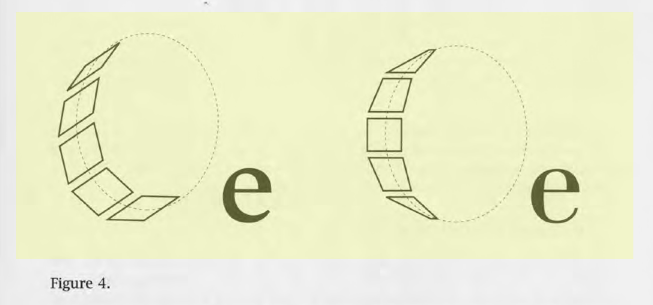
They were integral in MetaFont and in many other projects. Here’s Kalliculator, a tool that Frederik Berlaen made during his stay at Type & Media. Or all the way to the Letter Ink plugin for Illustrator and Glyphs, which is almost like a more user- friendly, direct manipulation and interactive version of Kalliculator. But all of these want to convert back to outlines and I wasn’t too keen on going this route. I was more interested in exploring something new, because why would we try to continually rehash the things that we already know? I wanted to see if there was something that we hadn’t done yet. So I went looking for different kinds of contrasts beyond the Noordzij universe. And one of the things I found, very by chance, was in an odd GitHub comment where John Hudson muses that there is a fourth kind of contrast that he calls ‘tilt’, which comes from tilting a broad nib pen or brush over one of the corners of the edges of the brush.
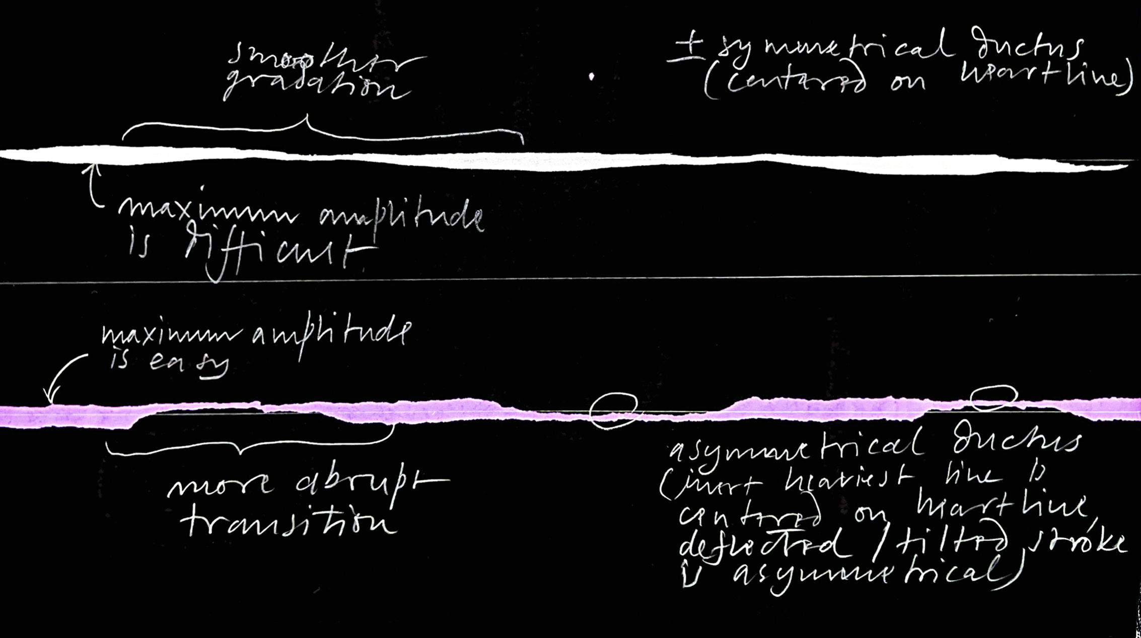
So I got a pen out and played around with it. I just wanted to try something very briefly and informally, tilting the broadened edge and then it’s clear the stroke becomes thin and it’s slightly different than expansion contrast: the ductus of the stroke is more or less symmetrical or centered around the heart line with expansion contrast, yet it’s always off-centre with tilt contrast. So it’s aligned with the maximum amplitude, if you will, and speaking of the maximum amplitude: the thickest a stroke can get, it is very easy to achieve this with tilt contrast. And as you may know, it’s neither easy nor without risk to try and get the maximum amplitude out of a flexible pen. The transitions are much more abrupt with this tilt method.
Hudson mentioned that this is used in Arabic calligraphy, and Lana Soufeh, a former MATD student I consulted with, said that this is actually correct and that type designer Khajag Apelian had just been talking about that with her as well. So we now know, there are at least four kinds of contrast: translation, expansion, rotation, and tilt. Then some of our current students presented me with what they are working on in a project for my first semester class titled Tools make shapes…. The group with Rebekka Hausmann, Lucas Portron and Ratchanon Boongsrithong did a very simple exercise, soaking a piece of string in ink and then laying it down on the paper to create contrast by the way they removed the string from the paper.
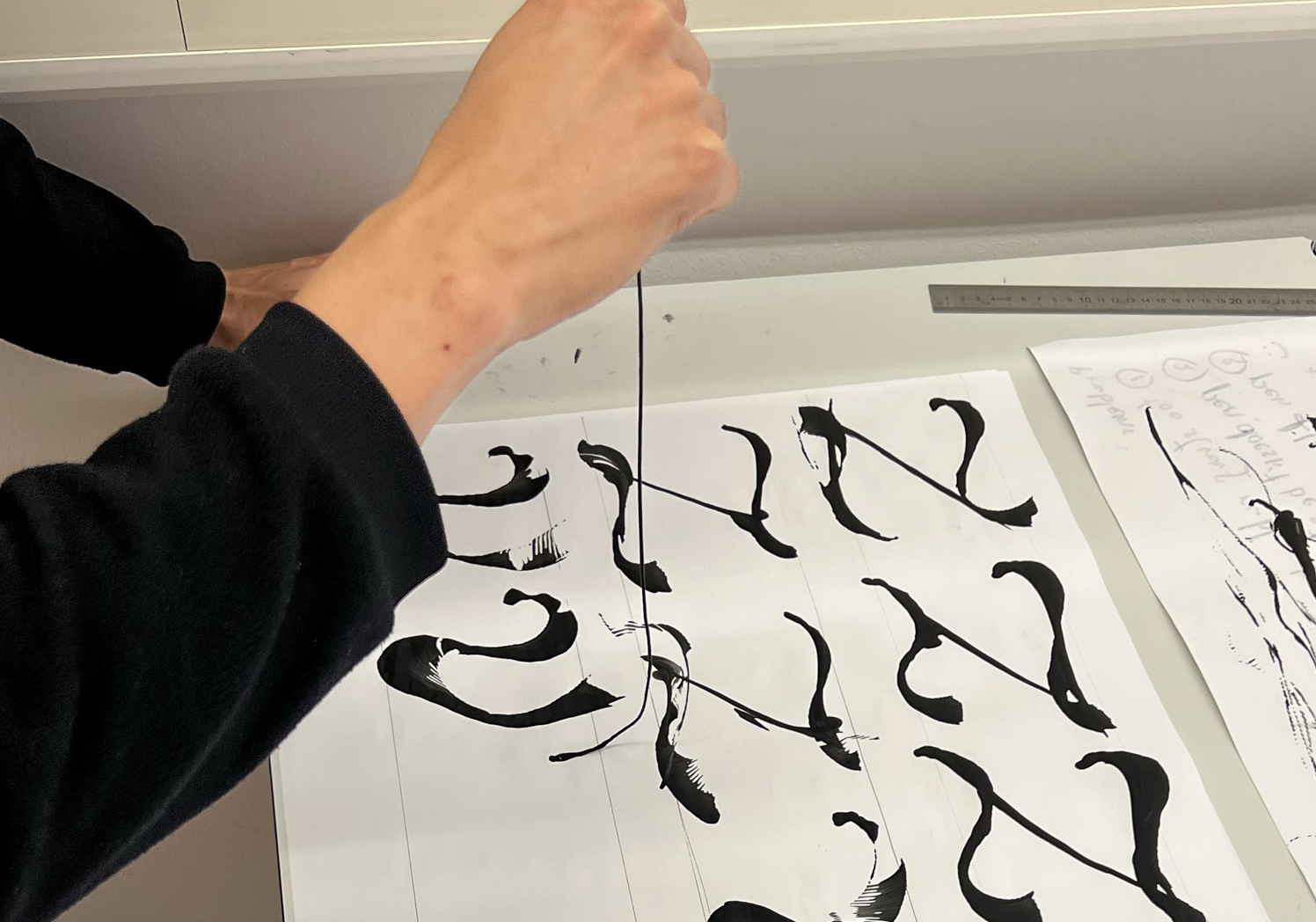
The transparency of the ink is quite nice, because it reveals a little bit what is happening here. Yet, I still find it really hard to define, or to put ‘what’s happening’, into words, because it almost looks like an interpolation between two independent contours. And importantly, the direction of the stroke is being defined when you lay down the string. But then the contrast is defined at the moment that you take the string off of the paper again and you have three dimensions to play with.
I think that’s sufficiently different. Maybe you can call it ‘vector contrast’ or ‘interpolation contrast’. Maybe it’s also just translation plus expansion plus rotation? But there is something that can’t be simply explained by this, because the contour here just looks like expansion, but the texture tells a different story, which is that the contour also flips around, as if the left side and the right side of the contour change places at one point. This would be interesting to explore further but I have to say I was a bit bored with calligraphic stroke contrast and I shared my frustration with my co-researchers and Alice Savoie, always very sharp and a quick thinker, said, ‘Why don’t you try the simplest possible stroke?’ – which to me meant one without contrast, a heartline, a skeleton, if you will, with a monolinear stroke applied to it – like from Illustrator or any vector drawing program – vis a vis the outline, of course, that encompasses or describes the stroke and also is distinct from the idea of a modulated stroke, mimicking or obeying the laws of calligraphy.
The fact that the stroke is unmodulated is already quite interesting and that made me think about two things:
The first is this article and this recorded lecture by Frank Griesshammer, who tells us about the Hershey Fonts.4 Just to summarise it really briefly, from the 1940s onwards, Alan Hershey was a civil service research scientist for the US Navy, namely the US Naval Weapons Laboratory. And like certain other people during this time period, he found himself annoyed with the typographic limitations and the amount of work required for writing his academic papers – so much so, says Frank Griesshammer, that he set about designing a system to make it easier for himself.
‘Computers can be used for the saving of labour…’ you know, this makes my heart beat faster… and then ‘Scientists are interested in the possibility of improving the versatility of printing.’ Like this other guy that we just talked about…! And the paper5 has something like a 150 page appendix of Hershey drawing alphabets and symbols.
Hershey just goes to town, like there was no need in the world for having Lombardic capitals at the US Naval Weapons Laboratory. What I thought was really interesting for the research I was doing was that sometimes there’s a single stroke and sometimes some, let’s call them calligraphic strokes or typographic strokes, were built up from several machine strokes. As you can see, these are all just straight lines. This is what Ferdinand Ulrich calls ‘line segments’ or ‘line chains’ and to each of these line chains, you can then apply a stroke thickness, very minimal, a bit bigger, or overlappingly fat…
Finally, looking at these fine details made me think of an old project I was involved in back in 2012. Our friends at Lust, which was a great graphic design studio in The Hague, invited Susanna Carvalho and me to design a new typeface for the Sandberg Institute in Amsterdam. Lust was designing their website and they wanted to have a typeface to go along with it. And the idea was to have a single sort of institutional voice and an institutional typeface, but also an infinite number of variations that the students could make of this typeface for their own use.
So we designed not only the ‘normal’ typeface, but we designed a skeleton of that, kind of like a set of instructions, that was then used by Lust for this web interface where you can distort the skeleton before applying a stroke to it. Or you can change the stroke, change the thickness and the angle and you can even swap the stroke for an image and then just download that as a piece of artwork. Or if you used one of the standard pens you can download an OTF file of your variation of that typeface. This was programmed in large part by Frederik Brodbeck who worked at that firm at that time.
So, pretty straightforward. The typeface itself was more or less a tracing of a Caslon skeleton, but what was interesting to us was this intent of applying a stroke to a skeleton. And it made us draw things differently, where we could allow all of these idiosyncrasies, of the two different approaches, drawing the outline and drawing the skeleton, sort of amplify each other instead of ironing them out, which made the typeface a lot more specific. And again, we revisit the idea of ‘truth to materials’: we want to show how the typeface is made.
As an example, if you draw a letter V as a skeleton and then you apply a stroke to it, you see how the vertex of the V dips quite below the baseline, and at the x-height, you have these diagonal endings, and of course if you increase the weight it becomes a little bit uglier. So adding two verticals to the diagonal stroke ends, and adding a horizontal to where the two diagonals join in the bottom, makes them align to the baseline and to the x-height much better. The bonus that we then got was to have a much more specific shape and one that tells you about how it was made.
The reward that we got for going against what we already knew how to draw was that sometimes we arrived at something new. For Susanna and me, the canonical version of the typeface is the actual skeleton itself, because of what you can do with it and because that is where all the interesting things originated. But until very recently an open single-path typeface was impossible for normal design use.
It would just look like this. And this goes back to the introduction slide and how our definition of what a typeface is needs to be a little bit looser. Maybe a font is more like raw material, an intermediate step that can be dropped into a piece of software to work with. Maybe that is enough of a definition of a font. Although I guess it’s not universally usable, this looser, more open idea of what a font is – maybe open in the sense of Umberto Eco’s ‘Open work’6 – a typeface could perhaps also be the kind of work that is only completed through its use or by its user. Something that is not a finalised artefact, but rather an ingredient that receives its final form through its use.
That made me think of the work of my friend Vera van de Seyp. I recently interviewed her as part of my research and she’s very far ‘Beyond Bézier’ in the sense that she says how, for her, a typeface is an independent system, a piece of software that people can use. She rather makes systems that contain lettering or type. And while other people can also use it, the output is not a typeface, but rather the output is an animation or a poster. So, she says, while what she designs look like typefaces, those shapes are often embedded in another medium which is a much more open, much less restrictive idea of what a typeface can be and it opens up a lot of new things for her.
For example, here she uses Voronoi field approximations – I don’t know what that means exactly – to draw something that looks like type, but it’s actually made of gradients, and, just because it’s somehow related to what I just showed, in her Skeletext project, she wrote software to try and recalculate the skeleton back from existing fonts that you can upload to a website. So you have to use a kind of brute force geometry to get at that skeleton because you can’t reverse engineer it. Such information is not contained in the typeface, but she did this mostly to get at the method, not to get at any typeface, but to get at this method of working because she wanted to use these skeletons in her own graphic design work.
To return to the Sandberg project: so this we thought was the canonical version of the typeface, but back then, in 2013 or so, it couldn’t be used as a typeface anywhere except with this web tool that I showed, and only during this research, I found a project called Relief Single Line Typeface that was made in Toulouse, at ISDAT in 2019. This was quite similar to what we had tried to do in the sense that it was also conceived as open paths. In their case it was designed to be used on routers, to engrave into a surface. The really cool part was that Frederik Berlaen wrote a little piece of software that would have been so useful if we had it back then.
It generates a typeface with open contours and also embeds an additional SVG outline instruction around it. There is no actual outline, but just an instruction e.g. What’s the thickness? What’s the colour? What’s the kind of corners and end caps? – as you do in Illustrator – and many applications can actually read those fonts really well. If you use Pages, the fonts appear in the menu and they work in design software too, like in Illustrator or InDesign. But the great thing is, when you use the ‘generate outlines’ function, you don’t get an outline. You get the skeleton back, and the thickness and the colour, and so what was defined earlier is exposed right there in the contours panel. As well as that, it’s manipulable, which is really cool because now you can set type first and then modify it in a way that you can’t normally do with typefaces – and this already really goes in the direction of a more permissive, more encompassing definition of what a typeface is that I mentioned earlier and that Vera talks about when she describes her work.
So I wanted to push this forward a bit more and I thought about the Hershey fonts and about the idea of multiple machine strokes making up one stroke of a typeface anatomy and the idea of the routers… And of course, there are already such fonts for routers where multiple router paths are combined to create one stroke of a typeface anatomy. And well, guess what? One of the contributors to the Relief project was Tanguy Vanlaeys, who had previously made a multipath per-stroke typeface research at ANRT. It’s a great typeface and interesting experimentation and research, also about the router. And I have to say that I’m really sorry that I didn’t manage to speak with Tanguy, because I think it would have been so interesting given that one of the things he was trying to do was to make optimal use of the router, minimising machine time.
Maximum efficiency can be really interesting. It can be freeing to take a good, sensible idea and then do the opposite of that. To speak in ‘oblique strategies’ terms: turn it upside down, or: What wouldn’t you do? By abusing tools, by abandoning common sense, by going against our own instincts, I think this is a good way to force ourselves to find something new.
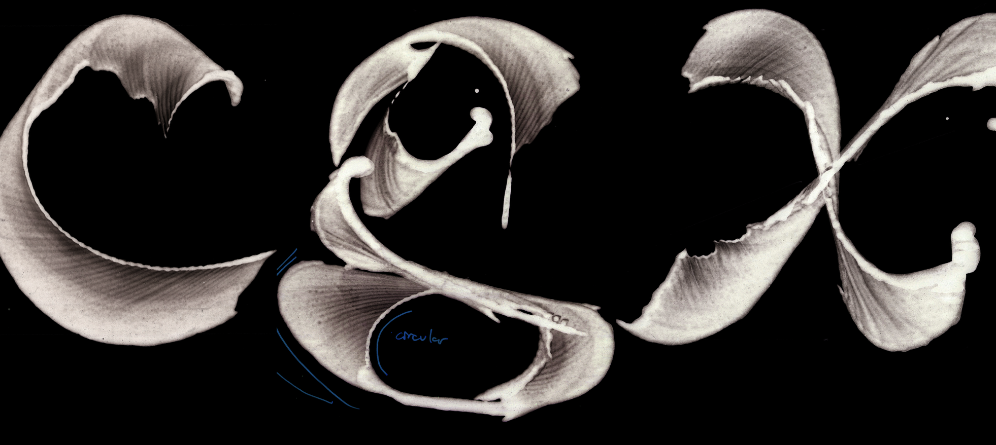
So I thought: What about minimum efficiency? I remembered this picture from a slide from half an hour ago, the visualisation of the broad nib stroke getting broken up into trapeziums.
![‘ELF, conceptualised by […] Wiseman, a system generating letterforms by building trapezium shapes along a path of strokes’ quoted from: Ferdinand Ulrich, ‘Ikarus between the Worlds’, <em>Footnotes</em>, issue D, 2022](https://beyondbezier.ch/media/pages/the-stroke/9b3ccddf11-1745840590/kb_ill15_screenshot-2025-04-14-at-15.10.30.png)
I then remembered why I remembered it, because of Ferdinand Ulrich, who had written an article in the very good Footnotes magazine from Geneva.7 In his paper Ulrich mentions, in a half sentence, another early type design software called ELF which also uses trapeziums, and also along a path. So I looked for more information about this and I found a paper from 1978 from Mr Wiseman and his colleagues that had these illustrations in it.8
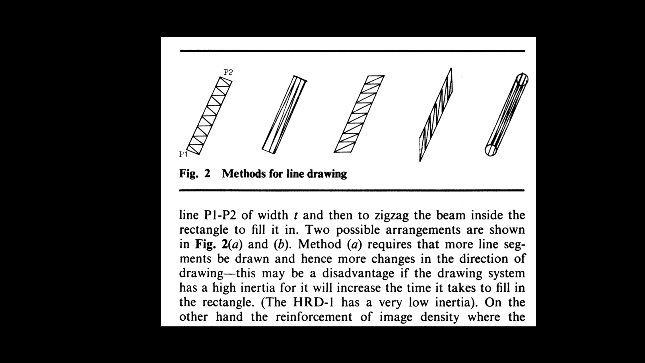
I probably misunderstood them totally at first, but then Ferdinand explained how ELF functioned in detail and that these funny fills were a reaction to the hardware that they had available in their lab – you can read about this in our interview. But it was too late, since I had already arrived at some spurious and admittedly somewhat superficial connections to this:
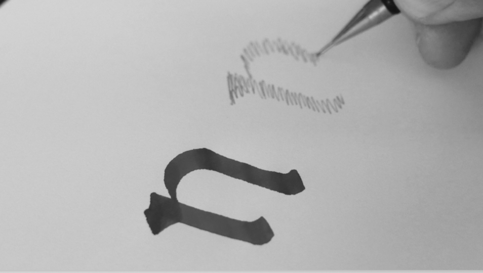
This crosshatch scribble is a great way of drawing letters that I learned at KABK and it’s very easy to simulate a broad nib contrast with it But the interesting thing here is that it builds up letters from the stroke or from the surface and not from the outline. There is this great sentence by Gerrit Noordzij, which he used to say in class, and I will paraphrase it: an outline is a really ill-suited way to draw a shape. Because you’re trying to define the border between a black shape that you don’t know what it looks like and a white shape that you don’t know what it looks like. 9
I found this quote in a publication he made and then I was like, hmm, now I have a number of ingredients that I could try and combine – and I apologise for the really bad drawing that I was making very hastily as I finally thought I have an idea. So what I wanted to do is design a sort of software that would visualise a stroke as a kind of surface scribbling, that outputs a visualisation of this path of least efficiency.
Imagine putting that on a router, this zigzag line and then with the tool from ISDA, that outline could receive a stroke – or the path could receive a stroke. A very obvious idea, yet the problem is I have no idea how to do that. And very often when I don’t know how to do something, the path to my solution begins by asking my friend Erik van Blokland. Erik said ‘Why don’t you try Drawbot?’ If you don’t know it, it’s a little didactic app that creates visual output programmatically with Python programming language. It was originally conceived by Just van Rossum and is now maintained by Frederik Berlaen. It’s very similar to processing, but it uses Python instead of JavaScript.
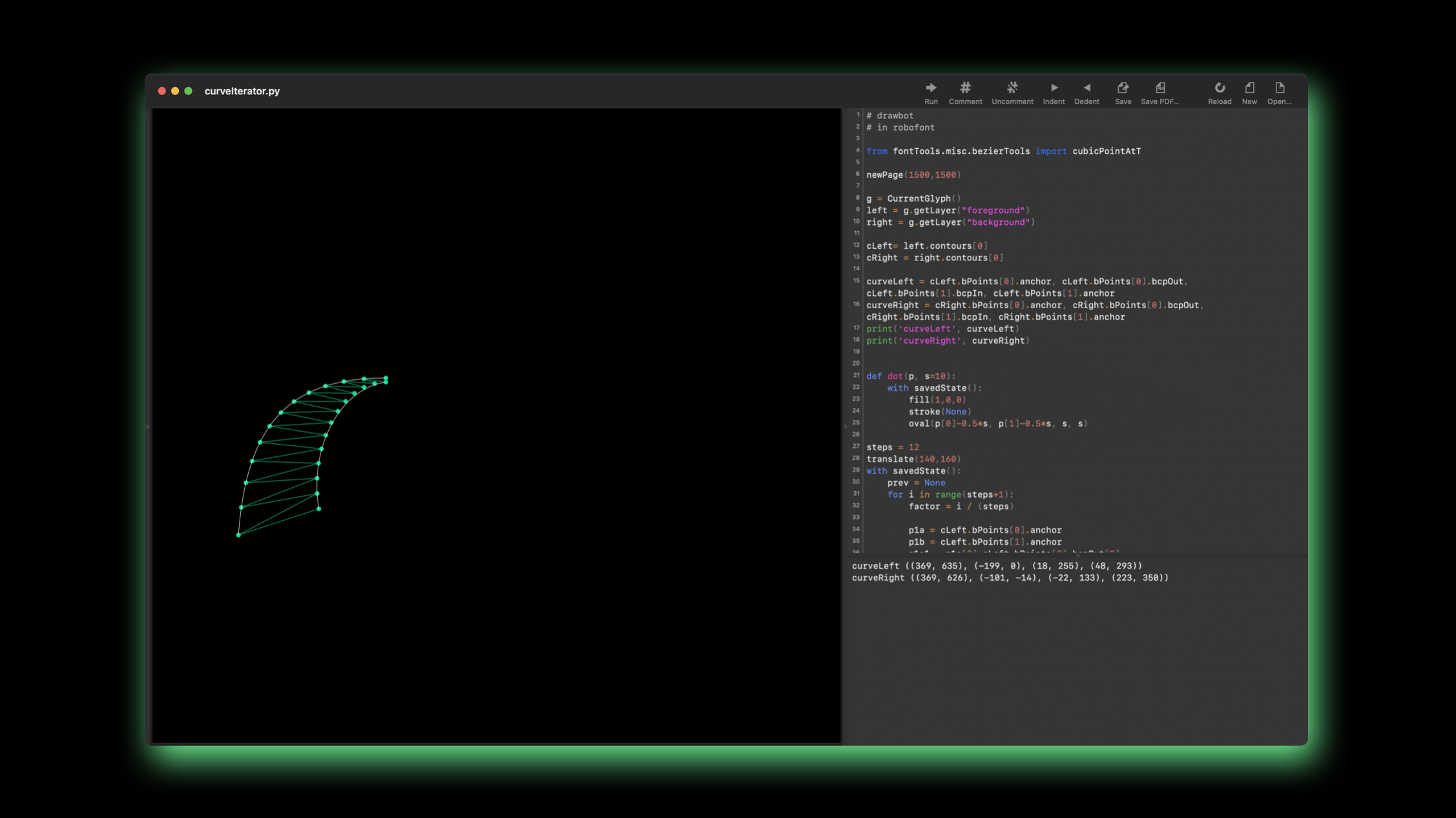
Drawbot lives as an extension inside of RoboFont and it’s easy for it to access a drawing that happens in a glyph. Here’s a proof of concept of what I thought I was trying to do, 99% written by Erik. You can feed a glyph from an open font and then it will crosshatch that in given intervals. It wasn’t very interactive and quite limited in its effect, and I thought it would be much nicer to do this straight in the Glyph window. Then I thought: FontParts has a flattened pen… it should be easy. FontParts is a theoretical editor-agnostic, well-conceived API, that knows about fonts and knows about drawings and from which you can build your own software to manipulate fonts and glyphs and so on. And font editors can support FontParts as part of a scripting API, meaning you can use the API from within those font editors. In FontParts a pen is something that knows how to draw things in a certain way. You can feed it an input, let’s say the contours of a glyph, and then you tell a pen to draw it, and guess what the flattened pen does? Now I have points on either side of the contour and all I have to do is connect one point from one contour to the corresponding point from the other contour. Then you have to abstract that into an overlay so that you don’t actually mess up the original contour. And then you need to figure out how to link two contours, one to the other, and how to deal with the case when one side of the contour is much longer than the other side, and how to turn that into an interactive overlay, maybe add a bunch of sliders.
I’m not a programmer as I think is clear by now. But luckily I know people who are, so I asked Connor Davenport, who is a type designer and a programmer – he has released typefaces with Sharp Type and he has an upcoming Jannon that is magnificent – and writes fantastic RoboFont extensions and scripts, and other kinds of software.
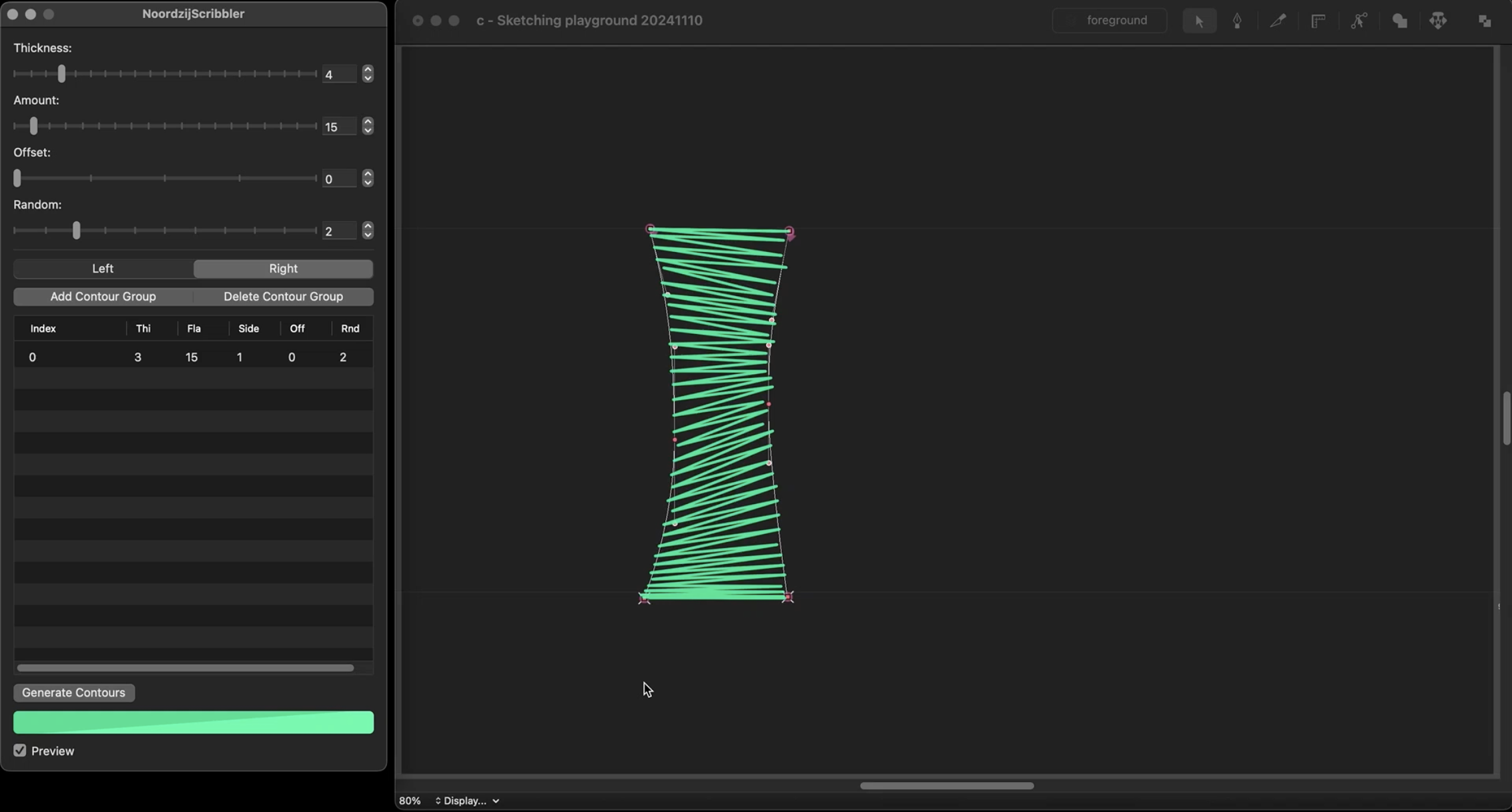
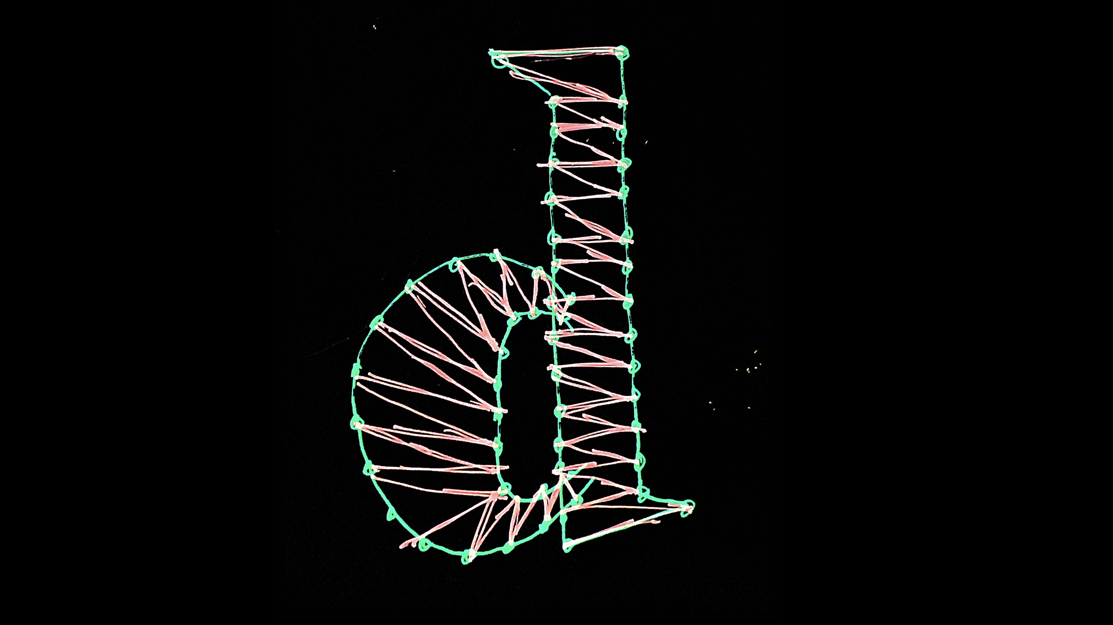
So I said, Connor, here’s what I’d like you to do – and he said: ‘Draw really badly?’ And I said: ‘Yes – well, not like this.’ And Connor was very kind to take this assignment and now here we are. To begin with, you just need to draw the two sides of a stroke, as open and interpolatable contours, and then you launch the extension and add a contour group to start this. The scribbles update live as you edit the outlines. There’s a couple of sliders that you can play with to choose the thickness or the amount of fill, if you want, or the density. Then there’s something to make the scribbles appear more diagonally, and there’s a noise generator in there – and that is really cool, because this random noise further deemphasises the outline and you focus more on the stroke itself. It was at that point that I suddenly noticed, that we are very much at the overlap between the stroke axis and the surface axis by Matthieu Cortat-Roller, because we are looking at the strokes as the surface of the letter.
Now you have the pleasure to watch me draw type, the most boring thing ever, but it’s very fun to draw, because immediately I just focus on the strokes instead of trying to polish the contour. It’s really exciting to me that at this moment. I truly don’t care what the outline looks like, which is something that I normally care very much about and which can be very distracting.
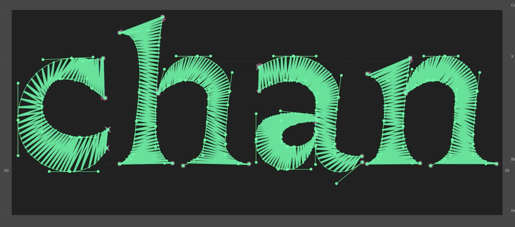
So instead I’m just busy massaging a stroke or pushing this mass around and I see this with a strange kind of blurry focus. Like, I look at the positive and negative shapes and not at the border between them. I’m drawing things that I wouldn’t normally draw.
There are a few things that this visualiser doesn’t do very well. If you wanted to make a connected script lettering, I don’t recommend it for this. The individual sides of the contour become very complex and too obfuscated to work with. The normal preview mode of your font editor does a much better job in this case, or, you know, just use a brush and paper. Of course, if you want to draw something that’s very straight and very constructed, this extension also does absolutely nothing for you. But it can help me to reprogram my brain a little bit and to not fall into the trap of polishing curves. You can use this for output as well as for drawing. Just hit ‘generate’ and it will produce that zigzag as a single line open path in a new layer, which in itself is not really a usable font, but then you could, for example, run this Outliner plugin on it or export it as a single line SVG font that I showed earlier. They have a lot of contour points, so some setups might just be like, no, this won’t work.
We all use the same tools, and that can tempt us to always do things in the same way. This exploration helped me to see my own drawing practice in a different way and hopefully it can do that for you too. You can download the Surface Scribbler for RoboFont. It’s open source and available on the Beyond Bézier GitHub page. I hope you enjoy playing with it.
- 1 Colin Cogen, ‘Gerard Unger, type designer’, in: Printing equipment and materials, Vol. 15, No. 171, June 1978, pp. 17−20. And Hermann Zapf, ‘Vom Stempelschnitt zur Digitalisierung von Schriftzeichen. Die technische Veränderung der Schriftherstellung’, in: Stephan Füssel (ed.): Gutenberg-Jahrbuch, Mainz, 2000, p. 31. Here from: Ferdinand Ulrich: ‘A brief overview of developments in digital type design’ in: Medium, 2018, https://medium.com/@fpeulrich/a-brief-overview-of-developments-in-digital-type-design-561d9e63a122 (last accessed 28.4.25).
- 2 Matthew Carter, My life in typefaces, TED talk, 2014, https://www.youtube.com/watch?v=xjxyEwjG2Es (last accessed 28.4.25).
- 3 Gerrit Noordzij, ‘The Shape of the Stroke’, RIDT 1991, Conference proceedings on Raster imaging and digital typography II, Cambridge University Press, 1991.
- 4 Frank Griesshammer, in: Footnotes, issue B. La Police, Geneva, 2017.
- 5 A V Hershey: Calligraphy for Computers, US Naval Weapons Laboratory, Dahlgren, Virginia, 1967.
- 6 Umberto Eco, The Open Work, Harvard University Press, Cambridge, Massachusetts, 1989.
- 7 Ferdinand Ulrich, ‘Ikarus between the worlds’, in: Footnotes, issue D, La Police, Geneva, 2022, pp. 16 ff.
- 8 N. E. Wiseman, C. I . C. Campbell, J. Harradine, ‘On making graphic arts quality output by computer’, in: The Computer Journal, Vol. 21, issue 1, 1978, University of Cambridge, pp. 2–6.
- 9 ‘A typeface is not a filled outline but a balance of shapes. It is, however, common practice in type production to describe the shapes of a typeface in outlines which are only filled by the composing machine. Defining a shape by drawing its outline is exactly as difficult as adjusting a balance with the scales removed; the draughtsman is making and changing shapes without actually seeing them.’ Gerrit Noordzij, ‘New Wings for Ikarus’, in: LetterLetter, No. 6, ATypI, Münchenstein, 1987.