Intelligent Type Design
Thank you to my colleagues for their great and inspiring talks today. It’s been a real pleasure to use this research project as an excuse to exchange ideas and create a shared space for experimentation. I should say from the outset that my presentation today has mostly emerged from these discussions and reflects many of the insightful comments and input from my colleagues.
While we were putting together the first draft of this project, back in late 2022 and early 2023, one acronym was on everybody’s lips: AI. More specifically, generative AI was becoming one of the most hotly-debated topics as ChatGPT, MidJourney, and others released some spectacular models for generating images and text. Designers were obviously intrigued and students started experimenting with these new tools, including in our classes.
Schools hurriedly started to run meetings and tutorials to draw up guidelines on how to deal with the use of ChatGPT in relation to dissertation writing or generative AI in image-making. So it felt appropriate to include these interrogations and new prospects into our thoughts and experiments as part of Beyond Bézier. We decided to name this axis ‘The Robot’, which is rather generic and can mean many things. I’ll start by briefly defining some of the terms I am going to use and discuss in this talk.
‘Artificial intelligence’ is a generic term, which refers to the simulation of human intelligence by machines. It involves systems that can perform tasks like reasoning, learning, decision-making, and problem-solving, which typically require human cognitive abilities.
‘Machine learning’ is a subset of AI that focuses on enabling machines to learn from data. Instead of being explicitly programmed, these systems improve their performance on specific tasks by identifying patterns and making predictions or decisions based on input data.
‘Deep learning’ is a specialised subset of machine learning that uses artificial neural networks inspired by the human brain. These networks often have many layers – hence ‘deep’ – and process large amounts of data to identify complex patterns and make predictions, or to generate content. It is particularly effective for tasks such as image recognition, natural language processing, and generative applications.
Each of these terms builds upon the previous one, illustrating a progression in the sophistication and creativity of AI applications.
A final definition: ‘Generative AI’ is a kind of machine learning that ‘creates’ new content by learning patterns from existing data. It generates output that resembles its training data, often using models like neural networks, including GANs (Generative Adversarial Networks) and transformers. This is the kind of AI most people are currently familiar with.
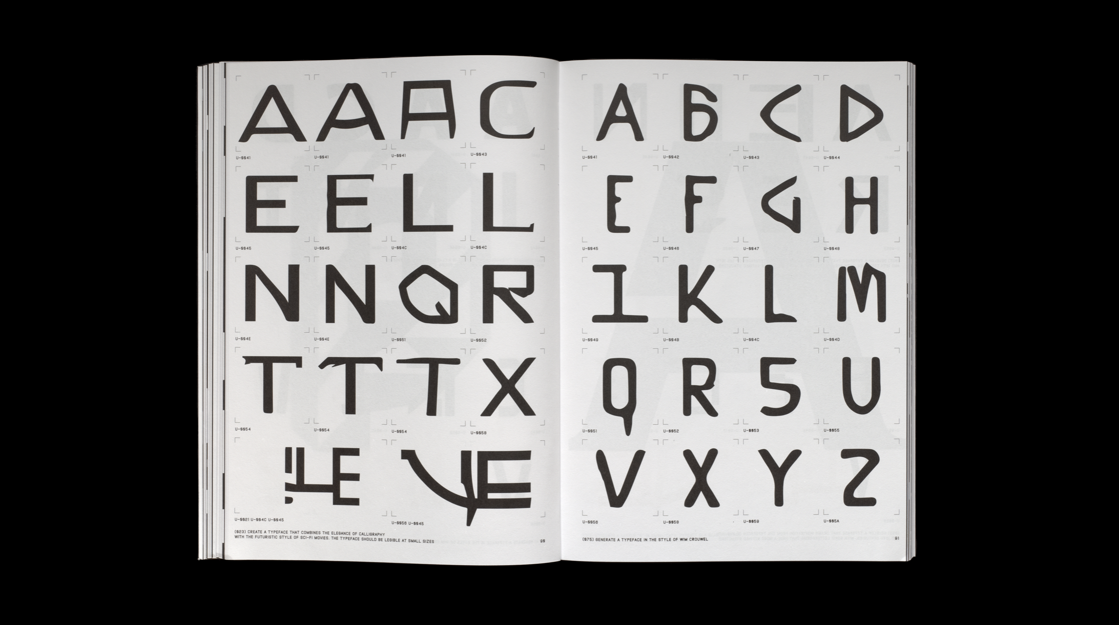
Generative AI is seen as having the potential to significantly change creative fields such as illustration, photography and copywriting, and it refers to a number of applications that we all know by now. This is the typical kind of image you can generate in a tool like Dall.e or MidJourney, based on a prompt that can be more or less elaborate. As you can see here, and this is a recurring observation with these generative tools, letterforms represented in images generated this way tend to be difficult for the model to replicate. At first glance, this image might seem convincing, but upon closer inspection, you’ll find that much of it is not just fake text, but also fake letters. Ironically, while most of these generative AI tools are text-based and language-based, using what is called ‘natural language processing’, they struggle significantly to render actual text and letterforms. The image you see here dates back to February 2024 and was generated in an earlier version of Dall.e, not the one that is currently available. Of course, the quality of the result depends on the model used and the prompt provided to the model. We also know that the quality of the generated content keeps improving.
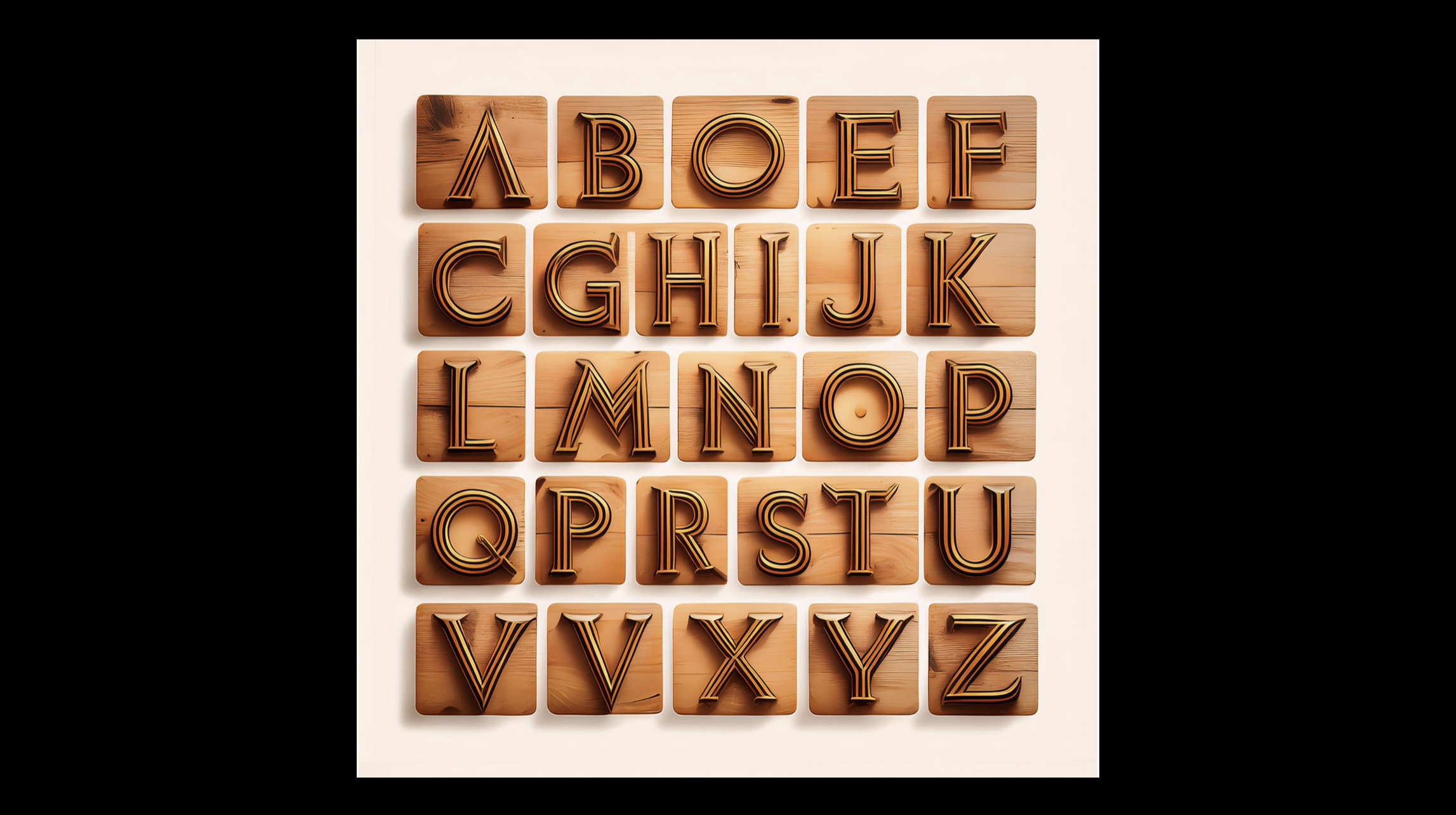
This is an image generated just last week in Adobe InDesign 2025, which now integrates a ‘text to image’ feature. I asked it to generate an ‘Alphabet in a Swiss Grotesk style, with a warm feel.’ As you can see, the warmth is supposedly represented through this wooden effect. Yet the model still struggles to output a complete and accurate alphabet, even when only providing capital letters. Of course, I probably could have generated a better output by working on a more elaborate or precise prompt.
Some models have been trained specifically on the issue of letterform style and structure. See, for instance, Google’s Gentype experiment, in which you can prompt the machine to output an alphabet made up of cats, clouds or computers. This application provides a series of images, not a font. But, as you all know, a set of letterforms is not the same thing as a font.
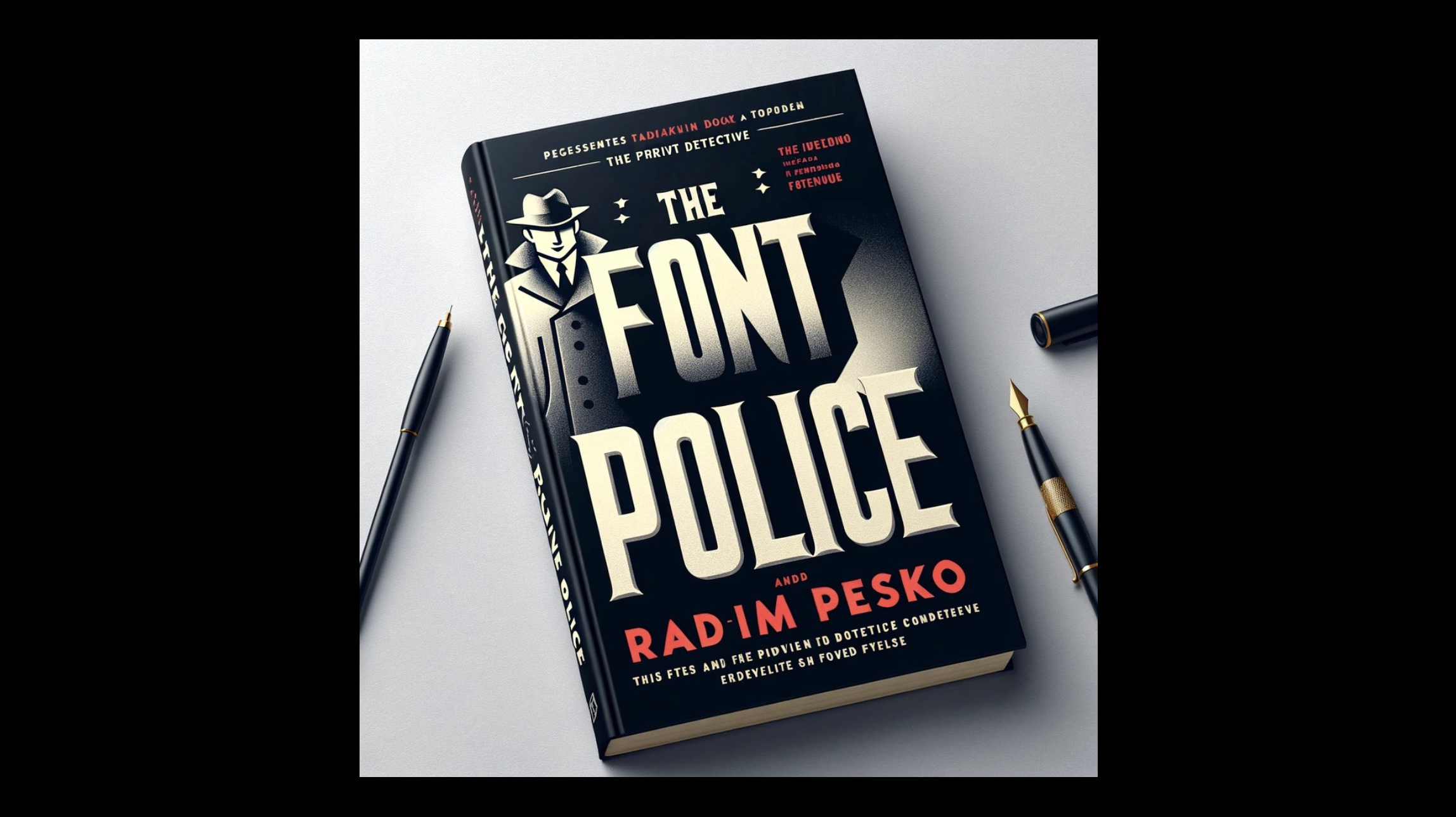
You might be delighted – or horrified – to know that even ChatGPT now offers to generate typefaces for you. This alphabet was generated in the free version of ChatGPT just last week. It generated an image, but I could easily have asked for scalable vector graphics (SVG). This is what ChatGPT came up with when asked for a ‘Swiss Grotesk style typeface.’ Obviously, there are many things to discuss from a design perspective: the proposal is closer to a humanist sans than a Grotesk face. It has issues with character consistency, proportions, and design features. One could argue that the overall feel is rather unimaginative and conservative but it will probably be convincing to most people. Here again, there’s no doubt that a better prompt would have produced a better result. In the end, ChatGPT even kindly agrees to provide a full family with a bold and an italic and proposed a font description, and a name! Who needs a type designer?
More seriously, while these experiments offer prospects for creating images of letterforms, they are limited when it comes to typeface design and production, as they deal almost exclusively with raster images or, at best, vector graphics.
There are very few tools that address the issue of generating an actual font. As you might expect, this is something that a number of people have been attempting to tackle.
Over the past couple of years, experiments have emerged to use machine learning to generate typefaces or font files with the press of a button. You might have come across the Hey Computer, Make Me a Font experiment by Sergey Tselovalnikov, which does actually output a font. The model was initially made publicly available by its author, but was soon removed from GitHub for reasons I’ll touch upon later.
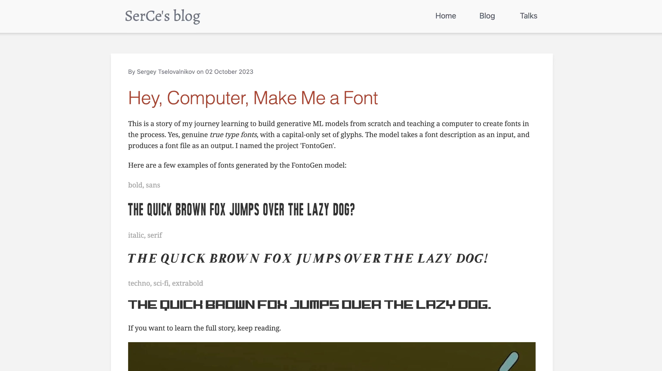
The model was trained on a number of existing typefaces scraped off the internet, as well as on some elementary font descriptions. As a result, the user can input keywords to describe a typeface, and the model offers a TrueType font file as an output – in capital letters only. As you see, the rendering of the full alphabet is kind of accurate, but the design quality of the typefaces is rather debatable. The main merit of this model at this stage lies in its ability to output an actual font file.
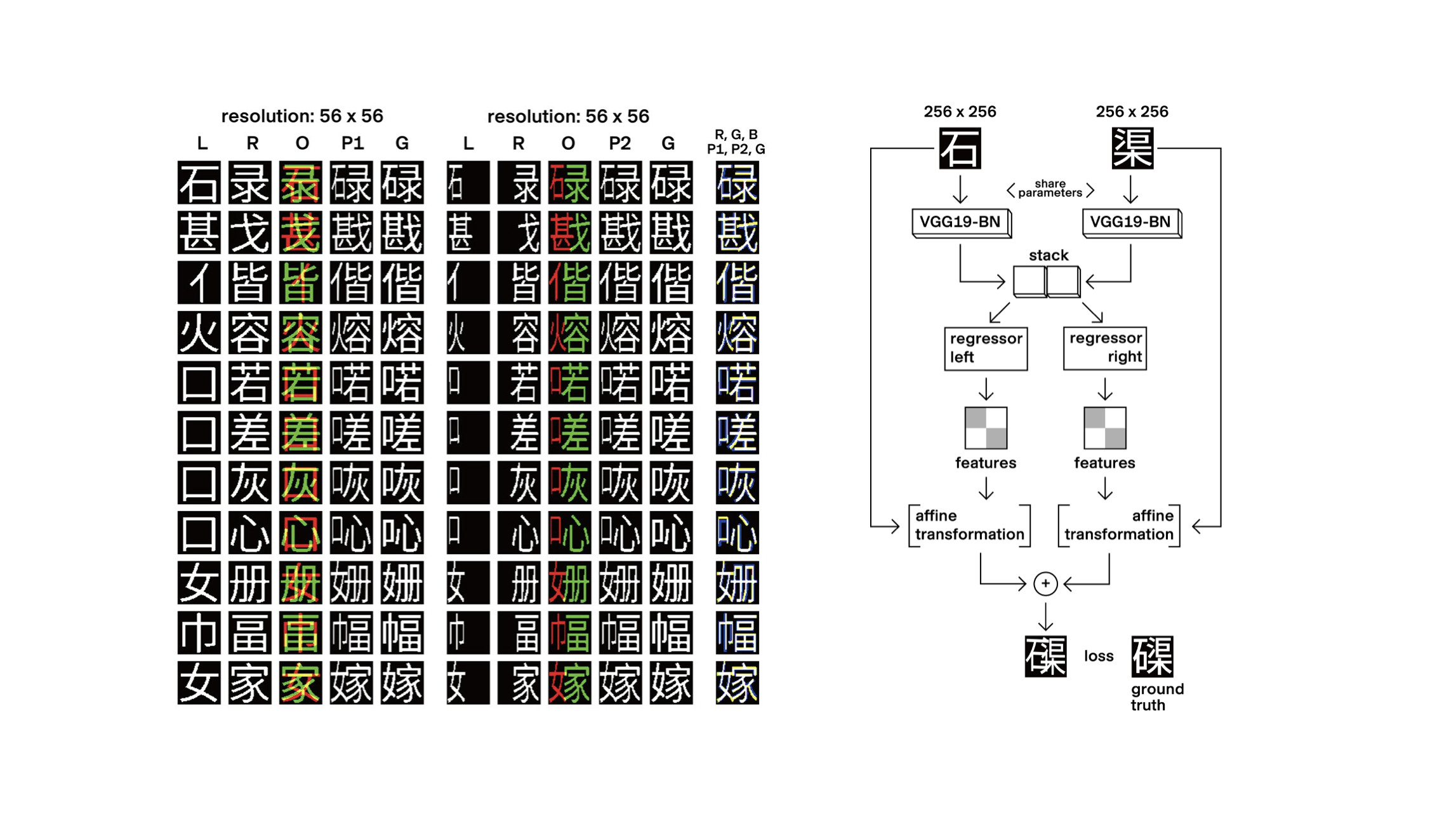
There are other experiments carried out in more academic or scientific environments, such as the DeepVecFont and DeepVecFont-v2 models. This is a generative framework engineered to output vector fonts rather than rasterised images of fonts. The model for this is publicly available on GitHub. The authors claim to generate a full glyphset based on a few input characters: you draw an A and a B, and the model outputs the entire glyphset for you. I will get back to it later in this talk. I’m not commenting further here on the design value of the typefaces coming out of these models, which are not concerned with aesthetic qualities or innovative shapes, but essentially with the accurate reproduction of letterforms that look consistent.
What is happening with these models is very much what has been observed throughout history: with every technological shift, the first step is to try and prove that the new technology can perform at least as well as the one it intends to replace.
An important point to mention here is that the origin and diversity of the datasets used to train the models are generally key to evaluating the results you obtain from them:
• When you input a number of similar typefaces, the results are often clean without much effort. They will look very much like what you fed into the machine. If you feed the model with 200 clean sans-serif fonts, it’ll come up easily with its own version of a similar looking sans-serif font.

• However, when a broader variety of typeface styles is input – for instance sans-serif, serif, script, all sorts of display faces, etc – the model will really struggle to discriminate amongst the variety of anatomical features: what is structural, what is stylistic? How do you make sense of the difference between a single-storey and a double-storey lowercase a or g?
These models therefore face fundamental challenges. In a field where innovation often happens within narrow margins (particularly in relation to Latin typography), is there room for generating anything worthwhile in the way of a typeface with these models?
Some type designers have been experimenting with generating typefaces using machine learning. You can already find a few such typefaces on the market that illustrate this. As you’ll see, they often play with the oddities or imperfections generated by the models, inducing a specific kind of aesthetic. Funnily enough, it shares some similarities with some of the grunge or postmodern experiments of the 1990s. For instance, here is a typeface by NaN Type Foundry in Berlin, with a model trained on a dataset of 2,674 Google Fonts. The fonts were released under the SIL Open Font Licence.
Another recent proposal by designer Orlando Brunner, one of our current MA students, was his project Archeology of Consequent Forms at ZHdK and recently published by Maxitype. In this project, Orlando used the oddities created by AI as a pool of unusual and original shapes, which he curated manually in a series of fonts. Here again, these experiments touch on what could essentially qualify as display typefaces.
If we are talking on the other hand about text faces for extensive reading, this is a field that involves a very particular set of challenges in regard to human perception and reading habits. It is also a field that evolves at a very slow pace. If you look at an eighteenth-century book, you might find that it doesn’t look all that different from a contemporary one. But the specific nature of letterforms make type design a particularly demanding field for AI.
Furthermore, generating accurate and coherent typographic systems involves complex issues such as shape consistency across whole character sets, developing style variants, dealing with spacing, font rendering, and other processes that require discrete protocols and skills.
You probably all know the oft-cited Matthew Carter quote: ‘Type is a beautiful group of letters, not a group of beautiful letters.’ Drawing letterforms is not the same thing as making a typeface. While there are AI-powered tools for experimenting with letter generation, no current model goes beyond this to consider all the other aspects involved in typeface design and production.
Of course, a key issue when considering these machine learning models is that the training cannot happen without a dataset. One of the key questions is: Where do you get the data from? What datasets are being used to train the models? The data is key to the end product and will directly influence the results. Training AI on existing fonts to generate ‘new’ ones raises ethical and intellectual property concerns. This was the main reason behind Sergey Tselovalnikov removing his model from the internet. He used ‘free fonts’ scraped from the internet, some of which turned out to be pirated copies of commercial fonts.
A number of type designers and foundries are now actively working to protect their fonts from unauthorised use for training AI and are monitoring such use. Nevertheless, history has shown that newcomers will always find ways to scrape the data somewhere, highlighting not only the importance of legal protection but also of structuring dialogue within the community.
As a reminder, ATypI, the Association Typographique Internationale, was created in the 1950s precisely at a time when phototypesetting made its appearance on the market and threatened the hegemony of metal type. Type manufacturers felt the need to engage in discussions about font protection issues and to reinforce their status through a shared association.
And, of course, there are other, wider ethical issues related to AI:• Its significant environmental footprint
• The fact that it often relies on the exploitation of low-paid labour
• Its reinforcement of the power of large (Western) corporations
French historian François Jarrige discussed the risks posed by ‘techno-solutionism’, which is the idea that all problems can be solved by technology. Jarriges highlighted the importance of differentiating between technical progress and social progress. We have to be careful that the engineer’s way doesn’t become the dominant way. We need to question our technological choices.1 This is where the input of designers might be most valuable: the designer has the ability to translate a technology into something relevant to humans. It is the role of designers to think of ways in which technologies can have an impact – ideally, a positive and ethical one.
So, from a related but slightly different perspective, the use of machine learning in type design raises a fundamental question: What kind of satisfaction do we derive from our work?
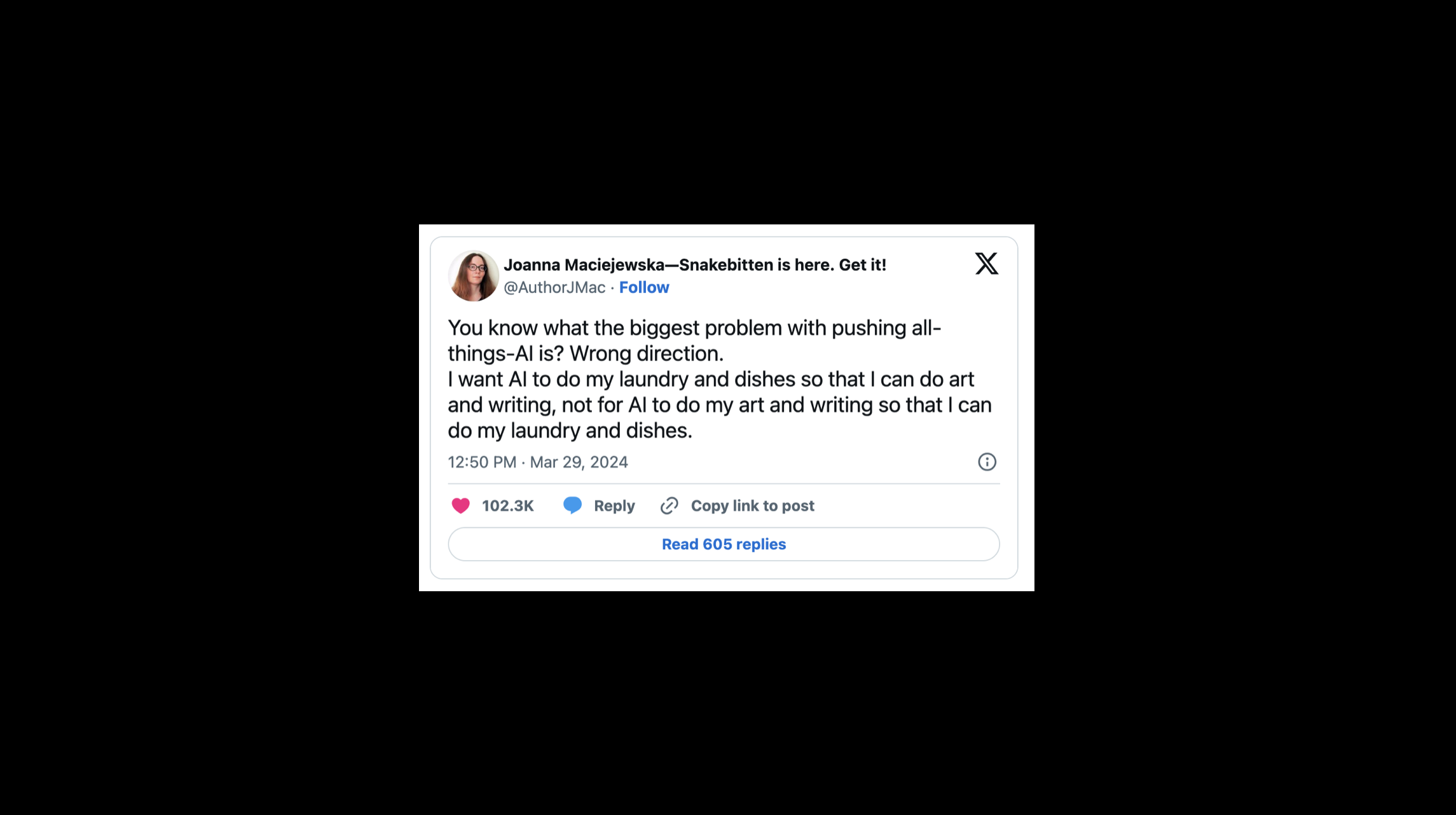
Kai shared this with me, maybe you’ve also seen it. It’s a quote from Joanna Maciejewska posted on X earlier this year, and which went viral on social media, saying: ‘You know what the biggest problem with pushing all-things-AI is? Wrong direction. I want AI to do my laundry and dishes so that I can do art and writing, not for AI to do my art and writing so that I can do my laundry and dishes.’ Of course, this is a crucial point. Design is not just a mechanical activity; it is also (and perhaps foremost) an intellectual, an emotional, and even to some extent, a physical process. Personally, I design fonts because I enjoy the drawing process, the explorations that go with it, and I like to think that there will always be room for that. AI is capable of analytical reasoning, but humans master many other forms of intelligence: creative, emotional and others. As it stands, this is not something AI masters. It can only pretend through imitative behaviours.
These issues are not new. In his book The Craftsman, Richard Sennett describes how the influence of the machine on the design process is an issue that goes back to the eighteenth century and the invention of the steam machine.
‘The greatest dilemma faced by the modern artisan-craftsman is the machine. Is it a friendly tool or an enemy replacing the work of the human hand?’2
Is the machine here to replace us or assist us? How does it change our relationship to our work and to what we make?
Unsurprisingly in type design as well, every technological shift has prompted these discussions. I’ll share here a quote from Dutch type designer Gerard Unger, dating from 1982. Gerard was my teacher and a dear friend, and I think he was also a great visionary. This is a quote from a text published in the journal Visible Language, in response to Donald Knuth’s Metafont system, which we heard about earlier from Kai:
‘Of the drawing systems now available, I prefer those that help me think rather than those that make me think. Besides being a designer, I have no objection to act as a systems operator, but I don’t want to become a programmer – even less a parameteriser.’3
I like this distinction between ‘help me think’ and ‘make me think.’ In fact, Unger’s quote bears a very interesting connection to Sennett’s book, whose entire foundation for his book, is the idea that actually making is thinking.
I think that this notion of crafting, the value of making things ourselves, and the satisfaction we draw from that process, is often at the basis of what designers do. This is particularly true in the field of typeface design. Sennett also says: ‘In terms of practice, there is no art without craft. The idea of a painting is not a painting.’4
Conceptual artists might not agree with this statement. And certain fields of design might be more concerned with concepts and ideas than with craft. But in typeface design, I think there is a strong argument to say that the idea of a typeface is not a typeface. Unless it is well-drawn, it is not going to work, right?
So, of course, we need to have intentions, but we also need to master the skills necessary to achieve the idea we have in our head. Whatever tool we use, practice and mastery of the tool will be key to producing qualitative output. Craftsmanship also raises the issue of acquiring skills. Mastering the tools takes time and requires repetitive use. Sennett says: ‘Skill development depends on how repetition is organised.’ He also says that ‘people can feel fully and think deeply about what they are doing once they are doing it well.’5 The more you master a skill, the better you become at devising the project. I believe this is true for any tool, including AI. Learning to use it will take time and repetition. It’s not going to be an easy ride if you want to obtain good results.
Repetition can also be rather satisfying. In fact, just last week, I came across this Instagram post from the British book designer David Pearson who said ‘There is something to be said for the mindless, repetitive activity and the pleasure of gently nibbling away at something.’
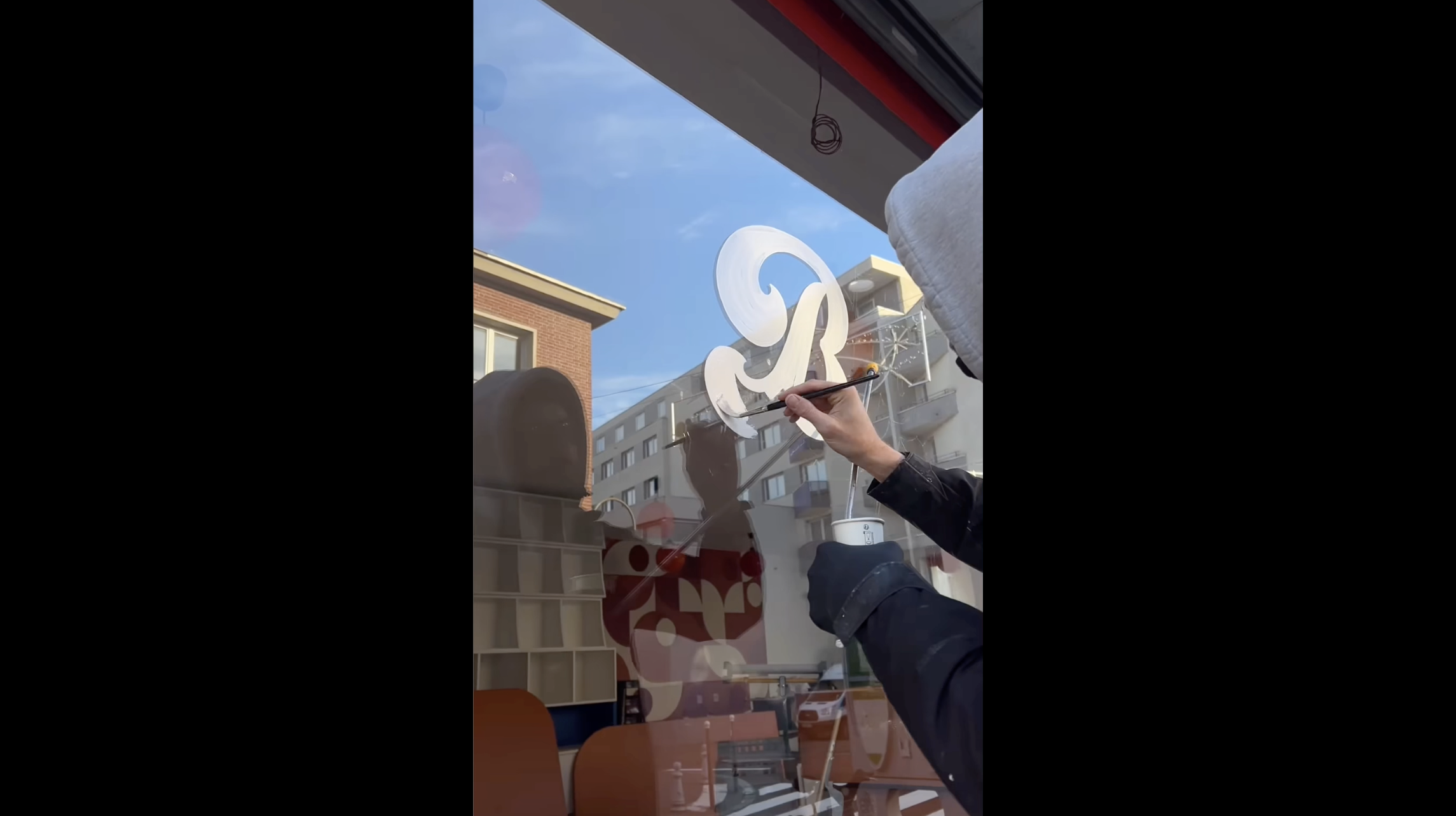
Returning to the notion of craft, I was recently talking with a good friend of mine who has been a successful designer for the last twenty years. She’s decided to take on sign painting. This is not her in this video – you see the talented Parisian duo Louis Lepais and Étienne Renard known as Enseignes Brillo. As you probably all know, sign painting pretty much died in the 1990s as desktop publishing and digital printing took over sign production. However, there is a huge revival currently in Europe and in the USA of the art of sign painting, with a fantastic community of letter painters doing brilliant work. Going back to my designer friend, it’s interesting that somebody who has been a successful graphic designer for so many years would now decide to learn a new skill, which is pretty difficult to acquire. Why would she go out in all weathers, climb a three or four-metre-tall ladder, and do a job that is much more physically demanding and possibly not as well-paid? Precisely, I suppose, because there is a level of satisfaction in mastering a new skill such as letter painting, which I suspect will resonate with a number of people in this auditorium. Similarly, there is a renewed appreciation from the public for beautiful, handmade signs and lettering. I believe this says something about human sensibility.
I’d like to think that typeface design is maybe not so different from baking in that respect. Sure, a font is a font, in the same way that a baguette is a baguette. You’ll always find platforms offering tons of average or uninteresting typefaces for free – Dafont already exists, and AI might simply feed such platforms with even more subpar typefaces. But this market segmentation has always existed. This is not really what I think we are interested in when we envision our own practice. Some people might value a business model that offers cheap products, or that brings them money regardless of the quality of the product they sell. Others might be looking for satisfaction in their working process, the satisfaction of working on something innovative or personal, rather than market-driven. Designers can also be seeking rewarding collaborations. They might find it important to foster a sense of community among peers. It’s all about priorities and the standards you set for yourself.
Of course, we should never forget that typefaces themselves are tools that only come to life when used in a real-life context. We have the duty to ask ourselves: What makes them meaningful? What makes them relevant to contemporary use? All this is to say that possibly, beyond the fantasy of a ‘super AI’, capable of generating hundreds of functional text typefaces at the push of a button, can we propose a more interesting path that does not strip us of our intentions and our craft, but is more suitable for the way we wish to shape visual communication and our practice along the way?
One possible approach would involve using automation, and possibly AI as part of it, as a set of tools in the hands of the designer – and I insist on the term ‘tools’ – which would intervene at specific stages of the design process. This perspective invites us to see type design as a form of automated craft. I borrow it here, as it has been precisely articulated by one of our former students, Mac Wang, in his MA thesis Craft is Dead, Long Live Craft: ‘The desire to reduce human intervention in the production process is the primary driving force that led to typography’s departure from handwriting. Type designers, or designers at large, have always been practitioners of automated craft.’6
This notion of ‘Automated craft’ refers to what others may have called ‘assisted type design’ or ‘smart assistants.’ Once this concept is established, how do we structure the design process to incorporate such tools? And how do designers maintain control over their intentions and workflows to ensure both satisfaction in the creative process and the output of interesting and qualitative typefaces?
In fact, automation is already being used extensively by type designers when it comes to font development. Kai mentioned earlier the Font Parts library developed by Just von Rossum, Erik van Blokland, Tal Leming and others, which makes it much easier to automate parts of a type design process. Automation frequently intervenes in character positioning, diacritic placement, kerning, generating style variants, etc. Could some of these tasks be performed more efficiently or more precisely using AI? In other words: How can AI do my ‘type design laundry’?
There is a tool I like to use to handle my kerning, which is a Glyphs plugin named Kern On by type designer Tim Ahrens. I should say from the outset that Kern On is not AI-powered. What I like about Kern On is that it doesn’t make decisions for me. It asks for my views on specific kerning pairs and then offers to apply my preferences to the rest of the glyphset, to the extent that I choose. It points out some inconsistencies, but I can always choose to opt-out, modify, or refine my choices, even be inconsistent. This is very much an assistant, to the degree that I decide. The tool is flexible, and it walks me through the process in an open way, which is what I’d expect from a smart assistant. Also, the fact that this is integrated into my font editor means that I can still decide to go back and make amendments to my letterforms throughout the process.
I recently had a chat with Tim about Kern On and asked him whether he saw any prospect of using AI to boost the performance of tools like this one. He was actually rather skeptical and mentioned that to him, the one important attribute of a good tool is predictability.
Tim said: ‘What’s the difference between a good brush and a bad brush? The good-quality brush will perform as you expect it to, while the bad brush will be much more difficult to handle, to master. It will have its own way.’ His main skepticism about AI was precisely its lack of predictability. The fact that you let it find its own patterns and logic within a dataset without much transparency might not fit with this requirement. Of course, this is probably something you can work on, both at the input and output level.
Another point raised by Tim was that tools perform very different roles depending on their users. While a non-savvy or new user of a tool like Kern On might be happy with the tool doing all the work for them without understanding much behind the mechanics of it, a more experienced designer would want the tool to perform exactly as intended.
As part of this second breed of savvy users, we know that a number of type designers frequently use and even write Python scripts to automate small parts of their design process.
Among evolving practices, we have observed that type designers already use AI models such as ChatGPT to generate such scripts. These practices reflect the transformations at play in the world of coding, as designers and developers frequently use apps such as Cursor and Bolt to generate what is sometimes rather complex code. This is a less spectacular but probably a more realistic way of envisioning the implementation of AI in a type design process. In fact this is an emerging practice that is likely to transform the programming industry at large.
Another automation tool that has become central to the type design process is interpolation. Once again, interpolation is a widespread automation tool that is not currently AI-powered. Interpolation involves generating intermediate type styles by mathematically blending two or more master designs. Each master represents a key variation, such as a light and a bold weight, or a condensed and an expanded width. And interpolation allows designers to generate a full spectrum of styles that transition smoothly between these ‘extreme’ masters.
As it stands, interpolation requires careful planning of the masters because corresponding points and paths must align perfectly to achieve smooth and predictable results. Entire type families are based on this, and the advent of the variable font format has proven that interpolation is a cornerstone of the type design process.
Some experiments have been made with AI-powered font interpolation, such as the Manifold project by Campbell and Kautz. This is a generative framework for typeface design using what they call a ‘font manifold’ – a low-dimensional space learned from existing fonts using unsupervised machine learning. This manifold enables interpolation and extrapolation between fonts that do not have compatible outlines, including, for instance, serif and sans-serif fonts. The idea is that you navigate a space of interpolations and extrapolations populated with existing fonts, which allows you to explore intermediate design variants.
The results shown in the article are not particularly exciting from a design perspective, but the notion of interpolating between incompatible outlines might be of interest in some specific cases. If the model was to be improved, this could, for instance, be used by type foundries to iterate between some of their existing fonts.
The use of these kinds of tools, I think, would probably be strictly limited to internal use within type foundries that need to quickly iterate between their own various designs, to which they own the raw data and the IP. As you tend to remain within charted territories, I suspect it might mostly be relevant for commercial work that involves modifying existing fonts and might remain of limited use for creating new designs.
One proposition in a similar vein has been made by designer Daniel Wenzel, who proposed an app that would mix and match various fonts as a starting point. His claim is that this could help deal with the blank page syndrome and iterate early ideas for a new design. Here again, the issue of originality and IP becomes central as you work from existing fonts, and Daniel Wenzel has been very careful with this sensitive aspect. At first sight we may have mixed views on this because, of course, one tends to remain within an existing design space. But it’s important to read Daniel Wenzel’s manifesto, which is on his website and an important component of his proposal. He says: ‘This software is a commentary on contemporary type design. It initially started to provoke a conversation on originality and legal versus ethical boundaries.’ His argument is that since type design so often comes down to remixing existing fonts, what he proposes is a very imperfect tool to help you simply do that. Now that this is so easily accessible, designers might want to spend less time redrawing existing fonts and more time creating concepts that the world might not yet have seen.
I mentioned earlier the DeepVecFont model, which claims to generate a full glyphset based on a few input characters – you draw an A and a B, and the model outputs the entire glyphset for you. Here, I’d like to follow Daniel Wenzel’s line of thinking: If a model can do this, can we agree that type designers have better things to do than produce very generic, predictable letterforms? Shall we instead try to create new paradigms that the models cannot actually comprehend and replicate? Maybe that would be more exciting.
I think there is a good argument here in favour of introducing surprises and proposing unexpected shapes. While these models are busy replicating what already exists, it might be our incentive to move on to other, uncharted territories. As you may notice on this slide, the authors of the DeepVecFont research have worked not only on Latin characters but also on Chinese ones and the researchers are based in China. Of course, this is no coincidence. The authors of the paper claim to have demonstrated improved ability to handle complex scripts, including Chinese and Arabic.
The use of AI for applying a set of key decisions to a wide number of related characters might be particularly valuable for writing systems with extensive character sets, like CJK, and scripts with complex positioning or combinations, such as Hangul. I think this is a crucial point here: while the market for Latin type design is overpopulated with thousands of very similar-looking fonts, the challenges and the situation for most other scripts is radically different. This is why it’s essential that these models be conceived and trained not just on Latin script, but on a diversity of scripts, where they might have a much more valuable impact. In fact as early as 2016, the team of designers and engineers at the Japanese Morisawa type foundry presented a talk at ATypI Warsaw on these issues. They even introduced their own AI model, which they had named John Morisawa.
Having said this, regardless of the writing system we are discussing here, deep learning models will always require large, high-quality datasets. This question remains central.
This was one of the aims of the AIZI project developed at ECAL with the EPFL Computer Vision Laboratory a few years back, and here, once again, I believe that one of the key findings was that the quality of the preparatory work and data for training the model was absolutely essential.
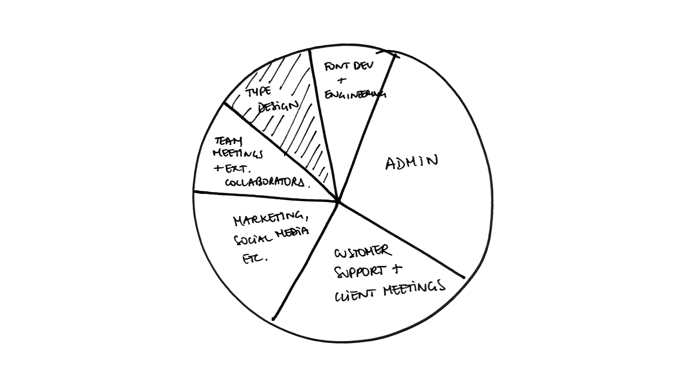
If we return to Joanna Maciejewska’s quote on using AI to wash the dishes. One possible answer to this is that we might actually want to delegate to AI all of the other tasks around typeface design i.e. anything non-design related: distribution, sales, marketing, social media, customer support.
In the last forty years, the move from analogue to digital typesetting has accelerated the autonomy of the type designer, who no longer needs to rely on a large manufacturer of typesetting equipment to distribute their fonts. Type designers, in that respect, have regained the autonomy of the punchcutters of the Renaissance. In the last decade, running a one-(wo)man type foundry has become increasingly common. Could the use of AI in the daily tasks involved in running a business enable the type designer to focus on drawing letterforms rather than on promoting them or doing administrative work?
As a conclusion, I’ve chosen to go back to the beginning: Johannes Gutenberg’s forty-two-line Bible from about 1455. One of the main reasons why Gutenberg’s bible is so famous is not only because it is the first printed book using movable type in the West, but also because the quality of its typesetting, and of the type used to set it, is absolutely staggering. This incredible achievement is essentially due to the collaboration between an engineer, Johannes Gutenberg, and a designer, Peter Schoeffer. Schoeffer was originally a calligrapher, and the fact that he closely collaborated with Gutenberg to achieve the level of perfection observed in this Bible greatly contributed to the acceptance of the new technology.
You can find further examples of fruitful collaborations throughout history that have set the highest qualitative standards and pushed our field forward. One of my favourite examples is the design of Univers, which is partly the product of the close collaboration between Adrian Frutiger and the engineers behind the Lumitype-Photon machine, the first truly groundbreaking filmsetting machine. Think also about the collaboration between Donald Knuth and Hermann Zapf on Metafont. Interestingly, each of these collaborations has involved an outsider – an engineer from outside the world of type design, and a talented type designer. I believe that such collaborations are going to be key in times of technological upheaval. They tend to be the ones that drive history forward and get remembered. They require both open-mindedness to challengers – people external to our field willing to propose new things – while holding on and reclaiming our expertise.
Such collaborations between designers and engineers tend to be very stimulating and are probably key if we want to steer the future of type design in a worthwhile direction. Our responsibility is also to engage in a collective conversation on the potential ways forward and how we’d like to shape our design process in meaningful, and also ethical, ways – not just let AI companies dictate how we’ll be working tomorrow.
- 1 François Jarrige, Technocritiques, La Découverte, Paris, 2015.
- 2 Richard Sennett, The Craftsman, Yale University Press, New Haven, London, 2008, p. 81.
- 3 Gerard Unger, ‘To the editor’, in: Visible Language, Vol. 16, issue 4, 1982, p. 353.
- 4 Richard Sennett, The Craftsman, Yale University Press, New Haven, London, 2008, p. 51.
- 5 Richard Sennett, The Craftsman, Yale University Press, New Haven, London, 2008, p. 20.
- 6 Mac Wang, Craft is Dead, Long Live Craft, MA thesis, ECAL MATD, Lausanne, 2024 (unpublished).
-
—
Richard Sennett, The Craftsman, Yale University Press, New Haven, London, 2008.
-
—
Dominique Boullier, Aurélie Jean, ‘L’IA, l’éthique et la théorie des baïonnettes intelligentes’ in: Analyse, Opinion, Critique, 27 November 2024, https://aoc.media/analyse/2024/11/26/lia-lethique-et-la-theorie-des-baionnettes-intelligentes/?loggedin=true (last accessed 28.4.25).
-
—
Bill Tomlinson, Rebecca W Black, Donald J Patterson, Andrew V Torrance, ‘The carbon emissions of writing and illustrating are lower for AI than for humans’, in: Sci Rep No. 14, Article Number 3732, 2024, https://doi.org/10.1038/s41598-024-54271-x (last accessed 28.4.25).
-
—
Gary McGraw, Douglas Hofstadter, ‘Letter spirit: An architecture for creativity in a microdomain’, in: Pietro Torasso (Ed.), Advances in Artificial Intelligence. AI*IA 1993. Lecture Notes in Computer Science, Vol. 728, 1993, https://doi.org/10.1007/3-540-57292-9_43 (last accessed 28.4.25).
-
—
Yuqing Wang, Yizhi Wang, Longhui Yu, Yuesheng Zhu, Zhouhui Lian (2023). ‘DeepVecFont-v2: Exploiting Transformers to Synthesize Vector Fonts with Higher Quality’: https://arxiv.org/abs/2303.14585 (last accessed 28.4.25).
-
—
Yizhi Wang & Zhouhui Lian, ‘DeepVecFont: Synthesizing High-quality Vector Fonts via Dual-modality Learning. ACM Transactions on Graphics’, 2023, via: https://www.researchgate.net/publication/355667599_DeepVecFont_Synthesizing_High-quality_Vector_Fonts_via_Dual-modality_Learning (last accessed 28.4.25).
-
—
Neill D F Campbell, Jan Kautz, ‘Learning a Manifold of Fonts’, in: ACM Transactions on Graphics, Vol. 33, No. 4, Article 91, July 2014, https://dl.acm.org/doi/10.1145/2601097.2601212 (last accessed 28.4.25).