All or None, or All for One
When I was invited to this project, I got a little intimidated when I heard the words ‘research’ and ‘academic research’. My practice is ‘whatever research’. It is rather practical, designing typefaces, designing books, collaborating with other people. I was trying to figure out how I would do this because in my practice everything is somehow connected – one work leads to another and a circle of friends also becomes a circle of potential clients and collaborators.
So I thought that I would start by framing it in this personal way. Earlier this year, after we started the Beyond Bézier project, I received an invitation from the parliament of the Czech Republic (where I’m from) to be part of a jury to select book designers for the Constitution of the Czech Republic. Being part of a jury is not so much fun, but I thought that could be an amazing opportunity to think about what national identity means. How can you express the identity of a community or a nation in a piece of typography or printed matter?
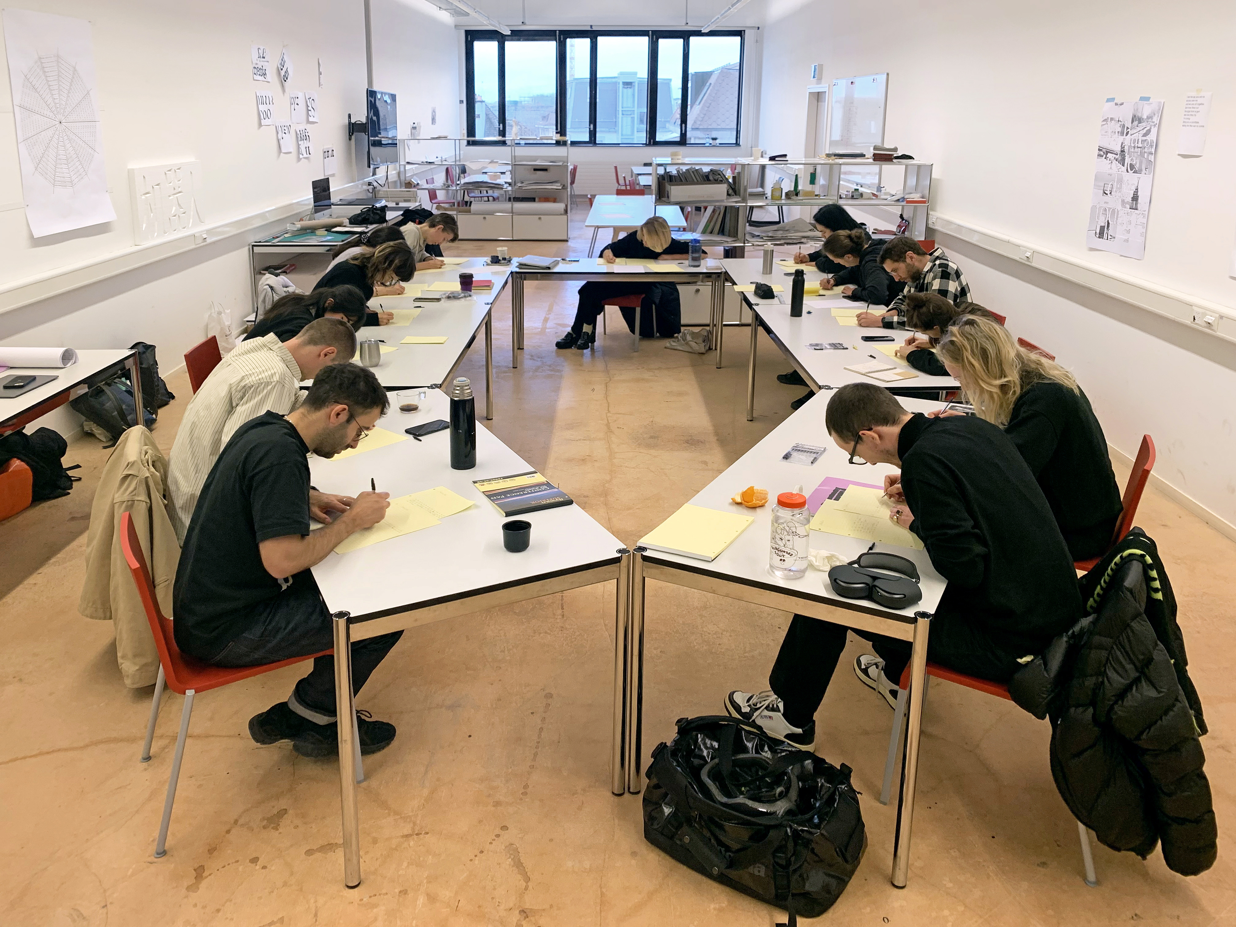
As well as that, I’m also teaching here at ECAL and in Urbino on the graphic design bachelor programme. My class in Urbino is basically once a year, in the form of a workshop. I always try to come up with some project or topic which is related to the city, but it’s also about practicing skills. For the students, even though most of them will not become type designers, they still engage with the subject. This is a picture from one of the most recent workshops which was dedicated to studying Roman letter shapes and doing so plein-air – which usually doesn’t happen, because if we study type, we tend to go to a library and sit hunched over books.
This image is a very personal one. I was observing my daughter who was starting to learn how to write and I was seeing the process when a drawing basically becomes writing and the writing becomes shapes and those shapes become letter shapes. It’s important for me to mention the personal dimension of this, because a lot of the projects I do are with people I know very well and the work is an extension of a conversation we might have had previously.
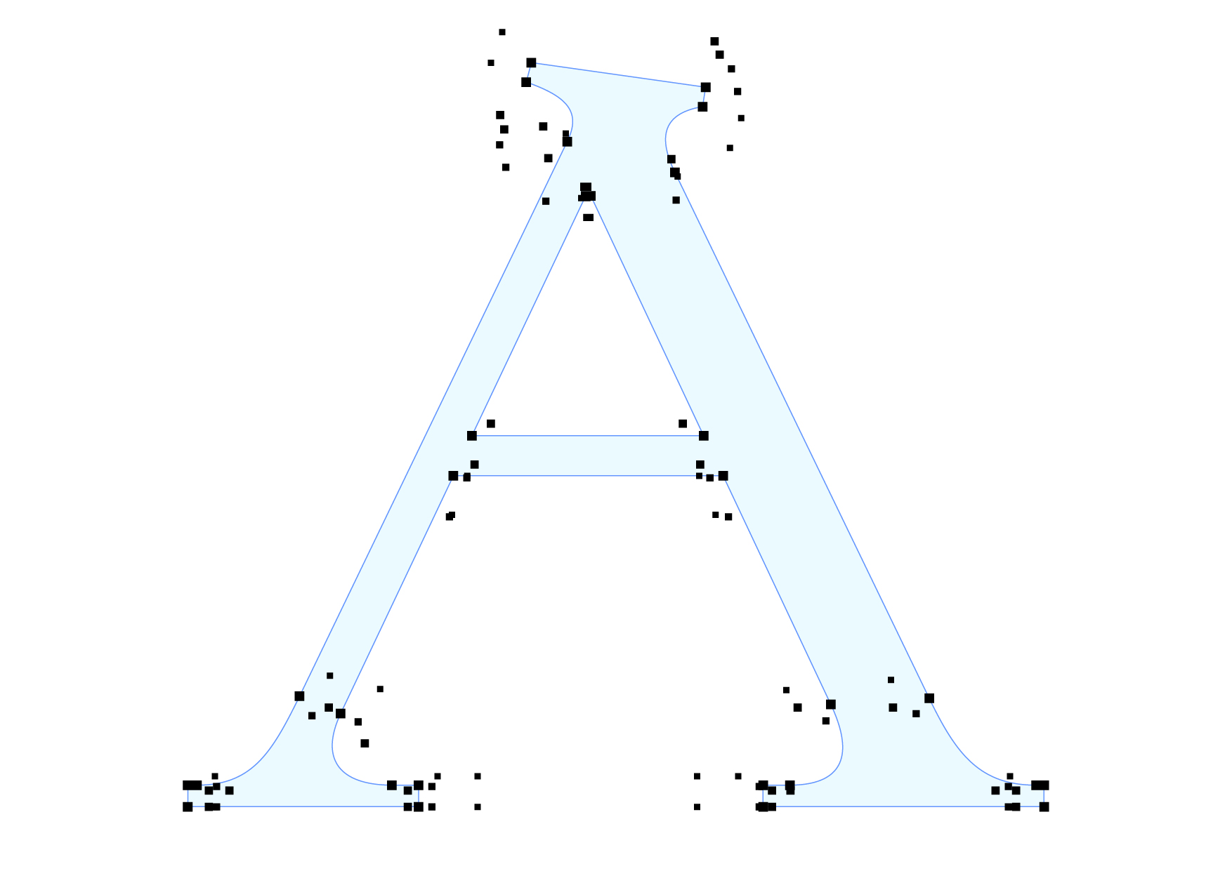
I would really like to start here at ECAL, in the context of the MATD, by showing a project which is directly connected to the subject of collective work. This was a workshop we did with the students about two years ago. It was called Shared Handwriting, a one-day exercise where students sat in a circle and copied a piece of text in their own handwriting and then passed it to their neighbour, and the neighbour copied the text of the person sitting next to them, and so on. At the end of the day everybody copied everybody else’s handwriting. During this process you slowly lost your handwriting, but gained some of the your colleagues’ shapes. Everybody lost something, but everybody also gained something. There were thirteen people altogether, and what emerged was the handwriting of a fourteenth person, which was not any one person’s specific handwriting, but rather composed from everybody’s. During the exercise, mistakes were copied, repeated and amplified, becoming part of the process.
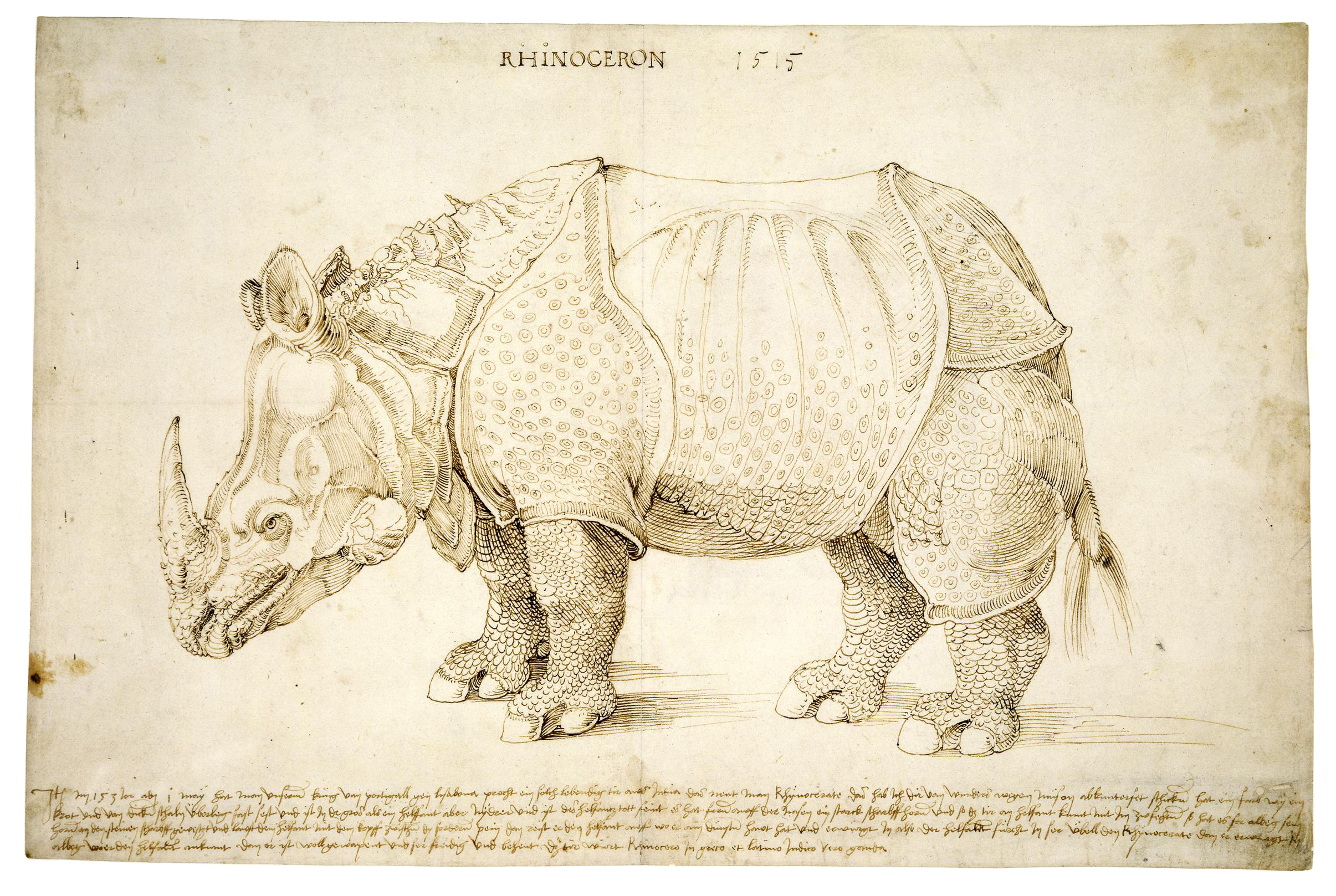
This is Genda. It’s a rhinoceros drawn and cut by Albrecht Dürer around 1515. It’s a beautiful print and the interesting thing about it is that Dürer never saw the rhino in real life, but generated the image based on stories and descriptions from people who had seen it. I find it fascinating that he added features which don’t exist, for example, it has this unicorn-like horn. So it’s an interesting mixture of ideas which were not really created by Dürer, he was acting more like a sort of tool here.
And I would argue that it’s a similar case with the version of Roman letters in Dürer’s time, the Renaissance, which were copied from Roman inscriptions and then somehow rationalised and balanced according to ‘divine proportions’, as they called it. But there’s an aspect of personality to it. The shapes of the rhino and the Roman letters aren’t as far from each other as they might seem.
This image may be one of the first examples of what we would call infographics today. It’s by Charles Joseph Minard, and is a graphic representation of Napoleon’s march on Moscow in 1812 and 1813. You can see the brown line becoming thinner and thinner as the poor soldiers were disappearing in the battles, or some were freezing to death or fleeing. Then you see Moscow on the map – where it didn’t really turn out that well for Napoleon – and you see the black line which represents the soldiers that made it back to France. It’s a poetic image, but also very brutal. And it’s based on facts. It’s not the right scale here obviously, but one millimetre of the line equals 10,000 men and so you can imagine the scale of that operation.
I wanted to include this image because it’s as close as it gets to the idea of a collective typeface. It’s the Ohio script, and I really like the dot on the top of the i, which is the most prominent spot you can get, reserved for the veteran player as the honour of ‘dotting the i’, as they say. If I lose you here, I don’t think I will ever win you back in terms of what ‘the collective work’ or ‘the collective typography’ might be…
What Dürer’s Rhino and Minard’s map have in the common is they’re based on hearsay and descriptions. All of these people could have described the rhino or the map in very different terms. There’s of course an aspect of trying to generate a visual based on facts and precise measurements – but both images have something to do with memory. People have to memorise it and Minard’s map is trying to recreate that, to visualise a specific past event. There’s a beautiful quote by Jorge Luis Borges, from one of his short stories Funes the Memorious, which is about a person who can remember everything and see everything with one gaze.
‘With one quick look, you and I perceive three wineglasses on a table; Funes perceived every grape that had been pressed into the wine and all the stalks and tendrils of its vineyard. He knew the forms of the clouds in the southern sky on the morning of April 30, 1882, and he could compare them in his memory with veins in the marbled binding of a book he had seen only once.’1
The protagonist can see all of the connections and all of what consists of the world at that moment. These days we have scientific methods for how we can record visual memory.
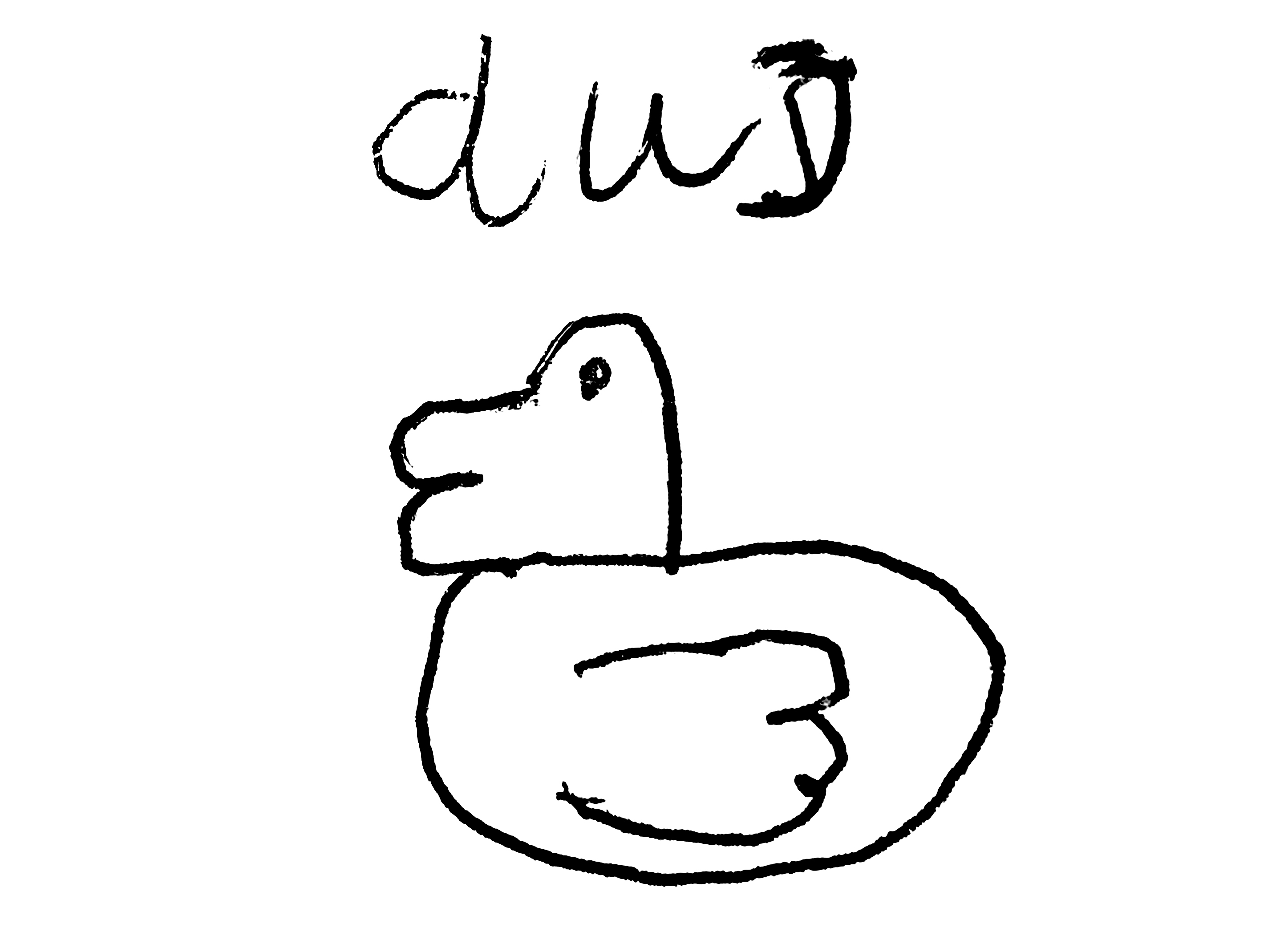
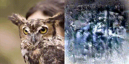
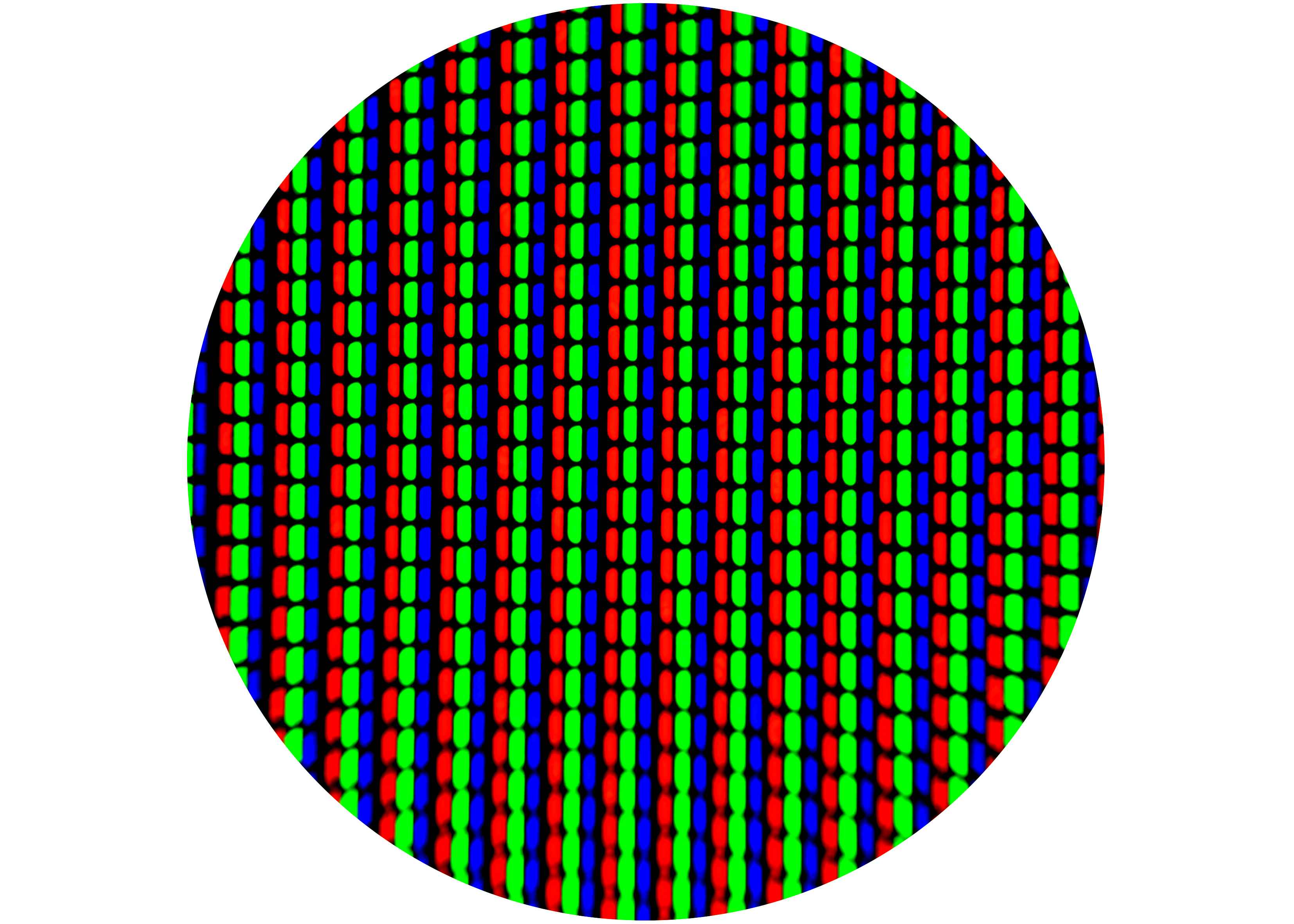
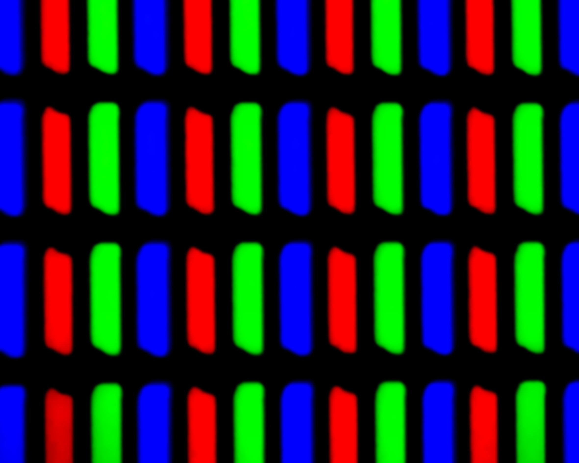
This is a deep image reconstruction of images, based on the activity of a brain and the impulses which it gives. And so what you see here would be a person who would be given an image of a duck, and then it will be recorded, and the way the brain records the message could be done by playing it back again, creating this strange, eerie-looking image, unlike anything we can see in real life.
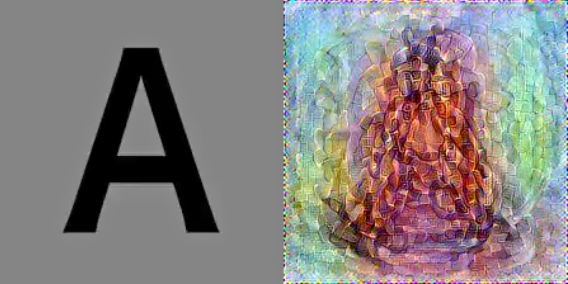
You can do this with objects and animals, and you can do it with the shapes of the alphabet. So a person would be given the letter ‘A’ and then the brain would be recorded and it would be displayed in this way. And even though this looks like a static image, it isn’t, because the brain is constantly recalibrating and recalculating. The images try to sort of sharpen – almost like a constant optimisation. You simply try to remember it better.
While this was a scientific and objective study, if you are dealing with typefaces, you may also include a dimension of culture and such culture being represented by the language of the alphabet, as well as the visual conventions of specific countries. I took these two examples:
This is a wood print by Hiroshige and on the right, a copy by Van Gogh. You can‘t really mix these two things up because they’re so distinctively different. But then Van Gogh is basically copying the style of Hiroshige and I think there is a sort of cultural layer to that. The way we grew up and were educated, and the way the conventions of the environment we grew up in shapes us I think is very important to understanding the typographic shapes we create.
There is one more example of this situation, but the other way around: the title says in Dutch ‘View of Franciscan Monastery’, which obviously this is not. It’s a kind of Roman Veduta which itself is taken from images like these, and which themselves are based on paintings of someone else, a painter who went by the name of Panini and who composed these images as a total fiction because he combined bits and pieces which had never occurred together in a real situation. What we see here is fiction, copied, misrepresented, appropriated, contextualised, translated into different cultures. And that is something which I think happens with typefaces as well.
Sometimes I think that to come up with ideas about shapes, to start a project, is similar to building a narrative. And the narrative can be fictional or can be fictionalised, it can be playful, but it sparks your imagination and allows you to look at things from a slightly different angle and – similar to Dürer’s Rhinoceros – simply to try to generate an image.
This is another theory of mine: the origins of serifs.
I believe that often it is not about inventing something new, but about cultivating what was there already and then combining things which were not necessarily meant to be combined. It is through this combination that something new can grow. I like the idea of grafting, that you have one tree, but you can graft things from another tree and it becomes a different tree and so on. As I said, I don’t create theoretical constructs, rather I design, I make typefaces. So I started to create some typefaces, just to get started with some exercises and play with, I guess academically speaking, the weird stuff.
I am fascinated by Muji’s stationery catalogues. Specifically when they show the pencils, they always show this loop. I used to think that they were Photoshopped because they’re so even, but they’re not, because if you put them side by side, they’re all different. I don’t know if there’s a loop specialist at Muji and I don’t know why it’s not just a straight line. So I was intrigued by this and I redrew these things without knowing where I’m going, which was not important because I just enjoyed the process of completing a story which was not meant to be a story to begin with.
I tried to make some shapes – don’t worry, I didn’t make a typeface – and I think I managed to create a decent falling snowman. When I was looking at Micha and Florence’s presentation, there was also this loop they created, and I thought, yes, I also have a loop to share.
It’s a different loop perhaps, but this exercise led me to a project, which started before Beyond Bézier, a typeface called Emergence. It’s interesting to share it in this context and also in connection to the Muji loop, because it’s based on a similar principle.

Emergence began as a collaboration with the artist Agnieszka Kurant, as a kind of art project. It was never meant to be a typeface you would use in an identity or to typeset anything. It was about having particular ‘subjects’ and trying to create a whole work based around them. To start off, I would only use things which are on my laptop, now, at this moment, and whatever system I’m using. I picked twenty-six typefaces which loosely represent the development of type, starting with the Trajan column – the one destroyed by the barbarian in the previous chapter – vaguely following these shapes and asking: Where are they placed on a timeline? I was having fun, all the way back to the Futurist stuff. But there were also more serious moments like the question of authorship and then foundries, printers and the names of typographers, and so on. It was interesting to put these things in an order.

I’m going to read a description: the Emergence typeface plays with different parts of various existing digital typefaces, extracting, assembling and arranging them together in emergent new letterforms. The components of this typographic gene pool consist of twenty-six fonts corresponding to the twenty-six letters of the Latin alphabet, covering different epochs and styles both high and low, all based on the history of typography and type design. Emergence therefore represents the subjective amalgamation of typographic knowledge.
To demonstrate how these shapes were created, I chose all the letters from those twenty-six typefaces and I took a few elements, a few points, and then followed the line and the idea of what the letter is. You can say yeah, but you can do this on the computer, you can code a software, blah, blah. But I didn’t. My problem with software is that it steals the joy of actually knowing the process, to know what you’re doing. You lose an overview of things and the only thing you’re always presented with is the result. And then you have to make a judgement. Is it good enough? Or is it not bad enough? But you lose the most precious part, where you go through it and learn from the process of creating.
So these bits can be reassembled in various ways, and to create variance for each given letter, numerous alternatives can be produced. It’s good to do it by hand, no matter how time consuming it is. You can decide that you’re going to break a rule here, and instead of two points, you will just do one, or you simply change the metrics. When you’re part of the process, you can interfere and you can place your hand or finger and move it slightly, take it out of the axis. Each new letter has as many different elements from as many different typefaces as makes sense. Some letters accommodate more and some less elements. The letter form ‘I’, for instance, converges less elements, then the letters ‘W’ or ‘G’.
You can have this version of the shape, but also many others – here there are twenty-seven. You can play with it and as soon as you are able to combine them at the end, the letter is created and the form emerges.
All typographers, from anonymous stonemasons in ancient Rome to contemporary digital foundries, contribute to the general intellect of typographic knowledge, which could be understood as a combination of technological expertise, social intellect and poetry. Users also contribute to typography by using and abusing typefaces as evolving tools. Emergence is the result of the labour and creativity of the multitude.
Agnieszka Kurant created an artwork which is a remake, referring to Hiroshige and Van Gogh, of the Marcel Broodthaers alphabet.
Here’s a quote:
‘Late in his life, Guglielmo Marconi had an epiphany. The godfather of radio technology decided that no sound ever dies. It just decays beyond the point that we can detect it with our ears. Any sound was forever recoverable, he believed, with the right device. His dream was to build one powerful enough to pick up Christ’s Sermon on the Mount. On the most basic level, Marconi was wrong. Sound is just change in air pressure that we interpret as information. The air is disturbed, but it always rights itself. The air always wins. But to say that a sound dies implies that it was once alive, and that’s not quite right, either. Sound waves are energy, and in our universe energy is never created or destroyed – it just changes form.’2
That’s taken from an interesting book I recommend reading. It has nothing to do with typography, but it has to do with sound and the recording of sound. But again, for me, there’s some parallel: I see the typeface also as a recording machine. Every typeface is a historical document, as a recording would be. We are lucky that, with typefaces, we have recording machines through which we can retrieve things from the past. This idea of sound brought me to something more abstract… and from sound I switched to light, and I was just thinking about what and how exactly changed when we switched from the analogue to the digital environment. Of course it has to do with tools, software, etc, but it also has to do with light.
Light doesn’t come from only one source. All of a sudden we are designing on a device which shines a light on us – and there’s light coming from the outside. So I was wondering, what does it do to us humans? What does it do to the eye? What does it do to the brain, this kind of constant flickering light, which we are constantly subjected to?
This is a familiar image to anybody who ever designed something on a computer, be it a font or a logotype or any shape or illustration.
There’s so much that our brain has to take in when we try to design a simple shape. There is the grid, there are points, there is a node, there are pixels, RGB, scale… Light is constantly flickering and nothing is static, even though it’s so small that we don’t really perceive it. But it’s there.
I then stumbled upon the word ‘liminal’ which is describing something in-between, or belonging to two places or states. It describes the state, time, the space that exists, and the point of change, which is of course a form that we try to search for when designing a typeface. Something which is defined as the final stage, which is no longer constantly moving.
Here’s a few images taken from the Palazzo in Urbino, looking through the stained glass windows. It’s a form of analogue variable font. Just tilt your head and you see a different shape.
This is called pentimento3 , which is if you x-ray a painting, you can see how the artist applied changes to the paint, adjusted or fixed certain spots, and then covered it again. But the shape is still there.
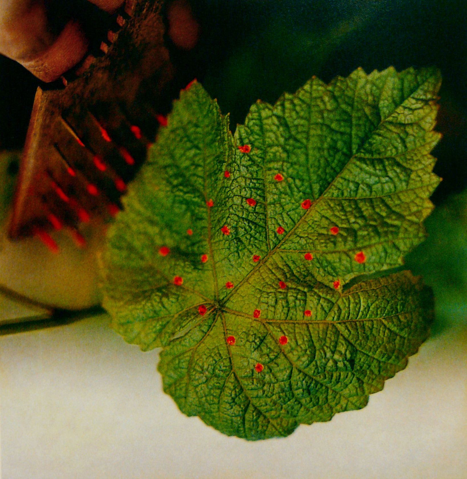
This is a picture from the office of Charles and Ray Eames, the famous designers who cultured little observations. They printed a grid on a leaf and let the leaf grow. You then see how different parts of the leaf grow at different speeds and you see that slowly the grid is disintegrating.4
This is also a good visual example for me, and Kai has a beautiful specimen on his trousers today, so check it out.
Finally, I’ll talk about binary choices, something Matthieu has perfectly described in his presentation. Binary choices of positive and negative, black and white, and clearly defined lines. I was wondering how you introduce something more to that, more variety and about when it’s not only a physical tool, but a mental space which allows you to operate or look at things from a slightly different angle. Let’s introduce the space in-between, a space which is not black, not white, but a grey area or a shadow. This is rather poetic, like the title of a book I like, In Praise of Shadows.
‘In making for ourselves a place to live, we first spread a parasol to throw a shadow on the earth, and in the pale light of the shadow we put together a house.’5
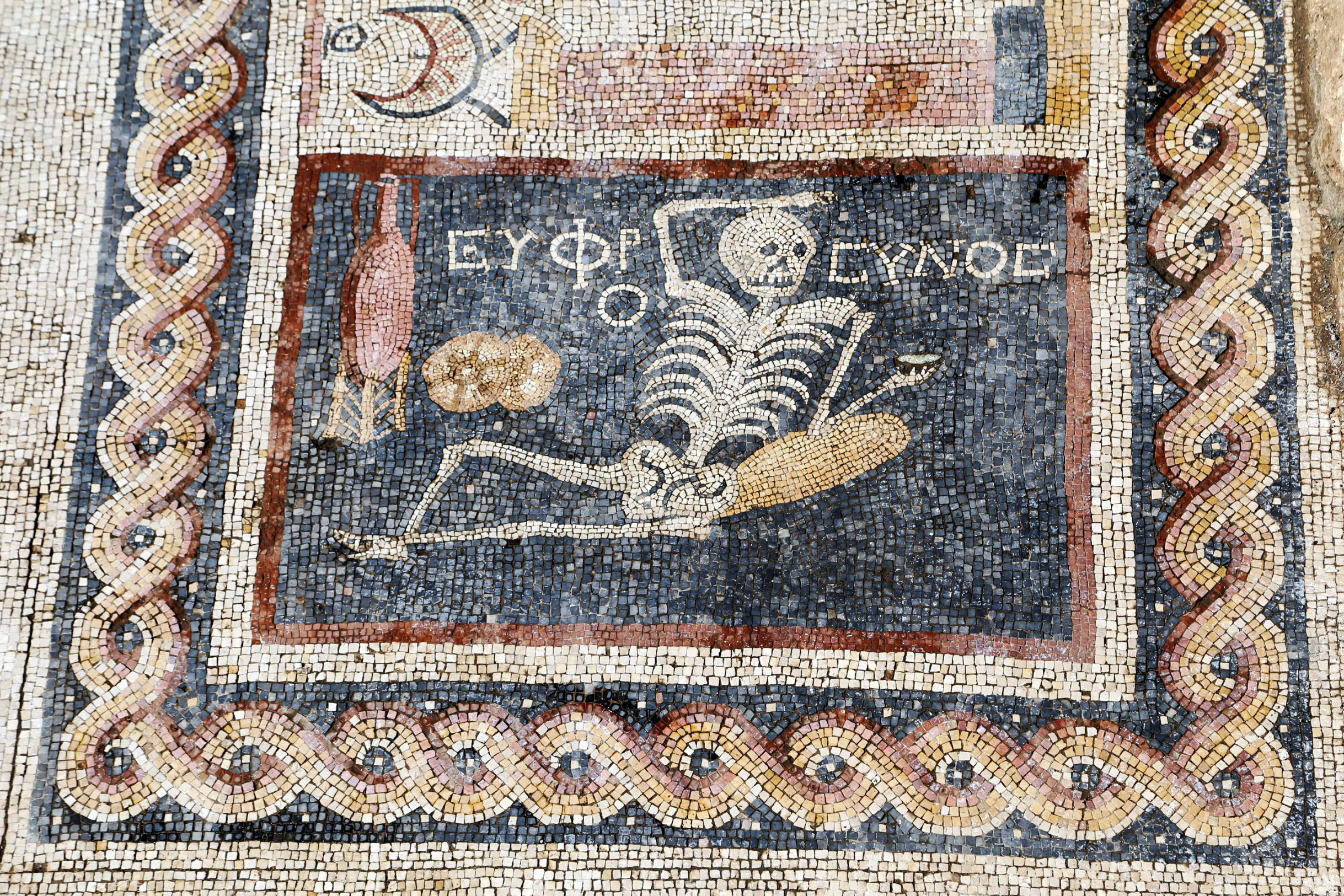
I started looking at examples of artistic representation of the shadow and it turns out to be quite wild and funny, very inconsistent and inspiring. These are just three examples of painted shadows, you would probably never see, not in the physical world. You never see a white shadow – but in this painting the skeleton has a white shadow, a nonsense idea. I like the one on the right, the shadow which disappears under the wall. I also like how shadows are something we all ‘learned’ and probably somebody would say, you know, this is how we represent shadows. And then, on the third painting, you see how for a leg in a painting, you have to have a sense of three-dimensional space, so they drew the shadow in this way. What’s fascinating about it is how there’s not just one convention, but each artist was approaching it from a different perspective, with his or her experience and technique.
All of these examples are taken from a book I’m going to read a quote from:
‘Artists can take many liberties in depicting scenes that appear realistic without having to slavishly follow all the laws of physics. If, instead, our visual systems had to check all the physical properties of shadows, as is often the case in computer vision and computer graphics, they would never arrive at appropriate shadow labelling within a practical amount of time. And artists, in turn, would be constrained to strict photorealism in their representation.
Shadows give us a window on vision, and this window has been found and opened by the work of artists and practitioners over the centuries. We view artists as fellow cognitive scientists: it is they who made many of the discoveries.’6
I would argue the shadow was also important in stonecarving. That’s where we get our first typographical shapes, which are the Roman inscriptions and specifically, again, on the Trajan column, which was copied many times and then somehow served as a model from which a lot of typefaces have been made. Without the shadow this would be just a mess. It’s the shadow which completes or generates the image. The shadow is changing and it’s connected to the weather etc. You can observe how the shadow makes these shifts visible.
This led me to my second case study, which I called ‘Liminal forms’, for which I created another typeface called Mitim Sigma.
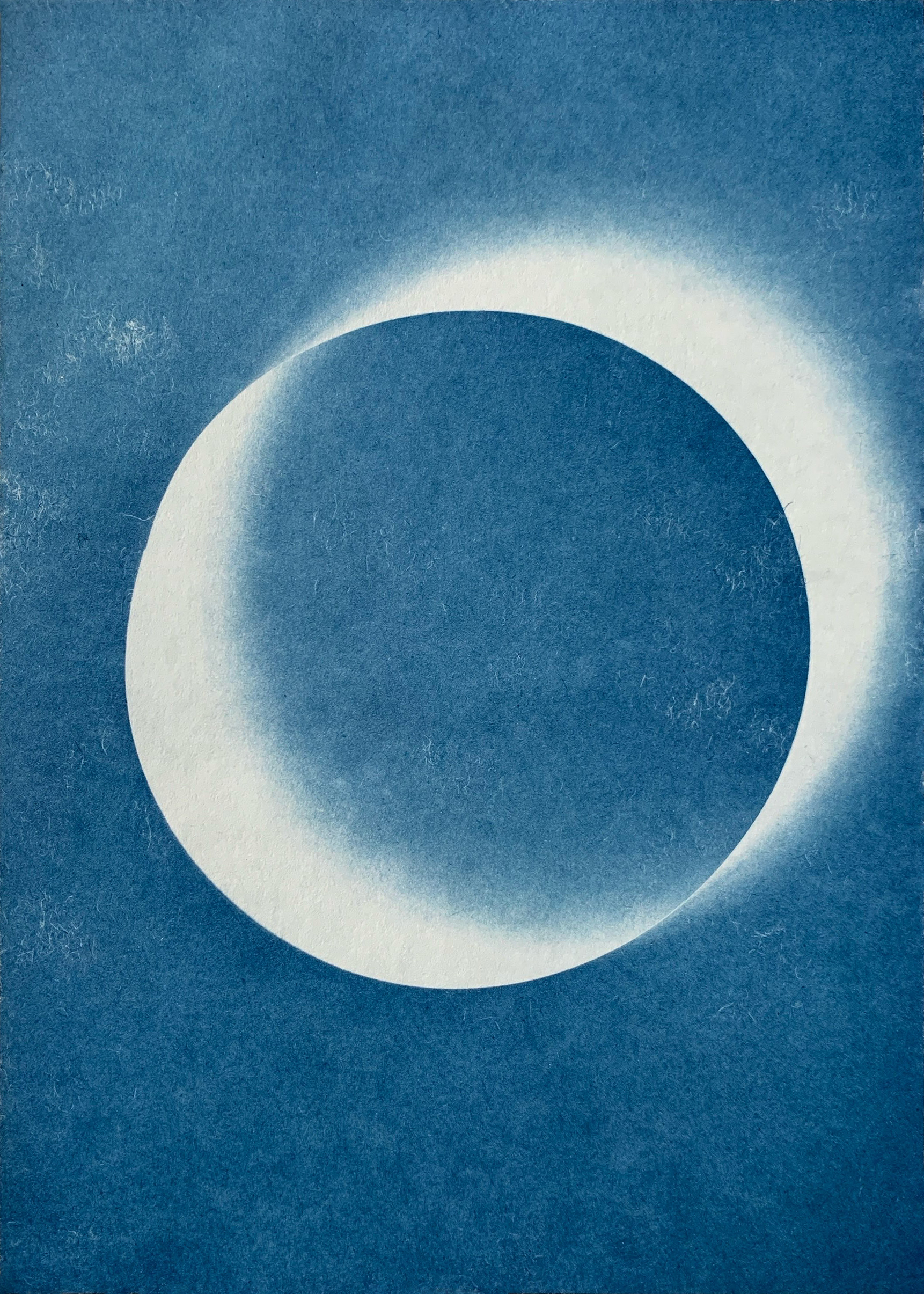
It started from the idea of the shadow as something where the shape is generated by light falling onto the surface, at a certain angle, for a certain amount of time, at a certain time of day, at a certain location. I began to do these formal experiments with light-sensitive paper in my studio and realised you can actually generate quite decent and interesting forms, which you would not get to with calligraphy or by constructing things on the computer. It gives you different ideas about solutions to the shapes and it gives you the freedom to develop something from an entirely new angle. I thought that if all shapes lead to a Roman, I started to figure out what the setup would be.
I made a series of letters and as you can see here, the results really depended on the weather. I live in London, so you can imagine the light is not very stable. The middle one and the one on the right were made on a very sunny day. The other two took more time, so the shadow is longer, it’s moving slightly and generates a different shape.
But because I wanted to make a digital typeface, I took these shapes as an inspiration or idea and then tried to extract elements for myself to see if there’s a potential to build on it in a typeface. I tried to do something which didn’t really work, real letters, like the letter ‘C’ and the letter ‘G’ or ‘V’. But it wasn’t satisfying. I thought I should just seek more abstract shapes and if I want to define something more, I’ll move to the computer because that’s where I can arrive at more satisfying results.
This is the letter ‘A’ and this is one of the longest-exposed examples, where the light was running around, so there is not one shadow, but rather multiple shadows.
This is how OTF code describes the font, but you can also describe the shape based on the weather forecast. This was at around 10.20 am, snow flurries, broken clouds – and by the end of the day, it was partly cloudy. It was 8 January 2024, so almost a year ago. A dark day. Still, the shapes didn’t really get me further. I needed something of a cultural context for it to make sense and create a typeface.
So I turned back to my previous work and I thought maybe I can apply this to a typeface which I made a long time ago for a magazine called Dot Dot Dot, edited by Stuart Bertolotti-Bailey and Peter Bil’ak. By issue 10 Stuart had the idea to standardise the design of the magazine and commissioned me to create a typeface for it.
He had sent me examples of typefaces he thought would fit and because there’s a lot of text in the magazine, it had to be a text face, with triangle serifs representing the Dot Dot Dot as a triangle and so on. What was interesting about it was that with each issue, the typeface managed to somehow respond to its content, collaborators, subjects or production. The font file would always be reopened and I would adjust it or add things to it. We then started to name it after the letters of the Greek alphabet. Alpha was first, designed in 2005. The Gamma version was a collection of dingbats and icons. And it continued to the Kappa version, before the magazine stopped being published. At first I thought, okay, it’s done – but I still have a lot of letters in the Greek alphabet to go. It was then that other people started asking me if I would use a version of the font, and I usually said no, unless there was a project where it was interesting to explore it further. This is an overview of its state up to the present day.
For continuity it meant working with pretty much the same drawings and sometimes I would change the series or I would draw italics, or I would just improve it. Later, after the magazine had stopped, it got more expressive. It also represents my learning curve. When it started, it was my first typeface – and coincidentally, it was published immediately. So for me, it’s also a timeline and I can see I was gaining skills as a craftsman, and with time I would be able to draw quicker and with more precision.
So while I was playing with the shapes of the shadows, I thought I could use this typeface because it already had a history. I feel it’s almost a perfect DNA sample, that I can continue with it in this project. And because it started in 2005, the first versions were actually drawn in FontStudio. Then I switched to FontLab and the last bits were done in Glyphs. I think each software brought something to it. I was really fond of FontStudio because it was like a calculator, but then you could draw a typeface with that. It was simple and rough. Each software brought something to it because when I was designing things in FontStudio, everybody was already using FontLab or Fontographer and I thought, yeah, but everything which comes out of FontLab looks the same. So I stuck to FontStudio even though it was really outdated. When I switched to FontLab, people started using Glyphs and I was like, yeah, but everything which comes from Glyphs looks the same, so smooth. And then, here I am today… So each software projects your personality, but it also hinders you because of its efficiency or whatever.
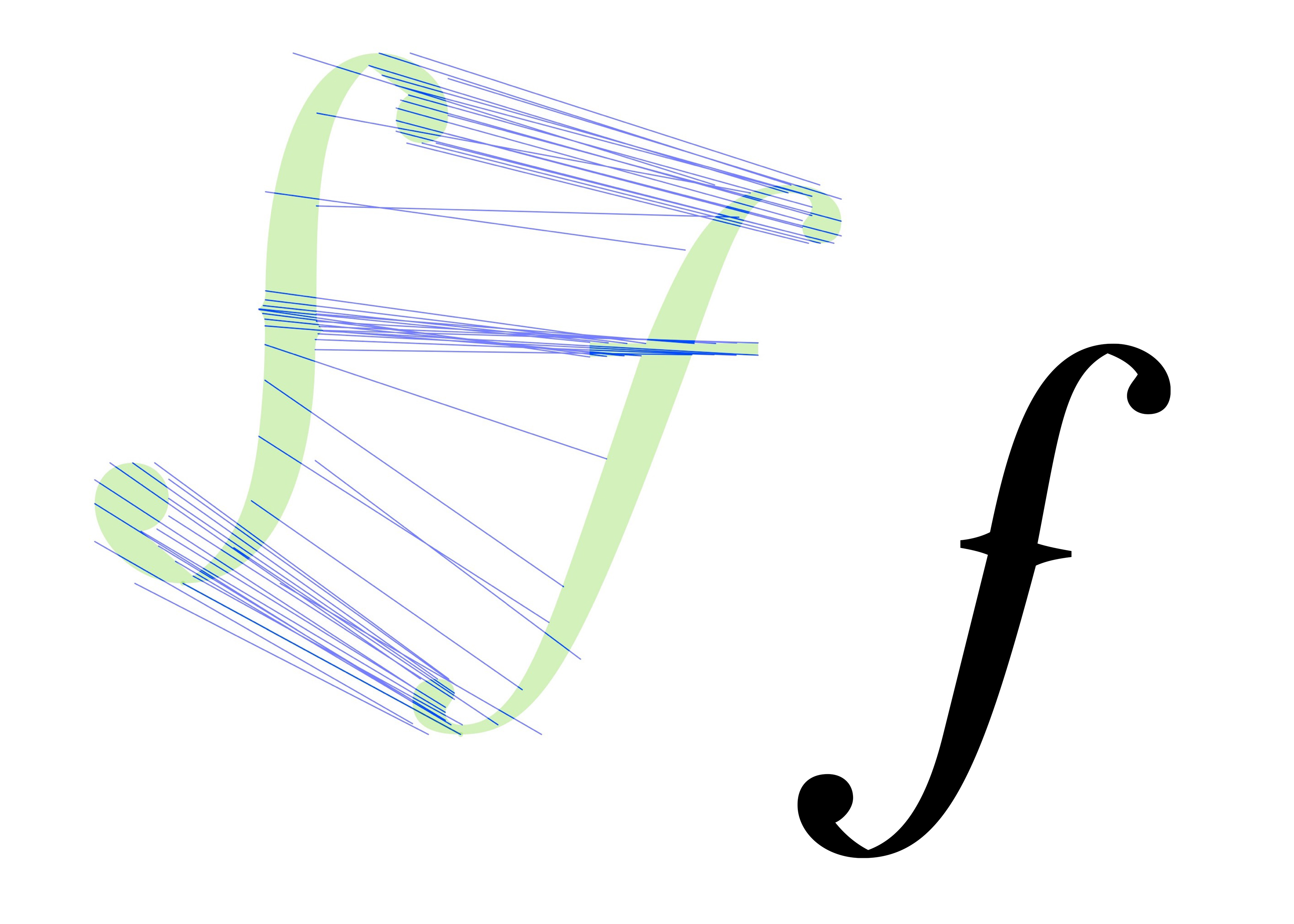
I also like to bring other elements to Mitim, details which are not related to Dot Dot Dot, looking at the forms and shapes and finding the stories which don’t exist. For example this fictional meeting between Giambattista Bodoni and Stradivari, which leads to combining the Bodoni shape with the Stradivari violin, its f-holes. I consulted Identifont and discovered that somebody actually made a typeface based on the Stradivari and I thought, I can find another idea for the shapes, just interpolating these things, Bodoni and Stradivari…
When looking at the interpolation, I realised it’s almost like a shadow, or a shadow of the shadow. All of these things and much more made it into this process, with constant adjustment, putting it into the pot and then stirring it for a couple of weeks.
At this point, this being about collaboration and collective practices, I asked Micha if he can run the shapes of the shadow through his Fourier method and this was the result.
This is a bit poetic and a bit silly, but this circular movement is where we are, the universe and the place we live, everything is constantly on the move, in a circular movement. I like this connection also in relation to light, because light depends on how the earth moves around the sun. All this is not really important for the result, but somehow it’s just the way I like to think about it, how it all connects in a broader perspective.
Yet, what is great about the results from Micha is the fact that the shapes are blurred again. I realised that his version is more definitive than mine because it has this ‘one shape’. You don’t see an element of copy-paste as you would do in the software. So you have to set it and paste it, but it becomes this one shape, one drawing. We usually work the other way around: if you design a revival, you have the ‘right’ image first and then you try to define it, to make it sharp. But here, it brought me to something which looks like it was done by hand and, when scaled up, it got unified. This process was eye opening for me and I also would like to thank Florence and Micha for the fact that they reintroduced mathematics into my life. I tried to avoid the subject for forty-something years and when one of you said that ‘mathematics is the way to describe the world’ I realised that if somebody had told me this back when I was eight years old, my life wouldn’t be so miserable.
So I simply ran with the initial design idea and I finished the character set, the usual story. It’s by no way defined, but I want to present it here.
As mentioned, with Mitim, I always rework the same file. It’s the file I started in 2005, resaved, sometimes in another format and with new software, but still the same twenty-something year old file. And so the versions of Mitim are all connected.
I can add another story now, towards the end, about when I asked Florence if she could run Mitim Sigma through this amazing component analysis and in some seemingly magical way my design proved what I was not even hoping for; it’s a kind of shadow and doesn’t belong to this part or that part, to serif or sans-serif. The shapes are somewhere in between.
What I learned and want to share with you: Drawing typefaces is to isolate and connect at the same time.
I would suggest to draw, to read and to read, to draw.
I think it’s better not to fit than being loose.
I would suggest to learn the software, not only to know how to use it, but also how to resist it.
And my favourite one is: the thought is the enemy of flow.
And I have a little animation to end on. Thank you.
- 1 Jorge Luis Borges, Funes the Memorious, originally ‘Funes el memorioso’ in: Jorge Luis Borges, Ficciones, Editorial Sur, 1942. (accessed: 17.4.25)
- 2 Greg Milner, Perfecting Sound Forever: An Aural History of Recorded Music, Macmillan, New York, 2009.
- 3 Pentimento: a reappearance in a painting of an original drawn or painted element which was eventually painted over by the artist. In painting, a pentimento (Italian for ‘repentance’; from the verb pentirsi, meaning ‘to repent’; plural pentimenti) is ‘the presence or emergence of earlier images, forms, or strokes that have been changed and painted over’. Sometimes the English form ‘pentiment’ is used, especially in older sources.
- 4 Donald Albrecht (Ed.), The Work of Charles and Ray Eames: A Legacy of Invention, Harry N Abrams, Inc., New York, 2005.
- 5 Jun’ichirō Tanizaki, In Praise of Shadows, Vintage Classics; revised edition, 2001 (1933).
- 6 Roberto Casati, Patrick Cavanagh, The Visual World of Shadows, MIT Press, Cambridge, Massachusetts, 2019.
-
—
Richard Sennett, The Craftsman, Penguin reprint edition, London, 2009.
-
—
Soetsu Yanagi, The Beauty of Everyday Things, Penguin Classics, London, 2019.
-
—
Maurice Halbwachs, On Collective Memory, University of Chicago Press, Heritage of Sociology Series, 1992.
-
—
Richard Elliott Friedman, Who Wrote the Bible? Harper Collins, London, 1997.
-
—
William V Harris, Ancient Literacy, Harvard University Press; revised edition, 1991.
-
—
Edward M Catich, The Origin of the Serif: Brush Writings & Roman Letters, Saint Ambrose University, Catfish Press, Davenport, 1991 (1968).